ptcs-value-display
Visual
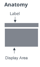
The value display consists of an optional label (referred to as the KEY in the key / label data pair of the property display component) and a display area in which to display a formatted value.
Overview
The value display web component displays the data formats text, password, checkbox, image, link and html natively, either using other PTCS web components (ptcs-label, ptcs-textfield, ptcs-checkbox, ptcs-image (indirectly via ptcs-modal-image-popup), ptcs-link—respectively), or as plain HTML.
The native type values are
textimagehtmllinkpasswordcheckbox
Usage Examples
Text Value
<ptcs-value-display label = "A Famous Quote"
                    data  = "Veni, vidi, vici"></ptcs-value-display>
Component API
The value display grows to accommodate its content. You can constrain the value display area using maximum width / height or by setting a fixed size.
Properties
| Property | Type | Description |
|---|---|---|
| backdropColor | String | The modal backdrop color |
| backdropOpacity | Number | The modal backdrop opacity, a value betwenn 0-1.0 |
| data | Object | The data to display |
| defaultText | String | Fallback textual contents to show when there is no data to display |
| disabled | Boolean | Is the value display disabled? |
| height | Number | Fixed height in pixels for the value display |
| horizontalAlignment | String | Horizontal alignment within the display area: left, center, right (default: left) |
| verticalAlignment | String | Vertical alignment within the display area: flex-start, center, flex-end (default: flex-start) |
| itemMeta | Object | The type of the data to display (default: {type: 'text'). If you are running inside of MashupBuilder application you must use {baseType: 'NUMBER'} instead: This will apply default MashupBuilder formatter rules. baseType can be any type supported by MashupBuilder. Using it will override selector attribute described above. You should use only one of type or baseType |
| label | String | The (key) label of the data value |
| labelAlignment | String | Horizontal alignment of the key label: left, center, right (default: left) |
| maxHeight | Number | Maximum height in pixels for the value display |
| maxWidth | Number | Maximum width in pixels for the value display |
| modalHeight | Number | Height of the general modal pop-up (not image), default: 600 |
| modalWidth | Number | Width of the general modal pop-up (not image), default: 380 |
| selector | Any | Selector for the value holder. If null the value is data; if the selector is of type string it identifies the name of the property in data that holds the value; otherwise it is interpreted as a function name to apply on data |
| textWrap | Boolean | Allow text content to wrap in the value? |
| tooltip | String | Tooltip text for the value display. In addition to any tooltip text on the web component itself, the tooltip will be populated from truncation overflow (when the value is truncated with ellipsis on account of size constraints) |
| tooltipIcon | String | Icon for the tooltip text |
| twNumberFormatToken | String | Format numbers according to TWX localization token. Ex.: |
| overflowOption | String | Controls display of overflow using disclosure button (default), 'Show More' textual link, or horizontal ellipsis with content truncation. Corresponding values are disclosure, showmore, and ellipsis (respectively) |
| valueDisplayType | String | One of the pre-defined label types (header, sub-header, label, or body) |
| width | Number | Fixed width in pixels for the value display |
The value display uses ptcs-value-container to render the value. This has following properties (propagated from its parent ptcs-value-display):
| Property | Type | Description |
|---|---|---|
| alignment | String | Horizontal alignment of the value: left, center, right (default: left) |
| backdropColor | String | The modal backdrop color (default: #232b2d). This is for the image pop-up. |
| backdropOpacity | Number | The modal backdrop opacity, a value between 0-1.0 (default: 0.6). This is for the image pop-up. |
| disabled | Boolean | Is the value display disabled? |
| height | Number | Fixed height in pixels. This constraint is used to scale the image thumbnail. |
| itemMeta | Object | Defines container type (text, checkbox, password, image, link, html, function). Should be one of two kinds: {type: 'text') or : {baseType='NUMBER'}. When baseType is used, the type is calculated automatically. baseType will work properly only when used in the MashupBuilder application. It accepts any baseType defined in the MashupBuilder |
| label | String | The key label for the value |
| labelHeight | Number | The height of the label above the value container; this is used to adjust the maximum available height accordingly |
| textWrap | Boolean | Allow text content to wrap in the value? |
| width | Number | Fixed width in pixels, This constraint is used to scale the image thumbnail. |
| maxWidth | Number | Maximum width in pixels. This constraint is used to scale the image thumbnail and applied on the key label as well. |
Events
| Name | Description |
|---|---|
| popup-close-action | Triggered when clicking on close button of a pop-up |
Methods
No methods
Styling
Parts
The ptcs-value-display has following parts:
| Part | Description |
|---|---|
| root | The container for the value display |
| value-display-area | The container for the are where the value is displayed |
| overflow-control | A container to monitor overflow of the value |
| value-display-label | The label above the value |
| disclosure-button-overlay | This is used to cover the bottommost part of the display area on content overflow |
| disclosure-button-container | The 34px x 34px hit area that contains the disclosure button |
| disclosure-button | The disclosure button to reveal the contents in a pop-up |
| show-button | The Show more button, an alternative to the disclosure button |
| text-link | The container for the textual link (Show More / Show Less) |
| value-container | The ptcs-value-container for the displayed value |
Part popup-container is a child of <body>, shown when the disclosure button is clicked. It contains ptcs-value-display-popup that shows the key label and value as modal
popup, without its inline size constraints.
| Part | Description |
|---|---|
| value-display-popup | The container for the value display in the pop-up, used for centering purposes |
| live-contents-area-popup | The container for the close button section (part popup-close-button-container), the key label in the pop-up (part value-display-label-popup, and the ptcs-value-container (part value-container-popup) |
| popup-close-button-container | The 34px x 34px hit area that contains the close button |
| popup-close-button | The button to close the pop-up |
| value-display-label-popup | The key label in the pop-up modal dialog |
| value-container-popup | The ptcs-value-container in the modal pop-up |
The ptcs-value-container used in the value display has following parts:
| Part | Description |
|---|---|
| item-value | The displayed value content holder |
| item-value-container | The container for part=item-value |
Custom Styling
The Show More disclosure link has the PTCS Base Theme primary background color set in the theme. If you were to use this component programmatically inside of your own component with another background color than the PTCS Base Theme, say yellow, you could override the background color of the "Show More" link (associated to part=show-button) in a couple of ways:
- By injecting a
ptcs-style-unitinto the DOM:
   <ptcs-style-unit wc="PTCS-VALUE-DISPLAY">
     :host(:not([_show-all])) [part~=show-button] {
     background-color: yellow;
     box-shadow: yellow 0px -8px 16px;
     }
   </ptcs-style-unit>
:host() predicate ensures to only apply the styling in the collapsed state when "Show More" is showing.
- Alternatively, you could use the CSS Shadow Parts Draft Specification (https://drafts.csswg.org/css-shadow-parts/) syntax:
    ptcs-value-display::part(show-button) {
    background-color: yellow;
    box-shadow: yellow 0px -8px 16px;
    }
This latter option only works well in browsers that have Shadow DOM support such as Chrome or Mozilla FireFox.
State attributes
| Attribute | Description | Part |
|---|---|---|
| text-wrap | Set when the value area contents should line wrap | :host |