ptcs-textarea
Visual
Overview
<ptcs-textarea> is a multiline input box that can be customized to fit your application.
Usage Examples
Basic Usage
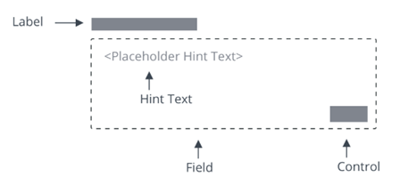
<ptcs-textarea label="Write a description" hint-text="Add detailed explanation"></ptcs-textarea>
Shows an text area box with a label and a hint text.
Component API
Properties
| Property | Type | Description | Triggers a changed event? |
|---|---|---|---|
| counter | Boolean | Adds a characters counter at the end of the field | No |
| disabled | Boolean | If true, the user cannot interact with this element | No |
| hasText | Boolean | read-only property, indicating if text has a non-empty value | No |
| hintText | String | Hint for an empty textarea | No |
| label | String | Label that is shown for the textarea | No |
| labelAlignment | String | Alignment of label (left, right, center). Default: 'left' | No |
| maxNumberOfCharacters | number | Allows only specified amount of characters. Default: 100 | No |
| readOnly | Boolean | This attribute indicates that the user cannot modify the value of the control | No |
| text | String | The initial value of the control. Supports two-way data binding | Yes |
| textAlignment | String | Alignment of text (left, right). Default: 'left' | No |
| tooltip | String | The tooltip that appears when hovering over the text area, or when it has keyboard focus | No |
| tooltipIcon | String | The icon for the tooltip | No |
Events
| Name | Data | Description |
|---|---|---|
| text-changed | { text } | Triggered whenever the value changes |
Methods
No methods
Styling
Parts
| Part | Description |
|---|---|
| root | The text area parent element |
| label | The label element |
| text-box | The element that wraps value and counter |
| hint-text | The hint text value inside the text-box element |
| text-value | The text value element inside the text-box element |
| counter | The characters counter element inside the text-box element |
CSS Variables
Currently no variables are available
State attributes
| Attribute | Description | Part |
|---|---|---|
| counter | Set to a text field with a characters counter | :host |
| disabled | Set to a disabled text field | :host, text-value |
| hintText | Set hint-text value to be presented on text-box | :host, hint-text |
| readOnly | Set to a read-only (non-editable) text area | :host, text-value |
| label | Set label value | :host, label |
| labelAlignment | Set text alignment in label part | :host, label |
| maxNumberOfCharacters | Set maximum number of characters to be entered in text-value | :host, text-value |
| textAlignment | Set text alignment of text-value input | :host, text-value |
| extraValidation | Function | Custom client validation function. This is invoked with the text component itself as parameter, so that it can use any ptcs-textarea property for custom validation. Can return true (= valid), false (= invalid), or undefined (ignore validation) |
| externalValidity | String | List validity as determined externally (server-side). Value: undefined, "unvalidated", "invalid", or "valid" |
| hideValidationCriteria | Boolean | Don't show validation criteria in unvalidated state? |
| hideValidationError | Boolean | Don't show validation error state? |
| hideValidationSuccess | Boolean | Don't show validation success state? |
| required | Boolean | Validation criterion: Must the list have a selection? |
| minLength | Number | Validation criterion: minimum text length |
| maxLength | Number | Validation criterion: maximum text length |
| pattern | String | Validation criterion: Regular expression. Field is valid only if the text matches this pattern rule |
| validationCriteria | String | The validation details message |
| validationCriteriaIcon | String | Icon for criteria state (unvalidated). Default: cds:icon_info |
| validationErrorIcon | String | Icon for error state (invalid). Default: cds:icon_error |
| validationMessage | String | The validation (title) message |
| validationSuccessDetails | String | The validation success details message |
| validationSuccessIcon | String | Icon for success state (valid). Default: cds:icon_success |
| validationSuccessMessage | String | The validation success (title) message. Default: "Success" |