ptcs-checkbox
Visual

Overview
A checkbox can be in an on or an off state. Selecting or clearing the checkbox toggles a state. The checkbox behaves according to the functionality of the ptcs-behavior-binary/ptcs-behavior-binary.js and (optionally) that of ptcs-behavior-validate/ptcs-behavior-validate.js.
Usage Examples
Basic Usage
<ptcs-checkbox variable="{{show}}">Show</ptcs-checkbox>
Sets the show variable to true when the checkbox state is on, and to false when it is off.
Start in an on state (checked)
<ptcs-checkbox variable="{{show}}" checked>Show</ptcs-checkbox>
Explicit variable values
<ptcs-checkbox variable="{{tool}}" value-on="knife" value-off="fork">Use tool</ptcs-checkbox>
Sets the tool variable to "knife" when the checkbox is set to on and "fork" when it is set to off.
Enforce validation
<ptcs-checkbox variable="{{terms}}" value-on="read" value-off="unread" required>I have read the Terms and Conditions</ptcs-checkbox>
Require the checkbox to be set via validation, to be used for a mandatory confirmation. In this case, the terms variable is set to "read" when the checkbox checked and to "unread" when it is unchecked.
Component API
Properties
| Property | Type | Description | Triggers a changed event |
|---|---|---|---|
| checked | Boolean | The current state of the checkbox (on: checked = true, off: checked = false) | No |
| disabled | Boolean | Use this property to disable the checkbox | No |
| label | String | Specifies the checkbox label | No |
| maxWidth | String | Sets the maximum width of the label | No |
| partial | Boolean | Displays a dash instead of a check mark | No |
| tooltip | String | The tooltip that appears when hovering over the checkbox | No |
| tooltipIcon | String | The icon for the tooltip | No |
| variable | any | Sets the variable name that the checkbox monitors and assigns | No |
| valueOff | any | Sets the value that the checkbox assigns to variable when the checkbox is off. Set to false by default | No |
| valueOn | any | Sets the value that the checkbox assigns to variable when the checkbox is on. Set to true by default. | No |
| extraValidation | Function | Custom validation function to complement the component's client-side validation logic. This is invoked with the checkbox component itself as parameter, so that it can use any checkbox property for custom validation. Can return true (= valid), false (= invalid), or undefined (ignore validation) |
No |
| externalValidity | String | Checkbox validity as determined externally (server-side). Value: undefined, "unvalidated", "invalid", or "valid" |
No |
| hideValidationCriteria | Boolean | Don't show validation criteria in unvalidated state? | No |
| hideValidationError | Boolean | Don't show validation error state? | No |
| hideValidationSuccess | Boolean | Don't show validation success state? | No |
| required | Boolean | Validation criterion: Must the checkbox be checked? | No |
| validationCriteria | String | The validation details message | No |
| validationCriteriaIcon | String | Icon for criteria state (unvalidated). Default: cds:icon_info |
No |
| validationErrorIcon | String | Icon for error state (invalid). Default: cds:icon_error |
No |
| validationMessage | String | The validation (title) message | No |
| validationSuccessDetails | String | The validation success details message | No |
| validationSuccessIcon | String | Icon for success state (valid). Default: cds:icon_success |
No |
| validationSuccessMessage | String | The validation success (title) message. Default: "Success" | No |
Methods
No methods
Styling
The Parts of a Component
| Part | Description |
|---|---|
| root | The button container |
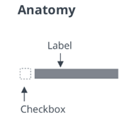
| box | The container for the box that contains the marker |
| check-mark | The check mark of the box element |
| label | The container for the text label |
State attributes
| Attribute | Description | Part |
|---|---|---|
| checked | Current state (on: checked = true, off: checked = false) | :host |
| disabled | Indicates whether the checkbox is disabled | :host |
| label | The displayed label | :host, label |
| partial | Shows a dash instead of a check mark | :host |