ptcs-chart-waterfall
Visual
Overview
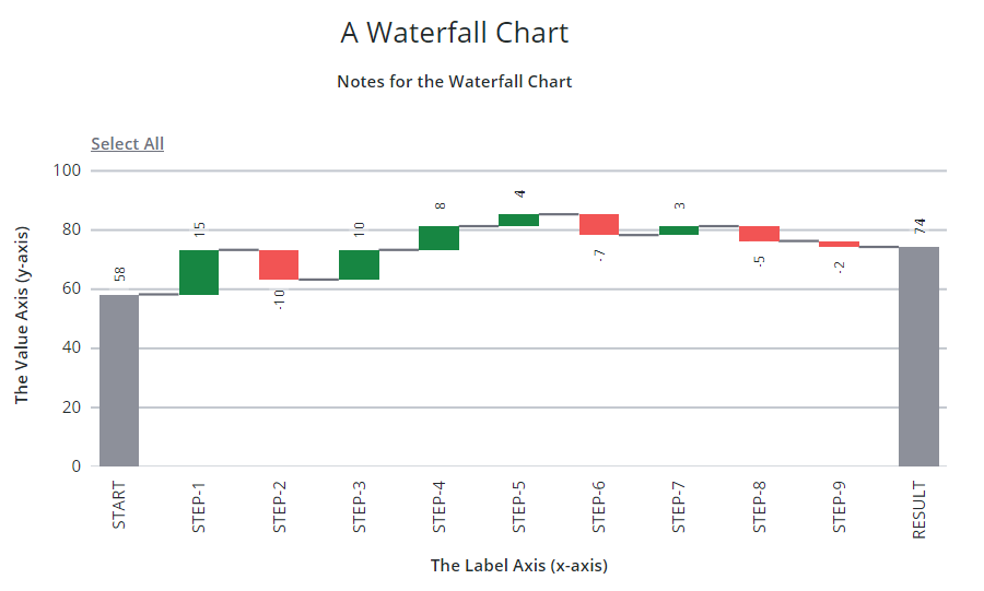
ptcs-chart-waterfall is a compound component for visualizing data as Waterfall charts.
Waterfall charts visualize changes to data. A bar in a waterfall chart can either represent:
- A summary, where the bar shows the current value
- A positive change
- A negative change
Optional connector lines can be added to emphasize that each bar represents a change to the same value.
Similar to other chart components, the Waterfall chart also has areas for a title, notes, legend, x-axes, y-axes and zoom controls.
Usage Examples
Basic Usage
<ptcs-chart-waterfall data="[[waterfall-chart-data]]"></ptcs-chart-waterfall>
Component API
Properties
| Property | Type | Description | Default |
|---|---|---|---|
| disabled | Boolean | Disables the Pareto chart | false |
| titleLabel | String | The chart title | |
| titlePos | String | Specifies the title position. Supported values: "top", "bottom", "left", or "right" | top |
| titleAlign | String | Specifies the title alignment. Supported values: "left", "center", or "right" | center |
| titleVariant | String | Title label variant | |
| notesLabel | String | The notes text | |
| hideNotes | Boolean | Hides the notes area | false |
| notesPos | String | Specifies the notes position. Supported values: "top", "bottom", "left", or "right" | bottom |
| notesAlign | String | Specifies the notes alignment. Supported values: "left", "center", or "right" | center |
| xAxisLabel | String | Specifies the X-axis label | |
| xAxisAlign | String | Specifies the alignment of the X-axis label. Supported values: "left", "center", or "right" | center |
| hideXAxis | Boolean | Hides the X-axis | false |
| yAxisLabel | String | Specifies the Y-axis label | |
| yAxisAlign | String | Specifies the alignment of the Y-axis label. Supported values: "left", "center", or "right" | center |
| hideYAxis | Boolean | Hide the y-axis? | false |
| NumberOfYLabels | Number | Set the number of labels on the Y-axis | |
| legend | Array | Array of strings that specifies the legend names | |
| legendPos | String | Specifies the legend position. Supported values: "top", "bottom", "left", or "right" | "right" |
| legendAlign | String | Specifies the alignment of the legend. Supported values: "start", "center", or "end" | start |
| legendShape | String | Specifies the shape of the legend. Supported values: "square", "circle", "none" | square |
| filterLegend | Boolean | When enabled, each legend item has a check box that allows a user to hide or show the related data series. | false |
| hideLegend | Boolean | Hide the legend? | false |
| showLegendButton | Boolean | Show a button in the Action Bar area for toggling the legend visibility? | false |
| sparkView | Boolean | Displays chart preview by hiding certain parts e.g. legend | false |
| flipAxes | Boolean | Flips the positions of the x- and y-axes | false |
| flipXAxis | Boolean | Flips the order of values on the x-axis | false |
| flipYAxis | Boolean | Flips the order of values on the y-axis | false |
| outerPadding | Number | Sets padding, in percentage of bar width, before and after each bar on the chart | 0 |
| innerPadding | Number | Sets padding, in percentage of bar width, between bars that belong to different groups | 0 |
| showXRulers | Boolean | Shows guide lines that are aligned with each tick marker on the x-axis | false |
| showYRulers | Boolean | Shows guide lines that are aligned with each tick marker on the y-axis | false |
| yAxisRulerAlignment | String | Aligns the Y-axis guidelines with the tick markers of the primary or secondary y-axis. | primary |
| frontRulers | Boolean | Moves ruler lines to the front of the bars | false |
| reverseXAxis | Boolean | Reverse the order of the x-axis | false |
| reverseYAxis | Boolean | Reverse the order of the y-axis | false |
| specXMin | String | Specifies the start label of the x-axis | |
| specXMax | String | Specifies the end label of the y-axis | |
| specYMin | "baseline" or "auto" or Number | Specifies the start value of the Y-axis. Select "baseline" to start from zero when the minimum value in the data is not negative. Select "auto" to use the minimum value of the data and subtract 20% of the full range of the data. Enter a number to start at specified number. | baseline |
| specYMax | "auto" or Number | Specifies the end value of the y-axis. See specYMin for details | auto |
| noXZoom | Boolean | Disable X-axis zooming | |
| xZoomStart | Object | The start position for the X-axis viewport | undefined |
| xZoomEnd | Object | The end position for the X-axis viewport | undefined |
| xZoomRange | Boolean | Show zoom range UI control | false |
| xZoomRangeStartLabel | String | Label for the X-axis range dropdown START (FROM) value | |
| xZoomRangeEndLabel | String | Label for the X-axis range dropdown END (TO) value | |
| xZoomInterval | Object | Specify zoom interval | null |
| xZoomIntervalLabel | String | Label for zoom interval control | undefined |
| xZoomIntervalControl | String | Specifies the type of UI used to control the X-axis zoom. Allowed values: "dropdown", radio, or "textfield" | undefined |
| xZoomIntervalOrigin | String | Sets the anchor point for the X-axis zoom interval: "start" or "end" | undefined |
| xShowIntervalAnchor | Boolean | Allow interval control to manipulate origin? | false |
| xZoomSlider | Boolean | Shows X-axis zoom slider | false |
| xZoomSliderLabel | String | Sets the label the X-axis zoom slider. | |
| xZoomSliderMaxLabel | String | Sets the maximum label of the X-axis zoom slider | |
| xZoomSliderMinLabel | String | Sets the minimum label of the X-axis zoom slider | |
| xZoomSelect | Boolean | Enables X-axis zoom by selecting two elements on the chart | |
| xZoomDrag | Boolean | Enables X-axis zoom by clicking and dragging the pointer | |
| noYZoom | Boolean | Disables zoom on the y-axis | false |
| yZoomStart | Object | The start position for the Y-axis viewport | undefined |
| yZoomEnd | Object | The end position for the y-label axis viewport | undefined |
| yZoomRange | Boolean | Shows UI elements that enable you to specify a range of values to zoom to. | false |
| yZoomInterval | Object | Specifies the zoom interval | null |
| yZoomIntervalLabel | String | Sets the label for the Y-axis zoom interval control | undefined |
| yZoomIntervalControl | String | Specifies the type of UI used to control Y-axis interval zoom. Allowed values: "dropdown", "radio", or "textfield" | undefined |
| yZoomIntervalOrigin | String | Sets the anchor point for the Y-axis zoom interval to "start" or "end" | undefined |
| yShowIntervalAnchor | Boolean | Displays UI control for re-assigning the Y-axis interval anchor | false |
| yZoomSlider | Boolean | Shows a slider that enables you to zoom on the y-axis | false |
| yZoomSliderLabel | String | Y-Axis Zoom Slider Label | |
| yZoomSliderMaxLabel | String | Sets the label for the maximum range of the Y-axis zoom slider | |
| yZoomSliderMinLabel | String | Sets the label for the minimum range of the Y-axis zoom slider | |
| yZoomSelect | Boolean | Enables zoom on the Y-axis by selecting two data points | |
| yZoomDrag | Boolean | Enables zoom on the Y-axis by clicking and dragging the pointer on the chart to select a range | |
| resetLabel | String | Sets the localization string for the zoom reset button | |
| xZoomIntervalFromLabel | String | Sets the localization string for the horizontal zoom 'From' button | |
| xZoomIntervalToLabel | String | Sets the localization string for the horizontal zoom 'To' button | |
| yZoomIntervalFromLabel | String | Sets the localization string for the vertical zoom 'From' button | |
| yZoomIntervalToLabel | String | Sets the localization string for the vertical zoom 'From' button | |
| legendMaxWidth | Number | Sets the maximum width of each legend label | |
| verticalAxisMaxWidth | Number | Sets the maximum width of the vertical axis | |
| horizontalAxisMaxHeight | Number | Sets the maximum height of the horizontal axis | |
| horizontalTicksRotation | Number | Sets the rotation of horizontal axis ticks in degrees. The allowed range is: -180 to 180. If this property is not specified, horizontal axis ticks auto-rotates 90 degrees if they collide when not rotated. | |
| data | Array | The chart data | |
| showValues | String | Controls the position of bar value labels. Supported values: 'inside', 'outside', or 'inside-end' | inside |
| hideValues | Boolean | Hide all values (bar values and marker values) | false |
| hideZeroRuler | Boolean | Hide the zero ruler? | false |
| hideConnectorLines | Booelan | Hide the connector lines? | false |
| yAxisNumberFormatSpecifier | String | Sets the number format (e.g. '0.00') to use for the y-axis | |
| showY2Axis | Boolean | Displays the secondary y-axis | false |
| reverseY2Axis | Boolean | Reverse the order of values on the secondary y-axis | false |
| specY2Min | String | Specifies the start value of the Y-axis. See specYMin for details | auto |
| specY2Max | String | Specifies the end value of the Y-axis. See specYMin for details | auto |
| y2AxisLabel | String | Specifies the secondary Y-axis label | |
| y2AxisAlign | String | Specifies the alignment of the secondary Y-axis label. Supported values: "left", "center", or "right" | center |
| summaryBars | Array | Array of row indexes for bars that should show an extra summary bar. A row is an entry in the data property (the chart data) | |
| unselectable | Array | Array of row indexes for bars that should be unselectable. A row is an entry in the data property (the chart data) | |
| y2AxisNumberFormatSpecifier | String | Sets the number format (e.g. '0.00') to use for the secondary y-axis | |
| selectionMode | String | Set selection mode: "none" (default) - no bars can be selected. "single" - one bar can be selected. "multiple" - any number of bars can be selected. The "multiple" option displays a link in the Action Bar area for selecting / un-selecting all bars. |
"none" |
| tooltipTemplate | String | Custom tooltip to display when a bar on the chart is selected. You can show a title, text, data values, and create new lines. Use the following syntax: Add #title# before a string to show a title, #newline# to create a new line, ${ |
Events
| Name | Data | Description |
|---|---|---|
| series-click | (serieIx, valueIx, x, y) | Bar data |
| zoom-selection | detail: {x: left, y: top, w: right - left, h: bottom - top} |
Selected area |
| chart-selection | selection | Chart selection |
| ## Styling |
The Parts of a Waterfall Chart
The ptcs-chart-waterfall consists of the following subcomponents:
ptcs-chart-layout, for chart layoutsptcs-chart-legend, for chart legendptcs-chart-coord, for combining a chart with a coordinate system (adds axes and rulers)ptcs-chart-axis, for chart axesptcs-chart-zoom, for the chart zoom controlsptcs-chart-core-waterfall, for the waterfall chart functionalityptcs-chart-action-bar, for theSelect All/Clear Alllink and theShow Legend/Hide Legendbutton to toggle legend visibility.
Parts
| Part | Description |
|---|---|
| chart-layout | The ptcs-chart-layout subcomponent |
| title-area | The chart title area container |
| title-label | The chart title |
| notes-area | The chart notes area container |
| notes-label | The chart notes title |
| chart | The ptcs-chart-coord subcomponent |
| core-chart | The ptcs-chart-core-waterfall subcomponent |
| legend-area | The legend area container |
| legend | The ptcs-chart-legend subcomponent |
| zoom-xaxis | The ptcs-chart-zoom subcomponent for x-axis |
| xaxis | The ptcs-chart-axis subcomponent for x-axis |
| zoom-yaxis | The ptcs-chart-zoom subcomponent for y-axis |
| yaxis | The ptcs-chart-axis subcomponent for y-axis |
| yaxis2 | The ptcs-chart-axis subcomponent for secondary y-axis |
| action-bar-area | The action bar area container |
| action-bar | The ptcs-chart-action-bar subcomponent |