Packaging a Web Component as a ThingWorx Widget
To use or import a web components in ThingWorx, you must create a widget extension. The ThingWorx Web Component SDK Utility lets you create ThingWorx extensions from Web Component widgets more easily. You can use the tool to:
- Expose the properties of your web components.
- Declare additional mashup-related properties.
- Create a responsive widget that expands to fill a responsive container.
- Assign a custom display name to the widget instead of a named derived from the web component HTML tag name.
- Declare custom code to included with the widget for behavior and styling in at design and run time.
- Assign a custom widget icon.
Exposing Public Properties and Default Wrapping
- All the public (name is not starting with '_') properties of the web component are exposed as widget properties.
- The name of widget properties is a PascalCase name of the web component property (
"defaultColor"→"DefaultColor"). - The widget property is a binding target if it is not read-only or computed. If property is output-bindable (
notify: trueorcomputed) in WC it's binding source in widget. - Property is editable if not read-only and has a type of "String", "Number" or "Boolean".
- A property-change event is generated for each output-bindable property.
- The event name is a PascalCase property name with a "Changed" suffix (
"defaultColor"→"DefaultColorChanged"). baseTypeis derived fromtypedefaultValue=value- You can modify the default wrapping behavior by configuring the widgets.json file.
Naming Widget Properties
Some properties in Mashup Builder are pre-defined. For example, a static container has numeric Height and Width properties, unlike a responsive container. If you declare public properties using the same name as pre-defined properties in the component, or directly in `widgets.json', they may not be displayed correctly.
Creating a widgets.json File
To wrap a web component as a widget, create a widgets.json under
The following is an example for a widgets.json file:
{
  "description": "Simple el extension",
  "extensionName": "simple-el-widget",
  "version": "9.2.2",
  "htmlImports": [
    {
      "from": "npm",
      "id": "some-general-library",
      "version": "^1.0.0",
      "url": "some-general-library/some-general-library.js"
    }
  ],
  "components": [
    "import!simple-el.json"
  ]
}
description, author, documentation
The objects are properties that enable you to set a description, an author name, and documentation for the widgets.json file.
extensionName
Defines the name of the ThingWorx extension.
version
The version number of the ThingWorx extension to create. This affects the name of the ZIP file that is generated when you run the utility.
htmlImports
A list of general dependencies which are required for all of the widgets in your extension. When you run the utility, dependencies are downloaded to the "webapps/common" folder on your ThingWorx platform server.
You can set the following properties for each dependency:
-
from The source of the dependency. You can only set this property to "npm"
-
id A unique ID for this dependency in the corresponding registry.
-
version The version number to use when searching for this dependency in the corresponding registry.
-
url The relative JavaScript URL path to the dependency that you wish to include into the mashup
components
References to files describing the widgets in input/widgets/
input/widgets/
You should place JSON files with definitions for your widgets. The following is an example file for a widget named simple-el:
{
  "elementName": "simple-el",
  "htmlImports": [
    {
      "from": "npm",
      "id": "simple-el",
      "version": "^1.0.0",
      "url": "simple-el/simple-el.js"
    }
  ],
  "flags": {
    "name": "Simple El",
    "description": "Simple El description"
  },
  "properties": {
    "CustomClass": {
      "baseType": "STRING",
      "description": "Custom class for the element",
      "isBindingSource": true
    },
    "Prop1": {
        "baseType": "STRING",
        "isBindingTarget": true,
        "isBindingSource": false,
        "defaultValue": "Simple-El",
        "description": "Prop1 property"
    },
    "Prop2Property": {
        "baseType": "STRING",
        "isBindingTarget": true,
        "isBindingSource": false,
        "description": "Prop2 property",
        "src": "prop2"
    },
    "Data": {
      "src": "items",
      "baseType": "INFOTABLE",
      "description": "Data from data service",
      "isBindingTarget": true,
      "isEditable": false,
      "warnIfNotBoundAsTarget": true
    },
    "DisplayField": {
      "src": "selector",
      "isEditable": true,
      "isBindingTarget": false,
      "baseType": "FIELDNAME",
      "description": "What to display",
      "sourcePropertyName": "Data"
    }
  },
  "events": {
    "Clicked": {
      "src": "click"
    }
  },
  "services": {
    "TriggerFoo": {
      "warnIfNotBound": false,
      "description": "Foo service"
    }
  }
}
-
elementName: The name of the HTML tag for the custom element. The widget name will be the tag name without any dashes and lower-case characters.
-
htmlImports: A list of all the html imports required for this widget. Note that dependencies for an entire extension are downloaded into one place. See widgets.json->htlmImports for more details.
-
flags: A JSON literal representing options supported by Mashup builder widget (ex.
"supportsLabel": true). -
properties: A JSON literal representing additional or modified widget properties in Mashup builder format. This will be merged with an automatically generated list of properties (see Default wrapping section). "false" property value removes the property - Use it to remove web component properties that are automatically exposed by the wrapper. The following are additional supported property fields:
- src: The name of corresponding web component property.
- slot: The name of Shadow DOM slot to map the property content to. Use "" as a name of default slot.
- slotElement: For slot-mapped property - element to enclose property content.
- srcCssProperty: Name of CSS custom property to map property content to.
- selected, selectedIndexes:
For property of
INFOTABLEtype - name of web component property holding an array of selected rows or row indexes. - generatedFrom: Name of defining widget property. The property value would be generated out of DataShape of infotable bound to defining property. (Used to generate content templates for data container widgets)
- generator: For generated property - name of generator method. Defaults to "defaultGenerator". defaultGenerator generates html fragment of form:
  <wrappingElement class="widgetid-line">
    <span class="widgetid-field widgetid-field-field1">{{item.field1}}</span>
    <span class="widgetid-field widgetid-field-field2">{{item.field2}}</span>
  </wrappingElement>
- wrappingElement: For generated property using defaultGenerator - element to enclose item content
- canBeReset:
In conjuction with flag
"supportsResetInputToDefault": trueit defines that this property should be reset to the default value if the "Reset Input to Default" service was triggered -
To support Composer's notion of custom class, add following:
- canBeUndefined: Some numeric values can be undefined and some not. to avoid the "Not numeric" error message and allow a numeric value to be undefined raise this flag (default value is false) - inverseValue: Only applicable for boolean properties which can't be modified internally from the web component (i.e. don't have notify:true). If widget property is set to false then the wc property will be set to true and vice versa. * events: Events exposed by the widget. Works like properties but the only additional field that you can use is src. * services: Services exposed by the widget. Works like properties but the only additional field that you can use is src."CustomClass": { "baseType": "STRING", "isLocalizable": false, "isBindingSource": true, "isBindingTarget": true, "description": "Custom Class" }
Declaring a Widget Display Name
You can specify a display name for the widget that is different from the web component name. To specify a widget name, edit the name property under the flags section of the widget .json file. The display name doesn't have to be unique.
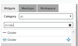
In Composer, the widget has an icon (to the left of the widget name in the widget listing, see image above). The wrapper tool emits a default icon for each wrapped widget. How to define a custom icon is covered in the section Custom Widget Code below.
Adding Tooltips to Widget Properties
You can set the description flag to specify the text to display for property tooltips in Mashup Builder.
Theming Support for Extension Widgets
You should style web component widgets using the Theme Designer. To enable style theme support for your widgets, you must add a style dictionary:
- Open the input folder within your working folder.
- Create a styles folder under the input folder.
- Create a folder with your widget name widget_name folder
-
Add a /
/style.dict.json fileYour JSON file should have the following structure:
    [
        {
            "variant": "",
            "parts": [
                {
                    "part":  "",
                    "states": [
                        {
                            "state":  "",
                            "styles": {
                                "background": "${global-color-bg-primary}",
                                "border": "8px dashed blue"
                            }
                        }
                    ]
                }
            ]
        }
    ]
After creating the folders and adding the JSON file, your folder structure should match the following structure:
```html
input
-- styles
  -- simpeel
    -- style.dict.json
```
For more information about style dictionaries and theme properties refer to the README file of the theme engine project.
Localization
You can use ThingWorx localization tokens to specify property names and their tooltip descriptions. For example:
tw.button-ide.ptcs-properties.custom-classis a localization token which is hard-coded in tw-mashupbuilder repository.[[audit.AuditCategory.FileTransfer]]is a server-side localization token which can be added to Localization Table entity.
Declaring a Responsive Widget
To enable responsive sizing for the widget in Mashup Builder and to add it to the responsive widget category, set the supportsAutoResize property to true in the flags section:
      "flags": {
        "supportsAutoResize": true,
        "name": "Divider"
      },
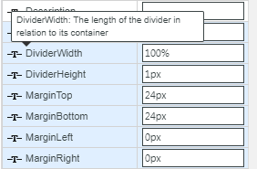
Static Container Properties
Some properties only apply to static widgets. For example, the numeric Height and Width properties do not appear when you place a responsive widget into a responsive container. However, both properties appear when you place the widget into a static container. You should to set the Width property, unless the widget gets a zero size when dropped into a static container (which makes the widget invisible except when selected in the IDE; and it appears styled if you preview the static mashup).
Custom Widget Code 
After you run the utility, you can find widget JavaScript and CSS files under dist/target/ui/<widgetname> where the <widgetname> is the same as the web component name without the hyphen. For example, running the utility for a web component named simple-el will create a folder named simpleel. The files contain the template code that you can customize. To customize the template code, copy any file under input/ui/<widgetname> and make your changes. You can customize the following files:
<widgetname>.ide.js<widgetname>.ide.css<widgetname>.runtime.js<widgetname>.runtime.cssdefault_widget_icon.ide.svg
The next time you run the utility, copy your custom code is automatically copied into the dist/target/ui/<widgetname> folder.
Adding a Custom Widget Icon
In Mashup Builder, a 48px x 48px PNG icon named default_widget_icon.ide.svg is used as default icon for web component widgets:
Assigning a Custom Icon to the Widget
To replace the default widget icon with a custom one, replace the default icon by another SVG image of same dimensions and filename.
Assigning a Category to the Widget
In Mashup Builder, widgets are assigned to one or more categories.
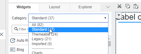
You can assign a category to your widget using the in the flags section as follows:
      "flags": {
        ...
        "category": ["Beta"],
        ...
      },
In the example, the widget is assigned to the Beta category. If you do not specify a category, the widget is added to the Standard category.