ptcs-button
Visual
Overview
A button can be activated through a click, a screen touch, or a key press. When a button is activated, any actions that are connected to the button are performed. A disabled button cannot be activated.
Usage Examples
Basic Usage
    <ptcs-button onclick="ok()" label="Ok"></ptcs-button>
    <ptcs-button variant="secondary" onclick="edit()" label="Edit"></ptcs-button>
    <ptcs-button variant="tertiary" onclick="cancel()" label="Cancel"></ptcs-button>
    function ok()
    {
      console.log("Clicked on Ok");
    }

    function edit()
    {
      console.log("Clicked on Edit");
    }

    function cancel()
    {
      console.log("Clicked on Cancel");
    }
Button with icon
~html
Component API
Properties
| Property | Type | Description | Triggers a changed event? |
|---|---|---|---|
| buttonMaxWidth | Number | The maximum width of the button in pixels | No |
| contentAlign | String | The alignment of the label. Set to "center" by default | No |
| disabled | Boolean | Disables the button | No |
| icon | String | The path to the .png button icon | No |
| iconSrc | String | The path to the .svg button icon | No |
| svgIcon | String | Specifies the ptcs-icon-library icon to display within the button | No |
| label | String | The button label | No |
| tooltip | String | The tooltip that appears when hovering over the button | No |
| tooltipIcon | String | The icon for the tooltip | No |
| variant | String | Specifies style variant of the button. Set to "Primary" by default | Yes |
| iconWidth | String | Sets a fixed width for the icon (both iconWidth and iconHeight should be set, otherwise the icon default size is set) | No |
| iconHeight | String | Sets a fixed height for the icon (both iconWidth and iconHeight should be set, otherwise the icon default size is set) | No |
| iconPlacement | String | Sets the icon image on the left or right of the text label if any. The default is "left". | No |
Events
| Name | Data | Description |
|---|---|---|
| action | An event that occurs when a user activates a button that is enabled. This event is not generated when the button is in a disabled state. |
|
| click | standard | A standard DOM event that triggers when the button is clicked. |
Methods
The button has no methods
Styling
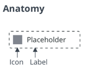
Parts
| Part | Description |
|---|---|
| root | The button parent element |
| icon | The button icon |
| label | The button label |
States
| Attribute | Description | Part |
|---|---|---|
| variant | Specifies the variant | :host |
| icon | The path to the PNG icon | :host |
| iconSrc | The path to SVG icon | :host |
| svgIcon | Specifies the ptcs-icon-library icon to display within the button | :host |
| hidden | Hides the part | icon, label, tooltip |
| contentAlign | The alignment of the label and the icon | :host |
| src | The icon path (SVG) | icon |
| mode | Does the button contain a label, an icon or both | :host |
| disabled | Disables the part | :host |