Theming
Introduction
At its core, the ThingWorx Visual SDK Theme Engine consists of two parts:
-
A set of theme properties
-
A set of styling rules, which maps theme properties to CSS styling
This theming data is manipulated by three modules:
-
The Theme Manager keeps track of the theme properties
-
The Style Engine generates styling information by combining the theme properties and the styling rules
-
The Theme Editor allow end users to reassign theming properties
The Theme Engine only defines the structure of the Theme Editor. The actual UI is implemented in the Thingworx Composer.
Theme Properties
A theme property consists of five parts:
-
name is the unique name of the property
-
value is the specified value of the property. This value is an expression that may reference other properties and call functions in the theme function library. See below for the complete syntax.
-
rValue is the result of evaluating value (the resolved value)
-
default is the default value. If default differs from value then the current theme has updated the property
-
type is the type of the property. It is mainly used by the Theme Editor to select the proper UI control for editing the value, but is also used for expression verification. See below for a complete list.
Syntax for Theme Values
value ::= string? ( '${' expr '}' string? ) *

expr  ::= func '(' args ')'
       |  string    // string in quotes
       |  var       // variable name
       |  unit      // e.g. 12px
       |  number    // e.g. 3.14

args  ::= ( expr ( ',' expr ) * ) ?
Examples:
center${disabled(global-color-core-primary)}solid ${line-thickness} green${line-type} 3px ${line-color}
List of Property Types
| Type | Description |
|---|---|
| angle | CSS angle |
| background | CSS background |
| boolean | JS true, "true", false, or "false" |
| border-style | CSS border-style |
| border-width | CSS border-width |
| box-shadow | CSS box-shadow |
| color | CSS color |
| font-family | CSS font-family |
| font-size | CSS font size |
| font-style | CSS font-style + "underline" |
| font-weight | CSS font-weight |
| icon | An icon name |
| integer | An integer, specified as a string |
| letter-spacing | CSS letter-spacing |
| line-height | CSS line-height |
| radius | CSS radius |
| side1 | "top", "bottom", or "both" |
| side2 | "top", "bottom", "left", or "right" |
| size | CSS length |
| string | Arbitrary string |
| text-align | CSS text-align |
Styling Rules
Styling Rules, also known as Styling Dictionaries, specify styling of arbitrary widgets based on theme properties.
The styling rules use this widget model:
-
A widget is anything that can be styled with CSS (i.e. arbitrary HTML structures, including single Web Components.)
-
A widget has a unique name
-
A widget may come in various variants
-
A widget consists of parts
-
Parts can have various states
The styling rules creates segments of CSS styling and binds those segments to the widget model. The CSS property values are interpreted as Theme Values.
Syntax for Styling Rules
rules    ::= '{' widget + '}'

widget   ::= widget-name ':' '[' variant + ']'

variant  ::= '{'
               'variant:' variant-name
               'parts:'   '[' part + ']'
             '}'

part     ::= '{'
               'part:'   part-name
               'states:' '[' state + ']'
             '}'

state    ::= '{'
               'state:'     state-expression
               'stateHost:' state-expression
               'styles:'    '[' style + ']'
             '}'

style    ::= '{' css-prop + '}'

widget-name, variant-name, part-name - any valid name

state-expression - partial CSS selector expression that selects a specic state for a specific part

css-prop ::= css-prop-name ':' theme-value

css-prop-name - name of CSS property

theme-value - a theme value (see above)
Note: for clarity the syntax is somewhat simplified; it omits quote characters needed for JSON and ',' separators in objects and arrays.
Example:
"my-list": [
  {
    "variant": "",
    "parts": [
      {
        "part": "", /* The whole list */
        "states": [
          {
            "state": "",
            "stateHost": "",
            "styles": {
              "width": "${list-width}",
              "height": "${list-height}"
            }
          }
        ]
      },
      {
        "part": "item",
        "states": [
          {
            "state": "",
            "stateHost": "",
            "styles": {
              "background": "${list-item-backgroundcolor}",
              "border-color": "${list-item-bordercolor}",
              "border-width": "${list-item-borderthickness}",
              "border-style": "solid"
            }
          },
          {
            "state": ":hover",
            "stateHost": ":not([disabled])",
            "styles": {
              "background": "${hover(list-item-backgroundcolor)}",
            }
          },
          {
            "state": "[selected]",
            "stateHost": ":not([disabled])",
            "styles": {
              "background": "${list-item-backgroundcolor-selected}"
            }
          },
          {
            "state": "",
            "stateHost": "[disabled]",
            "styles": {
              "border-color": "${disabled(list-item-bordercolor)}"
            }
          }
        ]
      }
    ]
  }
]
The styling rules do not specify how widget-name, variant-name and part-name are encoded in the HTML structure. This encoding can – and does – vary depending on the target widget. It is the job of the Style Engine to produce CSS selectors that identify these parameters in the widget HTML data.
Function Library
A function library is a Javascript object that binds function names to functions. Each function takes an array as input, where each array item corresponds to a parameter to the function (in the theme expression).
Functions in the Core Function Library
| Function | Input | Output |
|---|---|---|
| disabled | a color | a color that has been manipulated according to the "disabled" algorithm |
| disabledSelected | a color | a color that has been manipulated according to the "disabled-selected" algorithm |
| hover | a color | a color that has been manipulated according to the "hover" algorithm |
| pressed | a color | a color that has been manipulated according to the "pressed" algorithm |
| selected | a color | a color that has been manipulated according to the "selected" algorithm |
| fontStyleCond | a font style | |
| textDecorationCond | a font style | |
| strokeWidth | a width | the same width, but without any unit specifier |
Aliases
The function library does not automatically convert kebab-case to camelCase or vice versa, so this conversion must be manually added to the function library, if needed.
The following case bindings are added automatically:
| Kebab Case | Camel Case |
|---|---|
| font-style-cond | fontStyleCond |
| text-decoration-cond | textDecorationCond |
| stroke-width | strokeWidth |
| disabled-selected | disabledSelected |
Style Engine
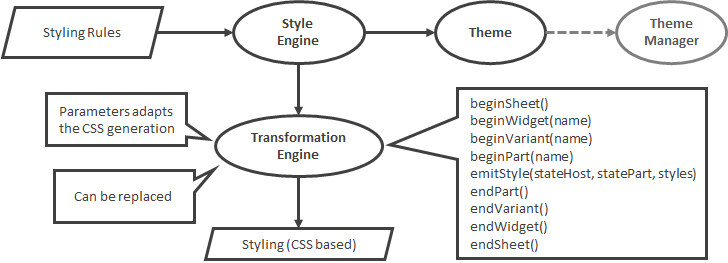
A Style Engine take styling rules as input, resolves the theme values with regard to a theme and produce corresponding CSS styling. The CSS is produced with the help of a Transformation Engine that knows how to map the widgets conceptual model to CSS selectors.
Theme Editor
The structure of the Theme Editor is defined in the file theme-editor.json. It consist of three kind of objects:
- A list of sub-objects
The list can be adapted with these fields:
| Field | Description |
|---|---|
| changemark | If assigned to true, a changemark should be visible alongside the label if any theme property in the list, at any depth, has a non-default value. |
| expanded | If this field exists, then the list can be expanded and collapsed. If the initial value is false the list is initially collpased, otherwise it is expanded. |
-
A single property assignment
-
A complex assignment of several properties that are logically grouped together
All objects can specify a label and a tooltipKey. Both fields are i18 keys, to support localization. The label should always be visible and the tooltip should be shown if the user requests it.
The localization strings resides in the file i18.json.
Theme Editor - Syntax
theme-editor ::= list

list         ::= '[' item + ']'

item         ::= item-list
              |  item-single
              |  item-complex

item-list    ::= '{' label expanded? changemark? sub '}'

item-single  ::= '{' label prop '}'

item-complex ::= '{' label type part '}'

label        ::= 'label:' i18key tooltipKey?

tooltipKey   ::= 'tooltipKey:' i18key

expanded     ::= 'expanded:' boolean

changemark   ::= 'changemark:' 'true'

sub          ::= 'sub:' list

prop         ::= 'prop:' theme-property

type         ::= 'type:' type-name

part         ::= '{' part-assign + '}'

part-assign  ::= part-key ':' theme-property

boolean      ::= 'true' | 'false'

part-key       - name of part property (dependent on the type)

theme-property - name of theme property that can be assigned

i18key         - key to i18 translation string

type-name      - see list of type names below
List of types for complex items
| Type | Description |
|---|---|
| alt-color | Properties for an alternative color, for instance for alternating rows. The properties consists of a boolean for enabling the alternative color and the value of the alternative color |
| border | Properties for borders, such as thickness and color |
| box | Properties for border, font, background, etc |
| font | Font properties, such as font family, font size, font weight, etc. |
Theme Editor - Current Structure
-
Global
-
Colors
-
Core Colors
-
Primary:
global-color-core-primary -
Secondary:
global-color-core-secondary1 -
Danger:
global-color-core-danger
-
-
Text Colors
-
Headers:
global-color-text-header -
Sub-Headers:
global-color-text-subheader -
Labels:
global-color-text-label -
Body:
global-color-text-body
-
-
Background Colors
-
Primary Background:
global-color-bg-primary -
Secondary Background:
global-color-bg-secondary -
Selected Background:
global-color-bg-selected -
Hover Background:
global-color-bg-hover -
Disabled Background:
global-color-bg-disabled
-
-
Line Colors
-
Borders:
global-color-line-border -
Dividers:
global-color-line-divider -
Interior Lines:
global-color-line-interior
-
-
-
Text
-
Headers [type = _
font]_-
font-family:
global-text-header-fontfamily -
font-weight:
global-text-header-fontweight -
font-size:
global-text-header-fontsize -
font-style:
global-text-header-fontstyle
-
-
Sub-Headers [type = _
font]_-
font-family:
global-text-subheader-fontfamily -
font-weight:
global-text-subheader-fontweight -
font-size:
global-text-subheader-fontsize -
font-style:
global-text-subheader-fontstyle
-
-
Labels [type = _
font]_-
font-family:
global-text-label-fontfamily -
font-weight:
global-text-label-fontweight -
font-size:
global-text-label-fontsize -
font-style:
global-text-label-fontstyle
-
-
Body [type = _
font]_-
font-family:
global-text-body-fontfamily -
font-weight:
global-text-body-fontweight -
font-size:
global-text-body-fontsize -
font-style:
global-text-body-fontstyle
-
-
Links [type = _
font]_-
font-family:
global-text-link-fontfamily -
font-weight:
global-text-link-fontweight -
font-size:
global-text-link-fontsize -
font-style:
global-text-link-fontstyle
-
-
-
Lines
-
Borders:
global-line-border-thickness -
Dividers:
global-line-divider-thickness -
Interior:
global-line-interior-thickness
-
-
-
Elements (changemark)
-
Buttons (changemark)
-
Primary Buttons
-
Active State (Base) [type = _
box]_-
font-color:
e-button-primary-fontcolor -
font-family:
e-button-primary-fontfamily -
font-weight:
e-button-primary-fontweight -
font-style:
e-button-primary-fontstyle -
font-size:
e-button-primary-fontsize -
background:
e-button-primary-backgroundcolor -
border-color:
e-button-primary-bordercolor -
border-width:
e-button-primary-borderthickness -
radius:
e-button-primary-radius
-
-
Hover State [type = _
box]_-
font-color:
e-button-primary-hover-fontcolor -
font-family:
e-button-primary-hover-fontfamily -
font-weight:
e-button-primary-hover-fontweight -
font-style:
e-button-primary-hover-fontstyle -
font-size:
e-button-primary-hover-fontsize -
background:
e-button-primary-hover-backgroundcolor -
border-color:
e-button-primary-hover-bordercolor -
border-width:
e-button-primary-hover-borderthickness -
radius:
e-button-primary-hover-radius
-
-
Pressed State [type = _
box]_-
font-color:
e-button-primary-pressed-fontcolor -
font-family:
e-button-primary-pressed-fontfamily -
font-weight:
e-button-primary-pressed-fontweight -
font-style:
e-button-primary-pressed-fontstyle -
font-size:
e-button-primary-pressed-fontsize -
background:
e-button-primary-pressed-backgroundcolor -
border-color:
e-button-primary-pressed-bordercolor -
border-width:
e-button-primary-pressed-borderthickness -
radius:
e-button-primary-pressed-radius
-
-
Disabled State [type = _
box]_-
font-color:
e-button-primary-disabled-fontcolor -
font-family:
e-button-primary-disabled-fontfamily -
font-weight:
e-button-primary-disabled-fontweight -
font-style:
e-button-primary-disabled-fontstyle -
font-size:
e-button-primary-disabled-fontsize -
background:
e-button-primary-disabled-backgroundcolor -
border-color:
e-button-primary-disabled-bordercolor -
border-width:
e-button-primary-disabled-borderthickness -
radius:
e-button-primary-disabled-radius
-
-
-
Secondary Buttons
-
Active State (Base) [type = _
box]_-
font-color:
e-button-secondary-fontcolor -
font-family:
e-button-secondary-fontfamily -
font-weight:
e-button-secondary-fontweight -
font-style:
e-button-secondary-fontstyle -
font-size:
e-button-secondary-fontsize -
background:
e-button-secondary-backgroundcolor -
border-color:
e-button-secondary-bordercolor -
border-width:
e-button-secondary-borderthickness -
radius:
e-button-secondary-radius
-
-
Hover State [type = _
box]_-
font-color:
e-button-secondary-hover-fontcolor -
font-family:
e-button-secondary-hover-fontfamily -
font-weight:
e-button-secondary-hover-fontweight -
font-style:
e-button-secondary-hover-fontstyle -
font-size:
e-button-secondary-hover-fontsize -
background:
e-button-secondary-hover-backgroundcolor -
border-color:
e-button-secondary-hover-bordercolor -
border-width:
e-button-secondary-hover-borderthickness -
radius:
e-button-secondary-hover-radius
-
-
Pressed State [type = _
box]_-
font-color:
e-button-secondary-pressed-fontcolor -
font-family:
e-button-secondary-pressed-fontfamily -
font-weight:
e-button-secondary-pressed-fontweight -
font-style:
e-button-secondary-pressed-fontstyle -
font-size:
e-button-secondary-pressed-fontsize -
background:
e-button-secondary-pressed-backgroundcolor -
border-color:
e-button-secondary-pressed-bordercolor -
border-width:
e-button-secondary-pressed-borderthickness -
radius:
e-button-secondary-pressed-radius
-
-
Disabled State [type = _
box]_-
font-color:
e-button-secondary-disabled-fontcolor -
font-family:
e-button-secondary-disabled-fontfamily -
font-weight:
e-button-secondary-disabled-fontweight -
font-style:
e-button-secondary-disabled-fontstyle -
font-size:
e-button-secondary-disabled-fontsize -
background:
e-button-secondary-disabled-backgroundcolor -
border-color:
e-button-secondary-disabled-bordercolor -
border-width:
e-button-secondary-disabled-borderthickness -
radius:
e-button-secondary-disabled-radius
-
-
-
Tertiary Buttons
-
Active State (Base) [type = _
box]_-
font-color:
e-button-tertiary-fontcolor -
font-family:
e-button-tertiary-fontfamily -
font-weight:
e-button-tertiary-fontweight -
font-style:
e-button-tertiary-fontstyle -
font-size:
e-button-tertiary-fontsize -
background:
e-button-tertiary-backgroundcolor -
border-color:
e-button-tertiary-bordercolor -
border-width:
e-button-tertiary-borderthickness -
radius:
e-button-tertiary-radius
-
-
Hover State [type = _
box]_-
font-color:
e-button-tertiary-hover-fontcolor -
font-family:
e-button-tertiary-hover-fontfamily -
font-weight:
e-button-tertiary-hover-fontweight -
font-style:
e-button-tertiary-hover-fontstyle -
font-size:
e-button-tertiary-hover-fontsize -
background:
e-button-tertiary-hover-backgroundcolor -
border-color:
e-button-tertiary-hover-bordercolor -
border-width:
e-button-tertiary-hover-borderthickness -
radius:
e-button-tertiary-hover-radius
-
-
Pressed State [type = _
box]_-
font-color:
e-button-tertiary-pressed-fontcolor -
font-family:
e-button-tertiary-pressed-fontfamily -
font-weight:
e-button-tertiary-pressed-fontweight -
font-style:
e-button-tertiary-pressed-fontstyle -
font-size:
e-button-tertiary-pressed-fontsize -
background:
e-button-tertiary-pressed-backgroundcolor -
border-color:
e-button-tertiary-pressed-bordercolor -
border-width:
e-button-tertiary-pressed-borderthickness -
radius:
e-button-tertiary-pressed-radius
-
-
Disabled State [type = _
box]_-
font-color:
e-button-tertiary-disabled-fontcolor -
font-family:
e-button-tertiary-disabled-fontfamily -
font-weight:
e-button-tertiary-disabled-fontweight -
font-style:
e-button-tertiary-disabled-fontstyle -
font-size:
e-button-tertiary-disabled-fontsize -
background:
e-button-tertiary-disabled-backgroundcolor -
border-color:
e-button-tertiary-disabled-bordercolor -
border-width:
e-button-tertiary-disabled-borderthickness -
radius:
e-button-tertiary-disabled-radius
-
-
-
Danger Buttons
-
Active State (Base) [type = _
box]_-
font-color:
e-button-danger-fontcolor -
font-family:
e-button-danger-fontfamily -
font-weight:
e-button-danger-fontweight -
font-style:
e-button-danger-fontstyle -
font-size:
e-button-danger-fontsize -
background:
e-button-danger-backgroundcolor -
border-color:
e-button-danger-bordercolor -
border-width:
e-button-danger-borderthickness -
radius:
e-button-danger-radius
-
-
Hover State [type = _
box]_-
font-color:
e-button-danger-hover-fontcolor -
font-family:
e-button-danger-hover-fontfamily -
font-weight:
e-button-danger-hover-fontweight -
font-style:
e-button-danger-hover-fontstyle -
font-size:
e-button-danger-hover-fontsize -
background:
e-button-danger-hover-backgroundcolor -
border-color:
e-button-danger-hover-bordercolor -
border-width:
e-button-danger-hover-borderthickness -
radius:
e-button-danger-hover-radius
-
-
Pressed State [type = _
box]_-
font-color:
e-button-danger-pressed-fontcolor -
font-family:
e-button-danger-pressed-fontfamily -
font-weight:
e-button-danger-pressed-fontweight -
font-style:
e-button-danger-pressed-fontstyle -
font-size:
e-button-danger-pressed-fontsize -
background:
e-button-danger-pressed-backgroundcolor -
border-color:
e-button-danger-pressed-bordercolor -
border-width:
e-button-danger-pressed-borderthickness -
radius:
e-button-danger-pressed-radius
-
-
Disabled State [type = _
box]_-
font-color:
e-button-danger-disabled-fontcolor -
font-family:
e-button-danger-disabled-fontfamily -
font-weight:
e-button-danger-disabled-fontweight -
font-style:
e-button-danger-disabled-fontstyle -
font-size:
e-button-danger-disabled-fontsize -
background:
e-button-danger-disabled-backgroundcolor -
border-color:
e-button-danger-disabled-bordercolor -
border-width:
e-button-danger-disabled-borderthickness -
radius:
e-button-danger-disabled-radius
-
-
-
Transparent Buttons
-
Active State (Base) [type = _
box]_-
font-color:
e-button-transparent-fontcolor -
font-family:
e-button-transparent-fontfamily -
font-weight:
e-button-transparent-fontweight -
font-style:
e-button-transparent-fontstyle -
font-size:
e-button-transparent-fontsize -
background:
e-button-transparent-backgroundcolor -
border-color:
e-button-transparent-bordercolor -
border-width:
e-button-transparent-borderthickness -
radius:
e-button-transparent-radius
-
-
Hover State [type = _
box]_-
font-color:
e-button-transparent-hover-fontcolor -
font-family:
e-button-transparent-hover-fontfamily -
font-weight:
e-button-transparent-hover-fontweight -
font-style:
e-button-transparent-hover-fontstyle -
font-size:
e-button-transparent-hover-fontsize -
background:
e-button-transparent-hover-backgroundcolor -
border-color:
e-button-transparent-hover-bordercolor -
border-width:
e-button-transparent-hover-borderthickness -
radius:
e-button-transparent-hover-radius
-
-
Pressed State [type = _
box]_-
font-color:
e-button-transparent-pressed-fontcolor -
font-family:
e-button-transparent-pressed-fontfamily -
font-weight:
e-button-transparent-pressed-fontweight -
font-style:
e-button-transparent-pressed-fontstyle -
font-size:
e-button-transparent-pressed-fontsize -
background:
e-button-transparent-pressed-backgroundcolor -
border-color:
e-button-transparent-pressed-bordercolor -
border-width:
e-button-transparent-pressed-borderthickness -
radius:
e-button-transparent-pressed-radius
-
-
Disabled State [type = _
box]_-
font-color:
e-button-transparent-disabled-fontcolor -
font-family:
e-button-transparent-disabled-fontfamily -
font-weight:
e-button-transparent-disabled-fontweight -
font-style:
e-button-transparent-disabled-fontstyle -
font-size:
e-button-transparent-disabled-fontsize -
background:
e-button-transparent-disabled-backgroundcolor -
border-color:
e-button-transparent-disabled-bordercolor -
border-width:
e-button-transparent-disabled-borderthickness -
radius:
e-button-transparent-disabled-radius
-
-
-
-
Grids and Lists (changemark)
-
Grids
-
Backgrounds (changemark)
-
Main Row Background:
e-grid-row-backgroundcolor -
Use Alternating Row Background [type = _
alt-color]_-
usealternating:
e-grid-row-backgroundcolor-usealternating -
color:
e-grid-row-backgroundcolor-alt
-
-
Title Row Background:
e-grid-header-backgroundcolor -
Selected Background:
e-grid-row-backgroundcolor-selected -
Hover Background:
e-grid-row-backgroundcolor-hover
-
-
Borders and Dividers (changemark)
-
Main Border [type = _
border]_-
color:
e-grid-bordercolor -
border-width:
e-grid-borderthickness
-
-
Title Row Dividers [type = _
border]_-
color:
e-grid-header-divider-color -
border-width:
e-grid-header-divider-thickness -
side1:
e-grid-header-divider-placement
-
-
Cell Borders [type = _
border]_-
color:
e-grid-cell-bordercolor -
border-width:
e-grid-cell-borderthickness -
side2:
e-grid-cell-border-placement
-
-
-
Text (changemark)
-
Title Row Labels [type = _
font]_-
color:
e-grid-header-label-fontcolor -
font-family:
e-grid-header-label-fontfamily -
font-weight:
e-grid-header-label-fontweight -
font-style:
e-grid-header-label-fontstyle -
font-size:
e-grid-header-label-fontsize
-
-
Main Text (Base) [type = _
font]_-
color:
e-grid-text-fontcolor -
font-family:
e-grid-text-fontfamily -
font-weight:
e-grid-text-fontweight -
font-style:
e-grid-text-fontstyle -
font-size:
e-grid-text-fontsize
-
-
Selected Text [type = _
font]_-
color:
e-grid-text-fontcolor-selected -
font-family:
e-grid-text-fontfamily-selected -
font-weight:
e-grid-text-fontweight-selected -
font-style:
e-grid-text-fontstyle-selected -
font-size:
e-grid-text-fontsize-selected
-
-
Hover Text [type = _
font]_-
color:
e-grid-text-fontcolor-hover -
font-family:
e-grid-text-fontfamily-hover -
font-weight:
e-grid-text-fontweight-hover -
font-style:
e-grid-text-fontstyle-hover -
font-size:
e-grid-text-fontsize-hover
-
-
-
-
Lists and Dropdowns
-
Backgrounds (changemark)
-
Main Row Background:
e-list-row-backgroundcolor -
Use Alternating Row Background [type = _
alt-color]_-
usealternating:
e-list-row-usealternating -
color:
e-list-row-backgroundcolor-alt
-
-
Selected Background:
e-list-row-backgroundcolor-selected -
Hover Background:
e-list-row-backgroundcolor-hover
-
-
Borders and Dividers (changemark)
-
Main Border [type = _
border]_-
color:
e-list-bordercolor -
border-width:
e-list-borderthickness
-
-
Row Dividers [type = _
border]_-
color:
e-list-row-bordercolor -
border-width:
e-list-row-borderthickness
-
-
-
Text (changemark)
-
Label Text [type = _
font]_-
color:
e-list-text-label-color -
font-family:
e-list-text-label-fontfamily -
font-weight:
e-list-text-label-fontweight -
font-size:
e-list-text-label-fontsize -
font-style:
e-list-text-label-fontstyle
-
-
Option Text (Base) [type = _
font]_-
color:
e-list-text-text-fontcolor -
font-family:
e-list-text-text-fontfamily -
font-weight:
e-list-text-text-fontweight -
font-size:
e-list-text-text-fontsize -
font-style:
e-list-text-text-fontstyle
-
-
Selected Option Text [type = _
font]_-
color:
e-list-text-text-fontcolor-selected -
font-family:
e-list-text-text-fontfamily-selected -
font-weight:
e-list-text-text-fontweight-selected -
font-size:
e-list-text-text-fontsize-selected -
font-style:
e-list-text-text-fontstyle-selected
-
-
Hover Option Text [type = _
font]_-
color:
e-list-text-text-fontcolor-hover -
font-family:
e-list-text-text-fontfamily-hover -
font-weight:
e-list-text-text-fontweight-hover -
font-size:
e-list-text-text-fontsize-hover -
font-style:
e-list-text-text-fontstyle-hover
-
-
-
-
-
Input Elements (changemark)
-
Text Fields & Text Areas
-
Field (changemark)
- Background Color:
e-textfield-backgroundcolor
- Background Color:
-
Borders [type = _
border]_-
color:
e-textfield-bordercolor -
border-width:
e-textfield-borderthickness -
radius:
e-textfield-border-radius
-
-
Text (changemark)
-
Label [type = _
font]_-
color:
e-textfield-text-label-color -
font-family:
e-textfield-text-label-fontfamily -
font-weight:
e-textfield-text-label-fontweight -
font-size:
e-textfield-text-label-fontsize -
font-style:
e-textfield-text-label-fontstyle
-
-
Text Content [type = _
font]_-
color:
e-textfield-text-text-color -
font-family:
e-textfield-text-text-fontfamily -
font-weight:
e-textfield-text-text-fontweight -
font-size:
e-textfield-text-text-fontsize -
font-style:
e-textfield-text-text-fontstyle
-
-
Hint Text [type = _
font]_-
color:
e-textfield-text-hinttext-color -
font-family:
e-textfield-text-hinttext-fontfamily -
font-weight:
e-textfield-text-hinttext-fontweight -
font-size:
e-textfield-text-hinttext-fontsize -
font-style:
e-textfield-text-hinttext-fontstyle
-
-
-
-
Checkboxes
-
Unselected State (Base) [type = _
box]_-
background:
e-checkbox-backgroundcolor -
border-color:
e-checkbox-bordercolor -
border-width:
e-checkbox-borderthickness -
radius:
e-checkbox-border-radius -
font-color:
e-checkbox-text-label-color -
font-family:
e-checkbox-text-label-fontfamily -
font-size:
e-checkbox-text-label-fontsize -
font-weight:
e-checkbox-text-label-fontweight -
font-style:
e-checkbox-text-label-fontstyle
-
-
Selected State [type = _
box]_-
background:
e-checkbox-backgroundcolor-selected -
border-color:
e-checkbox-bordercolor-selected -
border-width:
e-checkbox-borderthickness-selected -
radius:
e-checkbox-border-radius-selected -
font-color:
e-checkbox-text-label-color-selected -
font-family:
e-checkbox-text-label-fontfamily-selected -
font-size:
e-checkbox-text-label-fontsize-selected -
font-weight:
e-checkbox-text-label-fontweight-selected -
font-style:
e-checkbox-text-label-fontstyle-selected
-
-
-
Radio Buttons
-
Unselected State (Base) [type = _
box]_-
background:
e-radiobutton-backgroundcolor -
border-color:
e-radiobutton-bordercolor -
border-width:
e-radiobutton-borderthickness -
font-color:
e-radiobutton-text-label-color -
font-family:
e-radiobutton-text-label-fontfamily -
font-size:
e-radiobutton-text-label-fontsize -
font-weight:
e-radiobutton-text-label-fontweight -
font-style:
e-radiobutton-text-label-fontstyle
-
-
Selected State [type = _
box]_-
background:
e-radiobutton-backgroundcolor-selected -
fill-color:
e-radiobutton-fillcolor-selected -
fill-mode:
e-radiobutton-fillcolorcompletely-selected -
border-color:
e-radiobutton-bordercolor-selected -
border-width:
e-radiobutton-borderthickness-selected -
font-color:
e-radiobutton-text-label-color-selected -
font-family:
e-radiobutton-text-label-fontfamily-selected -
font-weight:
e-radiobutton-text-label-fontweight-selected -
font-size:
e-radiobutton-text-label-fontsize-selected -
font-style:
e-radiobutton-text-label-fontstyle-selected
-
-
-
-
Layout (changemark)
-
Containers
-
Backgrounds and Borders (changemark)
- Background Color:
flexcontainer-bg-color
- Background Color:
-
Borders [type = _
border]_-
color:
flexcontainer-border-color -
border-width:
flexcontainer-border-width -
border-style:
flexcontainer-border-style -
radius:
flexcontainer-border-radius
-
-
-
-
Navigation (changemark)
-
Menus
-
Backgrounds (changemark)
-
Main Row Background:
e-menu-row-backgroundcolor -
Use alternating row colors [type = _
alt-color]_-
usealternating:
e-menu-row-usealternating -
color:
e-menu-row-backgroundcolor-alt
-
-
Selected Background:
e-menu-backgroundcolor-selected -
Hover Background:
e-menu-backgroundcolor-hover
-
-
Borders and Dividers (changemark)
-
Main Border [type = _
border]_-
color:
e-menu-bordercolor -
border-width:
e-menu-borderthickness
-
-
Row Dividers [type = _
border]_-
color:
e-menu-divider-color -
border-width:
e-menu-divider-thickness
-
-
-
Text (changemark)
-
Main Text (Base) [type = _
font]_-
color:
e-menu-text-text-color -
font-family:
e-menu-text-fontfamily -
font-weight:
e-menu-text-fontweight -
font-style:
e-menu-text-fontstyle -
font-size:
e-menu-text-fontsize
-
-
Selected Text [type = _
font]_-
color:
e-menu-text-text-color-selected -
font-family:
e-menu-text-text-fontfamily-selected -
font-weight:
e-menu-text-text-fontweight-selected -
font-style:
e-menu-text-text-fontstyle-selected -
font-size:
e-menu-text-text-fontsize-selected
-
-
Hover Text [type = _
font]_-
color:
e-menu-text-text-color-hover -
font-family:
e-menu-text-text-fontfamily-hover -
font-weight:
e-menu-text-text-fontweight-hover -
font-style:
e-menu-text-text-fontstyle-hover -
font-size:
e-menu-text-text-fontsize-hover
-
-
-
-
Primary Links
-
Active State (Base) [type = _
font]_-
color:
e-link-primary-color -
font-family:
e-link-primary-fontfamily -
font-weight:
e-link-primary-fontweight -
font-style:
e-link-primary-fontstyle -
font-size:
e-link-primary-fontsize
-
-
Hover State [type = _
font]_-
color:
e-link-primary-color-hover -
font-family:
e-link-primary-fontfamily-hover -
font-weight:
e-link-primary-fontweight-hover -
font-style:
e-link-primary-fontstyle-hover -
font-size:
e-link-primary-fontsize-hover
-
-
Pressed State [type = _
font]_-
color:
e-link-primary-color-pressed -
font-family:
e-link-primary-fontfamily-pressed -
font-weight:
e-link-primary-fontweight-pressed -
font-style:
e-link-primary-fontstyle-pressed -
font-size:
e-link-primary-fontsize-pressed
-
-
Disabled State [type = _
font]_-
color:
e-link-primary-color-disabled -
font-family:
e-link-primary-fontfamily-disabled -
font-weight:
e-link-primary-fontweight-disabled -
font-style:
e-link-primary-fontstyle-disabled -
font-size:
e-link-primary-fontsize-disabled
-
-
Visited State
- Font Color:
e-link-primary-color-visited
- Font Color:
-
-
Secondary Links
-
Active State (Base) [type = _
font]_-
color:
e-link-secondary-color -
font-family:
e-link-secondary-fontfamily -
font-weight:
e-link-secondary-fontweight -
font-style:
e-link-secondary-fontstyle -
font-size:
e-link-secondary-fontsize
-
-
Hover State [type = _
font]_-
color:
e-link-secondary-color-hover -
font-family:
e-link-secondary-fontfamily-hover -
font-weight:
e-link-secondary-fontweight-hover -
font-style:
e-link-secondary-fontstyle-hover -
font-size:
e-link-secondary-fontsize-hover
-
-
Pressed State [type = _
font]_-
color:
e-link-secondary-color-pressed -
font-family:
e-link-secondary-fontfamily-pressed -
font-weight:
e-link-secondary-fontweight-pressed -
font-style:
e-link-secondary-fontstyle-pressed -
font-size:
e-link-secondary-fontsize-pressed
-
-
Disabled State [type = _
font]_-
color:
e-link-secondary-color-disabled -
font-family:
e-link-secondary-fontfamily-disabled -
font-weight:
e-link-secondary-fontweight-disabled -
font-style:
e-link-secondary-fontstyle-disabled -
font-size:
e-link-secondary-fontsize-disabled
-
-
Visited State
- Font Color:
e-link-secondary-color-visited
- Font Color:
-
-
-
tw.theme-editor.information (changemark)
-
tw.theme-editor.tooltips
-
tw.theme-editor.size (changemark)
-
tw.theme-editor.max-width:
tooltip-maxwidth -
tw.theme-editor.min-width:
tooltip-minwidth
-
-
Background Color (changemark)
- undefined:
tooltip-backgroundcolor
- undefined:
-
Borders (changemark)
-
undefined [type = _
border]_-
color:
tooltip-bordercolor -
border-width:
tooltip-borderwidth -
border-style:
tooltip-borderstyle -
radius:
tooltip-borderradius
-
-
-
tw.theme-editor.box-shadow (changemark)
- undefined:
tooltip-box-shadow
- undefined:
-
Text (changemark)
-
undefined [type = _
font]_-
font-color:
tooltip-text-color -
font-family:
tooltip-text-fontfamily -
font-weight:
tooltip-text-fontweight -
font-style:
tooltip-text-fontstyle -
font-size:
tooltip-text-fontsize
-
-
-
-
-