ptcs-datepicker
Visual
Closed
Opened

Overview
The date picker is a dialog box that enables you to pick a specific date and time. The date can be displayed according to a format that is specified by the user.
The date picker is implemented using the MomentJS library and it uses its format specification.
Usage Examples
Basic Usage
<ptcs-datepicker></ptcs-datepicker>
Specific date and format selected
<ptcs-datepicker format="LL" date="2018-11-25"></ptcs-datepicker>
In the example above, the attributes define the following:
- date - The date to display
- format - The date format specifier according to the MomentJS format. The 'LL' value generates the following: 'November 25, 2018'.
<ptcs-datepicker week-start="day" month-format="YMD" date-order="order" action-position="location" show-time display-seconds></ptcs-datepicker>
In the above example substitute attribute values:
- day - possible values: Monday, Sunday
- YMD - possible values: full, short, numeric
- order - possible values: YMD, MDY, DMY
- location - possible values: left, right
Date range selection
<ptcs-datepicker date-range-selection></ptcs-datepicker>
In the example above, date picker allows users to select a date range.
Component API
Properties
| Property | Type | Description | Triggers a changed event? |
|---|---|---|---|
| actionPosition | String | Sets the position of the "Done" button. The allowed values are "left" and "right". When set to "left", the button is placed to the left of the "Today" button. | No |
| date | String | Opens the calendar on a specific date using the following format: YYYY-MM-DD | Yes |
| dateDelimiter | String | The separator to use between date components. Set to '-' by default. | No |
| dateOnly | Boolean | A property for the _dateFormat call | No |
| dateOrder | String | The order of the year, month, and day. You can set it to "auto", "YMD", "MDY", or "DMY". Setting it to "auto" defaults to the "YMD" format. | No |
| dateTime | Date | The actual data, as a Date object | Yes |
| daysContainingAnyData | Array (timestamp) | Displays dots for the dates contained in the array. | No |
| disabled | Boolean | Disables the date picker | No |
| displaySeconds | Boolean | Displays seconds as part of the date. | No |
| formatToken | String | Overrides the format of the displayed date. See the Available formats. | No |
| hidden | Boolean | Hides the calendar | No |
| hintText | String | Sets the prompt text to pick a date | No |
| initWithCurrentDateTime | Boolean | Initializes the date picker with current date and time. | No |
| interval | Number | The refresh rate for updating the calendar. Default: 0 | No |
| intervalType | String | The unit of refresh rate for updating the calendar. Default: 'h'. Allowed values: 'h' - Hours, 'm' - Minutes, 's' - Seconds, 'd' - Days | No |
| label | String | An optional label above the date picker | No |
| monthFormat | String | The month format. Allowed values: "full", "short", "numeric" (default: "full") | No |
| labelAlignment | String | The horizontal alignment of the label. Allowed values: "left", "center", "right" (default: "left") | No |
| selectedDate | Object | The selected date as a moment object | Yes |
| showTime | Boolean | Shows the time in the picker. (default: false) | No |
| tooltip | String | The tooltip that appears when hovering over the date picker | No |
| tooltipIcon | String | The icon for the tooltip | No |
| weekStart | String | The first day of the week. Set to "Monday" by default. The allowed values are "Monday" and "Sunday". | No |
| dateRangeSelection | Boolean | Enables you to specify a date range by selecting a start and an end date. You cannot specify a time value when range selection is enabled. (default: true) | No |
| showTodayButton | Boolean | Deprecated. Adds a button that enables you to select the current date. (default: true) | No |
| hideTodayButton | Boolean | Hides the button used to select the current date. (default: false) | No |
| fromDate | Date | Sets the value of the start date for the date range. The value must be smaller than or equal to the toDate. | Yes |
| toDate | Date | Sets the value of the end date for the date range. The value must be larger than or equal to the fromDate. | Yes |
| fromFieldLabel | String | Specifies the label to display for the start date field | No |
| toFieldLabel | String | Specifies the label to display for the end date field | No |
| fromAndToFieldsHintText | String | Specifies the hint text to display within the start and end date fields. | No |
| iconWidth | String | Sets a fixed width for the icon (both iconWidth and iconHeight should be set, otherwise the icon default size is set) | No |
| iconHeight | String | Sets a fixed height for the icon (both iconWidth and iconHeight should be set, otherwise the icon default size is set) | No |
| extraValidation | Function | Custom client validation function. This is invoked with the text component itself as parameter, so that it can use any ptcs-textarea property for custom validation. Can return true (= valid), false (= invalid), or undefined (ignore validation) |
|
| externalValidity | String | List validity as determined externally (server-side). Value: undefined, "unvalidated", "invalid", or "valid" |
|
| hideValidationCriteria | Boolean | Don't show validation criteria in unvalidated state? | |
| hideValidationError | Boolean | Don't show validation error state? | |
| hideValidationSuccess | Boolean | Don't show validation success state? | |
| required | Boolean | Validation criterion: Must the list have a selection? | |
| min | Date | Validation criterion: Minimal possible date | |
| max | Date | Validation criterion: Maximal possible date | |
| validationCriteria | String | The validation details message | |
| validationCriteriaIcon | String | Icon for criteria state (unvalidated). Default: cds:icon_info |
|
| validationErrorIcon | String | Icon for error state (invalid). Default: cds:icon_error |
|
| validationMessage | String | The validation (title) message | |
| validationSuccessDetails | String | The validation success details message | |
| validationSuccessIcon | String | Icon for success state (valid). Default: cds:icon_success |
|
| validationSuccessMessage | String | The validation success (title) message. Default: "Success" |
Events
| Name | Data | Description |
|---|---|---|
| range-updated | Event that triggers when the start date or end date value is modified | |
| calendar-date-changed | { value: date } | The generated date as a string in specified format |
| { value: closeCalendar} | Boolean |
States
| Attribute | Description | Part |
|---|---|---|
| date | The actual date data | :host, date-field |
| disabled | Date picker or calendar state | :host, date-field, calendar |
| hidden | Indicates whether the date picker calendar is open. | calendar |
| label | The date picker label | :host, label |
| label-alignment | The horizontal alignment of the label | :host |
| no-label | Is True when there is no label | label |
Methods
Styling
Parts
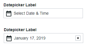
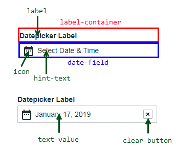
The closed date time picker is a text field with a calendar icon. In the text field, you can specify hint text or display the date and time. A clear button is displayed when the picker shows a date or time selection.
Note: The date picker has an optional label.
| Part | Description |
|---|---|
| label-container | The container panel of the label above the date picker |
| label | The label above the date picker |
| date-field | The container for the current timestamp or hint text |
| icon | The calendar icon |
| hint-text | The text prompt that is displayed to select a date and time |
| text-value | The generated date and time in specified format |
| clear-button | The button to clear a generated date and time string, reverting the contents to the hint text |
The following figure shows the different part of the component when the picker is closed:
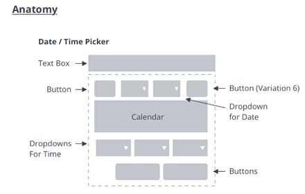
The opened date time picker displays date and time selectors with the following parts:
| Part | Description |
|---|---|
| calendar | The container panel of the calendar drop-down in the date picker |
| datepicker-container | The calendar container panel |
| header | The top part of the date picker, with navigation button for previous month, month dropdown, year dropdown, and navigation button for next month |
| prev-month-button | The back arrow |
| month-dropdown | The month drop-down selector |
| year-dropdown | The year drop-down selector |
| next-month-button | The forward arrow |
| weekdays | The weekdays container panel |
| weekday | A single weekday |
| days | The day date container panel |
| day | A single day |
| dot | A dot highlight below a day's date, generated via property daysContaingAnyData |
| time | The time selector container |
| hour-dropdown | The hours drop-down selector |
| minute-dropdown | The minutes drop-down selector |
| second-dropdown | The seconds drop-down selector |
| footer | The lower panel container for the buttons Done and Today |
| apply-button | The Done button |
| today-button | The Today button |
The following parts are added when the date-range-selection option is enabled:
| Part | Description |
|---|---|
| range-inputs | The container for the current timestamp or hint text |
| date-field-from | The container for the current 'from' timestamp |
| date-field-to | The container for the current 'to' timestamp |
The following figure shows the different parts of the component when the picker is open:
