Getting Started Tutorial
Getting Started Tutorial: Create a Web Component Widget Using Samples
In this tutorial, you will learn how to install a web component package, run the included demo, and package it as a ThingWorx widget. Then, you'll create a widget extension using the SDK utility and import it into the platform. This version of the tutorial is based on Polymer. To use the latest SDK library version based on Lit, see Getting Started Tutorial | ThingWorx Web Component SDK - Lit.
What you need
Make sure that you have the required dependencies installed on your system:
- NodeJS and npm
- The
gulp-cliandpolymer-clipackages for npm - The ThingWorx Web Component SDK Utility
For more information about the required software and tools, refer to the Overview topic of this help.
What you will learn
- Install a web component package using npm.
- Run the demo for a web component.
- Organize the file structure of the web component.
- Create a widget extension using the Web Component SDK Utility.
What you will build
A ThingWorx widget extension based on a simple web component. You will also learn how to use the SDK utility to create an extension from a web component widget. The widget is named Simple El and it contains subcomponents from the ptcs and Polymer libraries.
Download the required web component samples
Before you begin, download the following ZIP files:
-
A Sample Web Component - A simple web component project named
simple-el. -
A Web Component Widget - A web component (simple-el) that is packaged as a widget and ready to be used with the SDK utility.
ThingWorx Web Component SDK Utility - A utility that creates a ThingWorx extension from a packaged widget. The utility is available under ThingWorx Foundation > Release Version > ThingWorx Web Component SDK Utility.
Create your working folders
After you download the two ZIP files in the previous section, perform the following steps:
-
Extract the content of the sample web component to a folder named
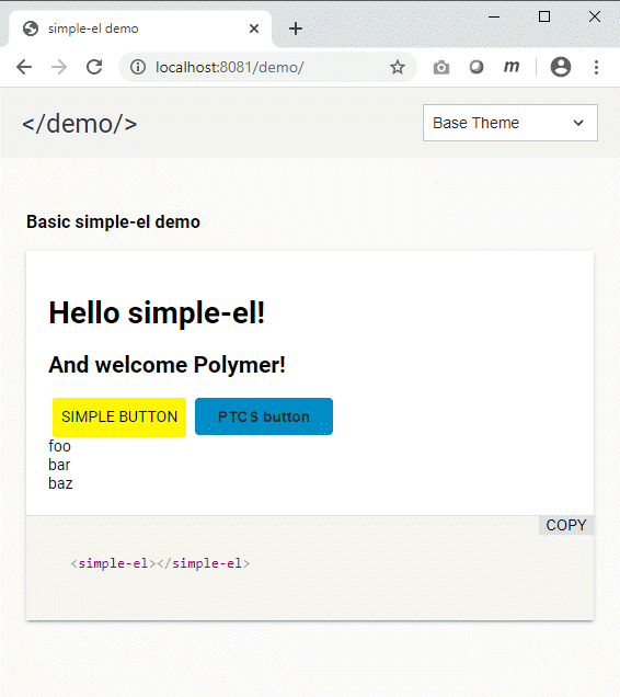
simple-el/. The root of your folder structure should be similar to the following:demo/ test/ twx-wc-sdk/ .gitignore index.html package.json polymer.json README.md simle-el.jsThe simple-el web component is a complex component that is made up of multiple subcomponents. When you run the demo, two buttons are displayed: a ptcs-button from the ptcs library and a paper button from the polymer library. These dependencies are defined in the
simple-el.jsfile:import {html, PolymerElement} from '@polymer/polymer/polymer-element.js'; import '@polymer/polymer/lib/elements/dom-repeat.js'; import '@polymer/paper-button/paper-button.js'; import 'ptcs-button/ptcs-button.js'; -
Extract the content of the web component widget to a folder named
simple-el-widget. This folder contains a widget that you can import into the ThingWorx Platform.
In a typical development environment, you should create an .npmrc file and publish the web component to an npm registry. The following steps list how to configure a project to run without publishing to an npm registry. Note that these steps are already performed in the simple-el-widget folder that you created.
-
Add a
tmp/folder next toinput/and copy the web component folder to it. The first two levels of your folder structure should be similar to the following:input/ styles/ ui/ widgets/ widgets.json tmp/ simple-el/ -
Specify the location of the web component in the
HTMLImportssection of theinput/widgets/simple-el.jsonfile as follows:"htmlImports": [ { "from": "npm", "id": "simple-el", "version": "file:simple-el", "url": "simple-el/simple-el.js" }
Install the Web Component package
- In a command prompt, change your directory to the location of the
simple-el/web component folder that you extracted. -
Run the following command to link the web component:
npm install
The package is now installed to your node_modules folder.
Run the Web Component demo and open it in a browser
To run the web component demo, make sure that you have the Polymer CLI package installed, then do the following:
- In the command prompt, make sure that your current directory is the
simple-el/web component folder that you downloaded and extracted in a previous step. -
Run the following command:
polymer serveThe web component demo is now running on the local web server and the following log is returned:
info: Files in this directory are available under the following URLs applications: http://127.0.0.1:8081 reusable components: http://127.0.0.1:8081/components/simple-el/` -
To view the demo, copy the address to the URL bar in your browser, then press ENTER. The web component demo page is now visible:

Note: By default, styling is applied using the ptcs-base-theme package. You can change the style theme using the drop-down list in the header section.
Install the SDK Utility and Create a ThingWorx Extension
To create a widget, you must package the web component as a ThingWorx widget. We've done that for you.
-
Download and extract the utility ZIP file to a folder named
twx-wc-sdk-utility. -
Open a command prompt, then change the current directory to the location on your system where you extracted the SDK utility:
cd twx-wc-sdk-utility -
Install the utility:
npm install -
Run the following command:
npm link -
Change your directory to the
simple-el-widget/folder that you created earlier:cd simple-el-widget -
In the widget folder, run the following command to create the extension:
mub
An extension ZIP file is created and placed in the dist/ folder of your working directory. You are now ready to import the extension.
Import the widget extension to the ThingWorx Platform
To import the widget ZIP file as an extension to the ThingWorx Platform:
- In the platform, open the Import/Export menu on the left navigation pane.
- Click Import. The import dialog box opens.
- Under Import Option, select Extension.
- Under File Name, click Browse and choose the ZIP file that you created using SDK utility in the previous section.
- Click Import. The extension is imported.
You can now use the widget in Mashup Builder.
Add the widget to a mashup
-
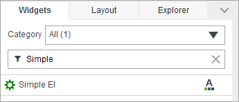
Create a new mashup, and then open the Widgets panel. The Simple El widget appears in the list.

Note: If the widget is not listed, clear your browser cache and refresh the page. 2. Drag the widget to a container on the canvas. You can now see the widget at design time. 3. Click Save, then View Mashup.
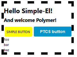
The widget appears at run time and styling for the widget is applied using the current mashup style theme.
