Web Component Development Guidelines
The ThingWorx Web Component SDK Library is a collection of web component widgets based on Google Polymer. The components are packaged as npm modules for developing UI and communicating with ThingWorx Composer back-end. You can use the ThingWorx Web Component SDK Utility mub to create widget extensions that you can import on the platform, then use in Mashup Builder. The components create themselves in the PTCS namespace with the components using the prefix ptcs- in their component name (such as ptcs-button).
Overview
This document is organized into sections as follows:
Web Component Development Guidelines
- Overview
- Prerequisites
- Organizing a Web Component Folder
- Implementation Considerations
- Model vs View
- Prefer Polymer Data Binding Annotations for Observing Data
- ARIA
Prerequisites 
The web component SDK is based on Polymer version 3. For development work, you should be familiar with Web Components and Polymer development (https://polymer-library.polymer-project.org/3.0/docs/devguide/feature-overview). You should have a working knowledge of web component concepts such as templates, data binding, Shadow DOM, component life cycle callbacks, and CSS pseudo-classes. This includes using :host, :host(), and pseudo-element ::part to reference elements with matching part attribute in the shadow tree. To learn more about web components, see the following resources:
- The Mozilla Developer Network documentation contains detailed information on Web Components. (https://developer.mozilla.org/en-US/docs/Web/Web_Components)
- The Web Fundamentals guides from Google. (https://developers.google.com/web/fundamentals/web-components)
- The Polymer 3 tutorial from the Polymer library. (https://polymer-library.polymer-project.org/3.0/docs/first-element/intro)
To migrate a web component that is based on Polymer 2, refer to the Polymer 3 upgrade guide https://polymer-library.polymer-project.org/3.0/docs/upgrade.
Organizing a Web Component Folder 
Each web components in the SDK library is documented in a Markdown file named README.md under the root of the component folder. For example, the documentation for ptcs-button resides in ptcs-button/README.md. The README.md covers the component visual representation, anatomy, API, and parts that you can style.
The web components follow common organizational guidelines: The main folder of the component has the name of its component with the main implementation of the component in file component-name/component-name.js (e.g. ptcs-button/ptcs-button.js).
As an example, the ptcs-button folder contains:
- The component's source file:
ptcs-button.js - The component's
README.mdfile in Markdown format - Subfolder
testfor the component's unit tests - Subfolder
demofor the component's demo - The component's
package.json, used for instance to declare dependencies
Other subfolders may exist, like img for images or doc for additional documentation; complex components may have additional files and folders, including subcomponents.
Normally, you only need to import the main file component-name.js in order to use it in your component.
Implementation Considerations 
Model vs View
The state (model) of the component should be separated from the view. This cannot be stressed enough.
In practice this means that the full state of the component should be encoded by the properties returned by static get properties(). It should be possible to copy those properties to a new instance of the component and that instance should look and behave as the original.
There are several reasons for this:
- The copying of properties that is described above actually happens. The dom-repeat "instance stamper" sometimes reuses deleted components by moving properties between components. This can lead to very difficult bugs if state is encoded in the DOM structure or as "invisible" properties.
- The separation of model and view results in less error prone code
- The code becomes easier to read if the full state of the component can be understood by only inspecting the registered properties
- The code becomes easier to read if all operations only affects the properties, and the DOM simply follows along
- The code becomes easier to update if you can focus on either the state changes or on how to display the changes
The component implementation should therefore consist of two layers:
- Manipulation of the state properties
- Observers of the state properties that reflects the state into the (shadow) DOM
Observers do of course also often manipulate state properties; the point is that no code should bypass the state properties and write state information directly into the DOM. The DOM should be updated indirectly, in separate code.
Prefer Polymer Data Binding Annotations for Observing Data 
You should always try to use Polymer data binding annotations instead of JavaScript observers. Data binding annotations are easier to read and result in fewer bugs.
ARIA 
WAI-ARIA (Web Accessibility Initiative – Accessible Rich Internet Applications) is a technical specification published by W3C (World Wide Web Consortium) that specifies how to increase the accessibility of web pages.
In short, supporting Aria means that the component should implement keyboard navigation and communicate its state using Aria attributes. The previously mentioned focus behavior includes functionality for easily delegating focus to subcomponents to support TAB / Shift-TAB keyboard navigation as well as converting SPACE to a click on the focused element.
PTC web components should support this specification. This is a recent requirement, so most of the existing components are still not Aria enabled. All new components should however conform to this specification, if the component has any user interaction.
See also https://www.w3.org/WAI/standards-guidelines.
Getting Started 
Development Tools and Versions 
The ThingWorx Web Component SDK development is done in an environment based on NodeJS (http://nodejs.org/) as well as npm, gulp, gulp-cli, and aurelia. The ThingWorx Web Component SDK library version requirements are listed below for reference.
NodeJS
nodejs should be version 8 or later. For ThingWorx 9.1, the NodeJS in use is version 10.15.3. you can verify your installed version by running node -v.
NPM
npm is included with the NodeJS installation. You should use version 5 or later. The current version used for the SDK is 6.12. You can verify your npm version by running: npm -v. To update your npm version, run the following command:
npm install -g npm
Gulp and gulp-cli
To install gulp (http://gulpjs.com/) run the following command:
npm install -g gulp gulp-cli
Aurelia
To install the aurelia (https://aurelia.io/) framework, run the following command:
npm install aurelia-cli -g```
The current aurelia-cli version used for the SDK is v.1.2.2.
Download and Installation 
- Download the ThingWorx Web Component SDK from the PTC Software Downloads page. The SDK is available under ThingWorx Foundation 9.1 > ThingWorx Web Component SDK Library. The ZIP file is named [VERSION]_WEB-Component-SDK-Library.zip.
- Extract the zipped contents to an empty folder named twx-wc-sdk in your project folder.
- Install the ThingWorx Web Component SDK Library and its dependencies by running the following command:
npm install twx-wc-sdk/ptcs-library
You can add your own dependencies to your project such as @polymer/paper-button. However, adding dependencies for @polymer/polymer and @webcomponents to your package.json file will cause conflicts with the dependencies of the ptcs-library.
The Web Component SDK Library is installed and symbolic links for ptcs modules appear inside your node_modules folder.
Development 
After you complete the installation, you can use ptcs modules to create your own custom web components.
Recommended Development Process 
In order to have a fully functional Web Component which is a themed widget in the mashup builder, we recommend that you follow these steps:
- Build a prototype/beta (demo component): Rapid prototyping helps you identify gaps in the component specification and to align the design with UX intentions.
- Create a demo page that shows a working version of the component with the specifics of the component functionality. Creating a working demo helps you test and resolve issues at the component level instead of doing the same after you use the component as a widget in Mashup Builder.
- Style the component.
- Document the Web Component API and the
partattributes are declared for styling. - Write tests for the component.
- Publish your component to an npm registry, then use the Web Component SDK Utility to create a ThingWorx extenstion from the web component.
Building a Web Component: Declaring Dependencies 
Complex components are created using subcomponents. Because there is an existing library of small components, it is easier to build complex components that have consistent behavior and styling. When designing a new complex component, you can select subcomponents that meet your user-experience requirements. Then, you can add new and more complex functionality is added to create the parent component structure. For example, you can use a primary ptcs-button as part of a submission form component, and would import it as follows:
import 'ptcs-button/ptcs-button.js';
Because component reuse is a common development methodology, most of the library components include other components within the SDK, in addition to external packages.
Common Imports
You can declare dependencies on other components as import statements at the top of the component file. The dependencies listed below are nearly a bare minimum: A component can also include additional import statements for behaviors, unless the component is invisible or is used only for layout. In those cases, the components can inherit directly from the PolymerElement class.
Polymer
@polymer/polymer/polymer-element.js– for Polymer
Styling
To enable styling for your component, include the following files:
-
ptcs-behavior-styleable/ptcs-behavior-styleable.js- Allows the component to be styled with ptcs-style-units, which are covered in detail under Using The Style Aggregator of the Styling Web Components topic. -
ptcs-shadow-style/ptcs-custom-css.js- Allows the component to be styled with CSS Shadow Parts (https://www.w3.org/TR/css-shadow-parts-1/), that is used by the Custom CSS tab for mashup entities in ThingWorx Composer. See the Using CSS Shadow Parts styling section of the Styling Web Components topic.
Tooltip and Focus Behavior
To enable tooltip and focus functionality, include the following files:
ptcs-behavior-focus/ptcs-behavior-focus.js- Allows the component to highlight focused elements consistently and follow keyboard navigation conventions used in ThingWorx web components to support accessibility requirements (such as using the SPACE key instead of a mouse click).
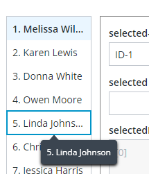
The focused List item has a blue border that is applied from the style theme. When the text of the list item is truncated, the full text is displayed in the tooltip when you place the pointer on it, or when it is focused.
ptcs-behavior-tooltip/ptcs-behavior-tooltip.js- Provides the functionality required to display tooltips in conjunction with the focus behavior. Tooltips in the ThingWorx Web Component SDK are also used to display dynamic contents such as truncated text when it overflows its container that has a limited size, and data markers on charts.
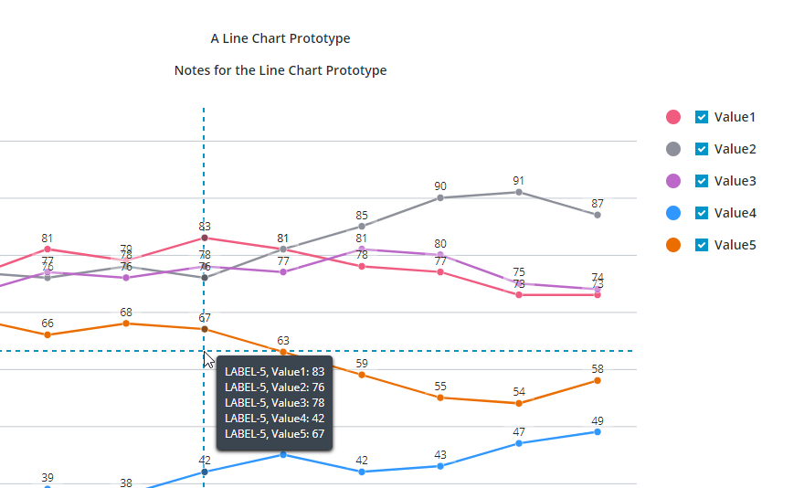
The image shows a tooltip that displays data values on a crosshair pointer for a chart. Values are displayed for data series on the vertical axis of the crosshair.
Example
For example, the ptcs-button web component of the SDK library contains the following import statements:
import {PolymerElement, html} from '@polymer/polymer/polymer-element.js';
import {PTCS} from 'ptcs-library/library.js';
import 'ptcs-icon/ptcs-icon.js';
import 'ptcs-icons/page-icons.js';
import 'ptcs-shadow-style/shadow-part.js';
import 'ptcs-behavior-styleable/ptcs-behavior-styleable.js';
import 'ptcs-behavior-focus/ptcs-behavior-focus.js';
import 'ptcs-behavior-tooltip/ptcs-behavior-tooltip.js';
In addition to dependencies that are mentioned in previous sections, the component uses additional subcomponents that are used to display icons within a button.
Declaring a Component Base Class 
To create a component that supports styling and theming, in addition to focus and tooltip behavior, declare the base class as follows:
ACME.Component = class extends PTCS.BehaviorTooltip(PTCS.BehaviorFocus(PTCS.BehaviorStyleable(PTCS.ShadowPart.ShadowPartMixin(PTCS.ThemableMixin(PolymerElement), [])))) {
Note:
- The component generally uses the two styling behaviors described above, plus PTCS.ThemableMixin. The latter allows the component to be styled using style modules, which is a more efficient, but less flexible way to style components.
If the component extends an existing component that already has these behaviors, then they should not be specified again. For example:
ACME.SpecialButton = class extends PTCS.Button {
To avoid conflict with other namespaces such as Polymer and PTCS when declaring custom web components, declare them in a custom namespace.
When adding new components, consider how they affect the size of the component files. Components should be as light-weight as possible.
Styling Demos 
The ptcs-base-theme is an npm module used to apply basic styling to web components. You should only install it to view the demo pages of web components that are served by Polymer. When the component is used as a widget in ThingWorx, this component is not used.
The web component demo pages use the following scripts to load styling:
<script type="module" src="../../ptcs-base-theme/ptcs-base-theme.js"></script>
or alternatively, using ptcs-multi-theme.js:
<script type="module" src="../../ptcs-base-theme/ptcs-multi-theme.js"></script>
The ptcs-multi-theme.js script adds a drop-down list to the upper-right corner of each demo page. This enables you to switch between the available themes, such as the PTCS Base Theme and PTCS Convergence Theme, when viewing the component demo.
Styling a Web Component 
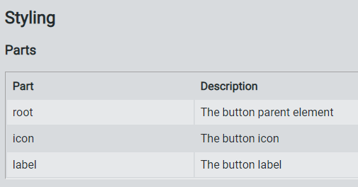
The SDK web components are designed to have their styling defined externally. Each compononent only includes functional CSS styling as part of the component itself. You can declare part attributes on the subelements of a component to expose them for styling. The available part attributes for each component are documented in the README.md file under each component folder. For example, the ptcs-button web component has following public parts:
Style themes allow you to create web components with a consistent look more easily. Instead of defining fixed styling for each component, you can map and customize theme values to create multiple themes that you can apply to multiple components.
The styling is defined for each web component in a separate JSON file, with the theme for the web components as a whole delivered in the mb-theme-engine.js file.
A style theme consists of:
- Theme properties
- Styles that bind theme properties to web components
For more information about styling and theming web components, see:
Browser Support
The Shadow DOM is supported in Chrome, Firefox (version 63 and later), Opera, and Safari. Microsoft Edge versions that are based on the Chromium browser engine are also supported.
To add support for Microsoft Edge Legacy browser, import a polyfill that enables you to embed web components. However, Edge Legacy still has limitations that make web component development and debugging work more difficult compared to modern browsers with native support.
- To load the Microsoft Edge Legacy polyfill for your web component demo page, add the following script:
<script src="../node_modules/@webcomponents/webcomponentsjs/webcomponents-loader.js"></script>
Adding a Web Component to ThingWorx Mashup Builder 
After you finish developing and testing your custom web component, we recommend that you publish your widget to an npm registry.
Then, you can use the SDK utility (mub) to create widget extensions that you can import and use in Mashup Builder. The utility uses a JSON configuration file for each web component. You can create an extension that includes multiple web components by adding them to the mub/input/widgets.json file.
In addition to the JSON configuration file, you must create following files under your web component folder mub/input/ui/web-component:
- IDE and runtime custom CSS files.
- IDE and runtime custom JS code files.
For more information, see Creating Widget Extensions.