ptcs-chart-bar
Visual
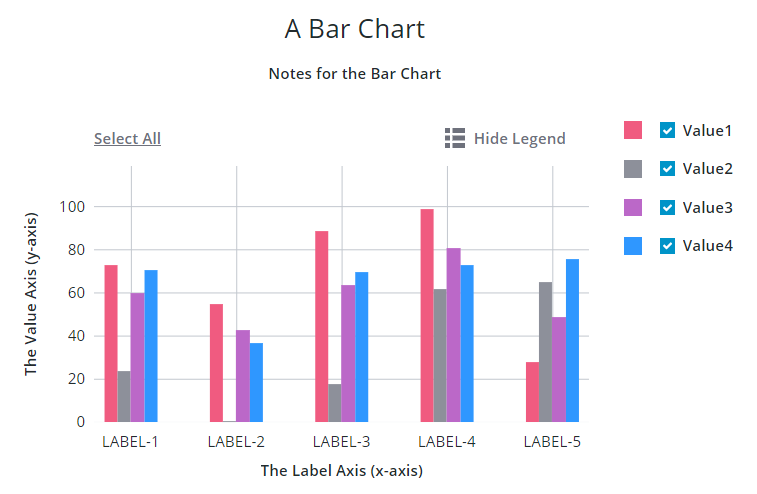
Overview
ptcs-chart-bar is a compound component that enables you to visualize data as a bar chart. In addition to the bar chart area, the chart has areas for a title, notes, legend, an X-axis, a Y-axis, and an Action Bar area for selecting / un-selecting all bars and for toggling legend visibility.
Usage Examples
Basic Usage
<ptcs-chart-bar items="[[bar-chart-data]]"></ptcs-chart-bar>
Component API
Properties
| Property | Type | Description | Default |
|---|---|---|---|
| titleLabel | String | The chart title | |
| titlePos | String | Specifies the title position. Supported values: "top", "bottom", "left", or "right" | top |
| titleAlign | String | Specifies the title alignment. Supported values: "left", "center", or "right" | center |
| notesLabel | String | The notes text | |
| notesPos | String | Specifies the notes position. Supported values: "top", "bottom", "left", or "right" | bottom |
| notesAlign | String | Specifies the notes alignment. Supported values: "left", "center", or "right" | center |
| xAxisLabel | String | Specifies the x-axis label | |
| xAxisAlign | String | Specifies the alignment of the x-axis label. Supported values: "left", "center", or "right" | center |
| hideXAxis | Boolean | Hides the x-axis | false |
| yAxisLabel | String | Specifies the y-axis label | |
| yAxisAlign | String | Specifies the alignment of the y-axis label. Supported values: "left", "center", or "right" | center |
| hideYAxis | Boolean | Hides the y-axis | false |
| NumberOfYLabels | Number | Set the number of labels on the Y-axis | |
| hideValues | Boolean | Toggle to hide bar values | false |
| referenceLines | Array | An array of items with properties label and value for threshold lines on the y-axis |
|
| hideLegend | Boolean | Hide the chart legends area | false |
| showLegendButton | Boolean | Show a button in the Action Bar area for toggling the legend visibility? | false |
| legend | Array | Array of strings that specifies the legend names | |
| legendPos | String | Specifies the legend position. Supported values: "top", "bottom", "left", or "right" | "right" |
| legendAlign | String | Specifies the alignment of the legend. Supported values: "start", "center", or "end" | start |
| legendShape | String | Specifies the shape of the legend. Supported values: "square", "circle", "none" | square |
| filterLegend | Boolean | If true, each legend item has a checkbox that allows the user to hide or show the corresponding data | false |
| flipAxes | Boolean | Flip the positions of the x- and y-axes | false |
| flipXAxis | Boolean | Flip the position of the x-axis to the other side of the chart | false |
| flipYAxis | Boolean | Flip the position of the y-axis to the other side of the chart | false |
| showXRulers | Boolean | Show rulers that corresponds to the ticks of the x-axis | false |
| showYRulers | Boolean | Show rulers that corresponds to the ticks of the y-axis | false |
| frontRulers | Boolean | Draw rulers on top of the bars | false |
| reverseXAxis | Boolean | Reverse the order of the x-axis | false |
| reverseYAxis | Boolean | Reverse the order of the y-axis | false |
| specXMin | String | Specifies the start label of the X-axis | |
| specXMax | String | Specifies the end label of the X-axis | |
| specYMin | "baseline" or "auto" or Number | Specifies the start value of the Y-axis. "baseline": start from zero if the minimum value in the data is non-negative. Otherwise use "auto". "auto": Use the minimum value of the data and subtract 20% of the full range of the data. Number: start at specified number. | baseline |
| specYMax | "auto" or Number | Specifies the end value of the Y-axis. See specYMin for details | auto |
| yAxisNumberFormatSpecifier | String | The number format to use on the y-axis (e.g. '0.00') | |
| xZoomSlider | Boolean | Shows a zoom slider for the X-axis | false |
| xZoomSliderLabel | String | Specifies the label for the X-axis Zoom Slider | |
| xZoomSliderMaxLabel | String | Specifies the Maximum label for the X-axis Zoom Slider | |
| xZoomSliderMinLabel | String | Specifies the Minimum label for the X-axis Zoom Slider | |
| yZoomSlider | Boolean | Shows a Zoom Slider for the Y-axis | false |
| yZoomSliderLabel | String | Specifies the label for the Y-axis Zoom Slider | |
| yZoomSliderMaxLabel | String | Specifies the Maximum label for the Y-axis Zoom Slider | |
| yZoomSliderMinLabel | String | Specifies the Minimum label for the Y-axis Zoom Slider | |
| data | Array | The chart data | |
| stack | String | Stack method. Only used when each x-value has several y-values. Supported values: "none", "auto", "expand". | none |
| showValues | String | Shows the value of each bar. Supported values: "none", "inside", "outside" | inside |
| hideZeroRuler | Boolean | Hides the zero ruler | false |
| outerPadding | String | Padding, in percentage of bar width, before and after the bars in the chart area | 0 |
| innerPadding | String | Padding, in percentage of bar width, between bars that belong to different groups | 0 |
| groupPadding | String | Padding, in percentage of bar width, between bars that belong to the same group | 0 |
| sparkView | Boolean | Displays chart preview by hiding certain parts e.g. legend | false |
| showY2Axis | Boolean | Displays the secondary y-axis | false |
| reverseY2Axis | Boolean | Reverse the order of the secondary y-axis | false |
| data2 | Array | The chart data attached to the secondary y-axis | |
| specY2Min | String | Specifies the start value of the Y-axis. See specYMin for details | auto |
| specY2Max | String | Specifies the end value of the Y-axis. See specYMin for details | auto |
| y2AxisLabel | String | Specifies the secondary y-axis label | |
| y2AxisAlign | String | Specifies the alignment of the secondary y-axis label. Supported values: "left", "center", or "right" | center |
| y2AxisNumberFormatSpecifier | String | The number format (e.g. '0.00') to use on the secondary y-axis. | |
| yAxisRulerAlignment | String | Aligns the Y-axis rulers with the tick markers of the primary or secondary Y-axis | primary |
| horizontalTicksRotation | Number | Sets the rotation of horizontal axis ticks in degrees. The allowed range is: -180 to 180. If this property is not specified, horizontal axis ticks auto-rotates 90 degrees if they collide when not rotated. | |
| selectionMode | String | Set selection mode: "none" (default) - no bars can be selected. "single" - one bar can be selected. "multiple" - any number of bars can be selected. The "multiple" option displays a link in the Action Bar area for selecting / un-selecting all bars. |
"none" |
| tooltipTemplate | String | Custom tooltip to display when a data point on the chart is selected. You can show a title, text, data values, and create new lines. Use the following syntax: Add #title# before a string to show a title, #newline# to create a new line, ${ |
|
| disabled | Boolean | Is the bar chart disabled? |
Events
| Name | Data | Description |
|---|---|---|
| series-click | (serieIx, valueIx, x, y) | Bar data |
| zoom-selection | detail: {x: left, y: top, w: right - left, h: bottom - top} |
Selected area |
| chart-selection | selection | Chart selection |
Styling
The Parts of a Bar Chart
A ptcs-chart-bar consist of these sub-components:
ptcs-chart-layout, for chart layoutsptcs-chart-legend, for chart legendptcs-chart-coord, for combining a chart with a coordinate system (adds axes and rulers)ptcs-chart-axis, for chart axesptcs-chart-core-bar, for the bar chartsptcs-chart-zoom, for chart zoom controlsptcs-chart-action-bar, for theSelect All/Clear Alllink and theShow Legend/Hide Legendbutton to toggle legend visibility.
Parts
| Part | Description |
|---|---|
| chart-layout | The ptcs-chart-layout subcomponent |
| title-area | The chart title area container |
| title-label | The chart title |
| notes-area | The chart notes area container |
| notes-label | The chart notes title |
| chart | The ptcs-chart-coord subcomponent |
| core-chart | The ptcs-chart-core-bar subcomponent |
| legend-area | The legend area container |
| legend | The ptcs-chart-legend subcomponent |
| zoom-xaxis | The ptcs-chart-zoom subcomponent for x-axis |
| xaxis | The ptcs-chart-axis subcomponent for x-axis |
| zoom-yaxis | The ptcs-chart-zoom subcomponent for y-axis |
| yaxis | The ptcs-chart-axis subcomponent for y-axis |
| yaxis2 | The ptcs-chart-axis subcomponent for secondary y-axis |
| action-bar-area | The action bar area container |
| action-bar | The ptcs-chart-action-bar subcomponent |
State attributes
| Attribute | Description | Part |
|---|---|---|
| disabled | Is the Bar Chart disabled? | :host |