Styling Web Components
Overview
The web component implementation should focus on the functionality and not the appearance. Any styling within the component should be minimal. You can define styling externally using one of the methods that are listed in the following topic.
You can style the SDK web components in five ways:
- Using Plain CSS
- Using CSS Variables
- Using Style Modules
- Using CSS Shadow Parts
- Using the Style Aggregator
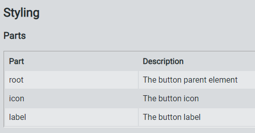
The SDK web components include parts that you style using part attributes. These parts are listed in a Parts table under the Styling section of the component's README. For example, the following images shows part attributes that you can style for ptcs-button:
Background
Web components use Shadow DOM, which creates a new style scope for elements inside the Shadow DOM hierarchy. Plain CSS only works when formatting non-complex components or when using inheritable properties, since CSS rules that are defined externally to the component do not reach into its Shadow DOM.
Components with Shadow DOM can define an interface using CSS variables for basic formatting, as CSS variables cross the Shadow DOM boundary. These interfaces only work for fairly simple components. Components that consist of several subparts and have many states (such as normal, hover, selected, disabled, hover + selected, and more) can greatly increase the number of variables.
To address the latter case, most complex SDK web components include support for injecting external style modules into the component. These style modules can directly target the subparts of the component and any of their states by using CSS selectors.
The style modules can also style templated contents, for components that use a <template> element to stamp various elements based on JavaScript data. These elements are created inside the component and attached to the Shadow DOM, and you cannot use regular CSS rules to style them.
You can create style modules can reside inside the DOM structure of HTML documents or as external modules that you can import. You can combine multiple style modules into one common import file, which you can include with a single import statement. You can use these files to create theme modules that style all components consistently.
Each topic of the SDK web components documents the following parts of the styling interface: * Subparts that can be individually styled using style modules * State attributes such as disabled * CSS variables that can style the component
NOTE: The styling of the SDK web components is currently based on the vaadin-themable-mixin component that is wrapped by PTCS.ThemableMixin in the ptcs-library/library.js file of the SDK.
Using Plain CSS
You can use plain CSS to style components like any other element. The following CSS styles ptcs-button components as large buttons:
ptcs-button
{
  color: #FAFAFA;
  background-color: #2B80D5;
  padding: 0px 60px;
  font-size: 24px;
  font-weight: bold;
  height: 80px;
  border-radius: 6px;
}
All <ptcs-button> components are now displayed with the large button style. Since there are multiple button styles, it is recommended that you bind each style to a class:
ptcs-button.large
{
  ...
}
Now, you can add large buttons as follows:
<ptcs-button class="large">Save</ptcs-button>
You can only use plain CSS styling to style the host part of the component or to specify properties that can be inherited. The next sections describe ways for styling to penetrate into the Shadow DOM.
Using CSS Variables
You can expose various parts of a Shadow DOM tree from a component for styling using CSS variables (CSS Custom Properties). A CSS variable can either specify a single property value, such as border color, or a collection of properties that are known as a CSS mixin.
For information about the CSS styling variables that are available for each component, refer to the component README file.
When using CSS variables, it is recommended that you place the <style> element inside a <custom-style>, for browser compatibility. The <custom-style> is required when using CSS mixins.
Example:
<custom-style>
<style>
  ptcs-widget
  {
    --ptcs-dropdown--height: 40px;
    --ptcs-dropdown--border-color: green;
  }
</style>
</custom-style>
To apply the styles in the previous example to the ptcs-widget element, make sure that the same CSS variables are defined for the component:
  {
    height: var(--ptcs-dropdown--height, 30px);
    border: 1px solid var(--ptcs-dropdown--border-color, var(--theme-color-mid-03, #C2C7CE));
    background-color: var(--ptcs-dropdown--background-color, var(--theme-color-white, #FFFFFF));
  }
var() statements for chained default value: If --ptcs-dropdown--background-color is not defined, the CSS variable --theme-color-white would be evaluated in turn, and if it is undefined, the background-color is set to #FFFFFF.
The following is an example of using CSS mixins:
<custom-style>
<style>
  ptcs-breadcrumb
  {
    /* Change color of the breadcrumb step */
    --ptcs-breadcrumb-step: {
      color: rgb(13, 79, 172);
      font-weight: bold;
    };

    /* And also specify a new :hover color */
    --ptcs-breadcrumb-step__hover: {
      background-color: #333;
      color: white;
    };
  }
</style>
</custom-style>
For a list of the CSS variables available for styling, refer to the component's API documentation topic. Because of an earlier requirement to support Internet Explorer 11 (which doesn't support CSS variables), most of the components in the library currently do not expose CSS variables for styling. This may change in the future as all modern browser support CSS Custom Properties.
A notable exception is the Focus Behavior, which defines following variables:
| Variable | Description | Default |
|---|---|---|
| --ptcs-focus-overlay--padding | distance from element area to focus border | 8px |
| --ptcs-focus-overlay--padding-left | distance from element area to left focus border | --ptcs-focus-overlay--padding |
| --ptcs-focus-overlay--padding-right | distance from element area to right focus border | --ptcs-focus-overlay--padding |
| --ptcs-focus-overlay--padding-top | distance from element area to top focus border | --ptcs-focus-overlay--padding |
| --ptcs-focus-overlay--padding-bottom | distance from element area to bottom focus border | --ptcs-focus-overlay--padding |
| --ptcs-focus-overlay--border-style | focus border style | dashed |
| --ptcs-focus-overlay--border-width | focus border width | 1px |
| --ptcs-focus-overlay--border-color | focus border color | #5d2fec |
| --ptcs-focus-overlay--border-radius | focus border radius | 0 |
Naming Conventions for CSS Variables
In order to keep your code uniform and clear, use a consistent naming scheme. The SDK web components use the following syntax to name CSS variables:
--ptcs-component(-part)?(__state)?(--property)?
Where:
-part Specifies a specific part of the component
__state Specifies a state such as “hover” or “selected”
--property Specifies a specific property
-
If the
--propertycorresponds directly to a CSS property, use its CSS name. For example, use “background-color” instead of “bg-color”. -
If the
--propertyis omitted, then the variable is a mixin.
Examples:
| Variable | Description |
|---|---|
| --ptcs-breadcrumb | Mixin for the root breadcrumb container |
| --ptcs-breadcrumb-step | Mixin for a breadcrumb step container |
| --ptcs-breadcrumb-step__hover | Mixin for a breadcrumb step container while hovering |
| --ptcs-breadcrumb-sep--icon | Specifies the icon property of the breadcrumb separator |
| --ptcs-breadcrumb--speed | Sets the animation speed for the breadcrumb |
| --ptcs-dropdown--background-color | Background color for the dropdown |
| --ptcs-dropdown-choice__selected--color | Specifies the color of the dropdown option when it is selected |
Using Style Modules
A style module assigns CSS formatting to various parts of the component. The style module is imported by the component and therefore applies to the nodes in its Shadow DOM.
You must place the style module in a <dom-module> container element:
<dom-module id="my-breadcrumb-style" theme-for="ptcs-breadcrumb">
  <template>
  <custom-style>
    <style>
      /* Styling for the whole breadcrumb */
      :host(.my-breadcrumb)
      {
        background-color: maroon;
      }

      /* Style the breadcrumb step */
      :host(.my-breadcrumb) [part="step"]
      {
        color: white;
      }

      /* Hovering over the breadcrumb step */
      :host(.my-breadcrumb) [part="step"]:hover
      {
        background-color: red;
      }
    </style>
  </custom-style>
  </template>
</dom-module>
You should add unique value to the id attribute. The theme-for attribute specifies the component name. You can add several component names that are separated by a space, or you can use a wildcard, such as ptcs-*.
Note that the <dom-module> requires three elements wrapped around the actual stylesheet:
- <template>
- <custom-style>
- <style>
These stylesheets can use the CSS :host selector to match the host element itself. All other CSS selectors match content in the Shadow DOM.
Note that all styles in the example style module are scoped with the class “my-breadcrumb” on the host element, so in order to use it you need to invoke the breadcrumb with that class:
<ptcs-breadcrumb class="my-breadcrumb" ...></ptcs-breadcrumb>
For more information, refer to the vaadin-themable-mixin link in the References section.
Style Modules in External Files
You can store a style module in an external file. When you create an external file, you should still add add <dom-module> as the root element.
To use the external file, you must import it as a stylesheet:
<link rel="import" type="css" href="my-style.html">
In some cases, you may not be able to keep the stylesheet within a <dom-module> element. For example, you may generate the stylesheet using a SASS compiler that only creates CSS files with a strict structure, or you may be using a specific CSS editor. In these cases some indirection is needed. To build the CSS file, create a reference to the stylesheet.
The following code example shows a reference to a stylesheet within the my-theme.css file:
<link rel="import" href="bower_components/polymer/lib/elements/dom-module.html">

<dom-module id="my-theme.css">
  <link rel="import" type="css" href="my-theme.css">
</dom-module>

<dom-module id="my-style-id" theme-for="ptcs-component">
  <template>
  <custom-style>
    <style include="my-theme.css"></style>
  </custom-style>
  </template>
</dom-module>
In the example, a reference to the Polymer library is used to define the dom-module element. You can then use the element to define a dom-module that includes the external stylesheet.
To include the stylesheet, you must embedded it in a custom-style element. Instead of creating a direct binding from the first dom-module to the component that should be styled, a second dom-module is added. The second dom-module specifies the theme-for attribute that binds it to the component, and also creates a custom-style that wraps a style that includes the first dom-module using its id attribute.
Using this method adds the external stylesheet to the custom-style element.
You can include any number of references to external stylesheets and multiple dom-modules within the wrapper file.
Style Modules and Subclasses
You should be aware of the following issues when using style modules:
-
The default styling is disabled.
-
All style modules that apply to a component are gathered into a single style sheet. You should qualify all CSS selectors with a host class name to prevent different modules from applying styles incorrectly to each other.
-
When you style multiple variants of a component, the combined stylesheet becomes large because each component contains the styles for all of its variants.
Alternatively, create a new subclass of the component, with the same implementation and a different name. You can then bind the style module to the new component name, and keep the original component bound to its default style.
The ThingWorx Web Component SDK library ptcs-library/library.js file contains a function that lets you create a subclass:
PTCS.subclass(name, base);
Instead of creating the style module in the previous section with all of the host class qualifications, you can use the following simplified version:
<dom-module id="my-breadcrumb-theme" theme-for="my-breadcrumb">
  <template>
    <style>
      /* Styling for the whole breadcrumb */
      :host
      {
        background-color: maroon;
      }

      /* Breadcrumb step */
      [part="step"]
      {
        color: white;
      }

      /* Hovering breadcrumb step */
      [part="step"]:hover
      {
        background-color: red;
      }
    </style>
  </template>
</dom-module>
To use the stylesheet, you must declare the “my-breadcrumb” component subclass:
PTCS.subclass("my-breadcrumb", "ptcs-breadcrumb");
After you declare the subclass, you can use the new element:
<my-breadcrumb ...></my-breadcrumb>
You can use this method to:
- Create smaller and simpler stylesheets inside the components.
- Keep the default styling for the base class available.
- Avoid using a class attribute.
Using CSS Shadow Parts
The CSS Shadow Parts specification defines the ::part() pseudo-element on shadow hosts, allowing shadow hosts to selectively expose chosen elements from their shadow tree to the outside page for styling purposes.
You can use the ::part syntax to create a local override for the existing styling from the style theme, without making changes to the styling definitions of the theme. For example, you can override the theme to create a custom style for special cases.
Examples
A web component that uses ptcs-value-display and overrides the background-color of its disclosure button container:
        ptcs-value-display::part(show-button) {
          background-color: #c9c9c9;
        }
To change the color of the SVG icon part="icon-img" when ptcs-dropdown is disabled:
        ptcs-dropdown[disabled]::part(icon-img) {
            fill: #adb5bd;
        }
To change the color of the SVG icon with part="icon-img"on hover over part="clear-button":
        [part=clear-button]:hover::part(icon-img) {
          fill: #ffffff;
        }
See the References section for additional information.
Using the Style Aggregator
The Style Aggregator pushes style information into the Shadow DOM of web components, where it affects the Shadow DOM elements. The Style Aggregator therefore only works on browsers that have native support for Shadow DOM. This includes modern browsers such as Chrome, Chromium Edge, and Firefox (see Browser support for Shadow DOM).
The Style Aggregator takes its styling information from <ptcs-style-unit> elements. The <ptcs-style-unit> can identify a target component in two ways: - Directly - Using the components name and variant - Contextually - Using a chain of part names in component
Examples of direct styling:
Surround all ptcs-label components with a red border:
<ptcs-style-unit wc="PTCS-LABEL">
  :host {
    border: 1px solid red;
  }
</ptcs-style-unit>
Change all ptcs-button in variant small to a pale green color:
<ptcs-style-unit wc="PTCS-BUTTON.small">
  :host {
    background: palegreen;
  }
</ptcs-style-unit>
If a component is set to a variant, then you can only style the variant. For example, in the example above, if you change "PTCS-BUTTON.small" to "PTCS-BUTTON", only buttons that do not specify a variant are styled.
Examples of contextual styling:
Style content in the clear-button part when it occurs in a ptcs-textfield component:
<ptcs-style-unit wc="PTCS-TEXTFIELD" part="clear-button">...</ptcs-style-unit>
Style content in the clear-button part when it occurs in the date-field part in a ptcs-datepicker component:
<ptcs-style-unit wc="PTCS-DATEPICKER" part="date-field:clear-button">...</ptcs-style-unit>
The wc attribute specifies a component where the styling starts. If the component contains sub-components, use the part attribute to navigate down within the hierarchy and apply the style to the correct Shadow DOM.
References
[1] Shadow DOM styling, Polymer documentation
[2] Vaadin Themable Mixin README