ptcs-modal-image-popup
Visual

Overview
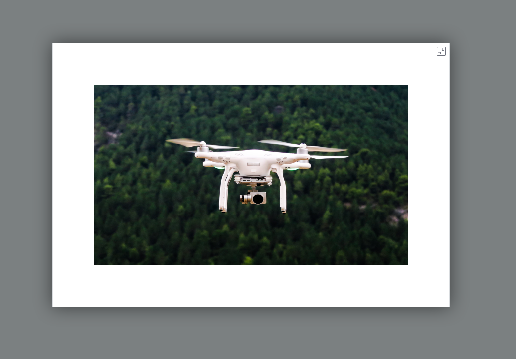
The ptcs-modal-image-popup shows an image thumbnail and a button. Clicking on the button shows the image in a modal pop-up against a semi-opaque backdrop.
Usage Examples
Basic Usage
<ptcs-modal-image-popup src="./some-image.png"></ptcs-modal-image-popup>

<ptcs-modal-image-popup src="./some-image.png" disabled></ptcs-modal-image-popup>
Attribute disabled prevents the pop-up behavior.
Component API
Properties
| Property | Type | Description | Triggers a changed event |
|---|---|---|---|
| src | String | The image to display | No |
| backdropColor | String | The modal dialog backdrop overlay color (default: #232b2d) | No |
| backdropOpacity | String | The modal dialog backdrop opacity, a value between 0 and 1.0 (default: 0.6) | No |
| disabled | Boolean | Is the image pop-up disabled? | No |
Events
| Name | Description |
|---|---|
| popup-close-action | Triggered when clicking on the close button |
Methods
The component has methods open and close but they are called automatically from the respective buttons, so do not need to be invoked directly.
| Signature | Description |
|---|---|
| open() | Opens the modal pop-up dialog. Called when you click on the button in the thumbnail version. |
| close() | Closes the modal pop-up dialog. Called when the close button is clicked. |
Styling
Parts
| Part | Description |
|---|---|
| popup-root | Container for the modal pop-up |
| popup-link | Container for the link contents |
| image | Container for the thumbnail version of the image |
| disclosure-button | The button that opens the image in the modal pop-up |
| popup-container | The container for the pop-up data across whole browser window |
| popup-contents-and-button | Container for the pop-up itself (the modal dialog and its close button), displayed vertically and horizontally centered in the window |
| popup-contents | Container for the modal pop-up dialog data |
| popup-image | The image in the modal pop-up |
| popup-close-button | The close button in the modal pop-up dialog |
State attributes
No public state attributes.