ptcs-tab-set
Visual
Overview
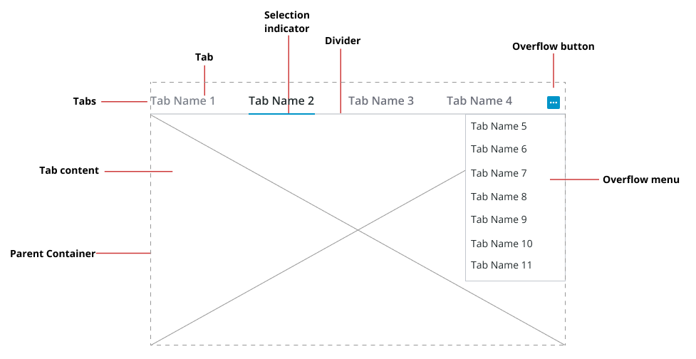
The <ptcs-tab-set> is a layout component that contains a set of tabs. Each tab can display a different set of items. Only one tab can be selected at a time. The selected tab is indicated with a selection bar that is typically a line under the tab. The tab name width will auto-size to accommodate the name length, but can optionally be assigned a maximum width; a tab name that exceeds the maximum width is truncated with horizontal ellipsis suffix to indicate the overflow.
The layout mode is horizontal, where the tabs are laid out along a line. On overflow a dropdown menu button appears, for tabs that are not being shown.
The component builds on vaadin-tabs so inherits a vertical layout option, but this is not a supported layout.
Usage Examples
Basic Usage
function func()
  {
    const bind = document.getElementById('tabSet');

    bind.tabs = [
      { name: "Tab One Title"},
      { name: "Another Tab"}
    ];
  }
<ptcs-tab-set selected="0" id="tabSet" items="{{tabs}}">
<div>something in the first tab</div>
</ptcs-tab-set>
Vertical layout
<ptcs-tab-set selected="0" orientation="vertical" id="tabSet" items="{{tabs}}">
</ptcs-tab-set>
Creates a two-column vertical tab set with a div element that is shown when the first tab is selected, without overflow or
NOTE: * The PTC Design System does not provide support for vertical tabs. The orientation is only an attribute and not a property. * Each DOM inside the tab set becomes the pages body of its index corresponding column.
Component API
Properties
| Property | Type | Description | Triggers a changed event? |
|---|---|---|---|
| defaultTabNumber | Number | The one-based index number of the selected tab when the tab set is loaded. The default is 1. | Yes |
| disabled | Boolean | Disables the tabs. Set to False by default. | No |
| items | Array | The array that holds the tab data. It includes four properties: name, value (String), visible, and disabled | No |
| selected | Number | The zero-based index of the selected tab | Yes |
| selectedTabName | String | The name of the selected tab | Yes |
| selectedTabValue | String | The value of the selected tab | Yes |
| tabHeight | Number | The height of page that the tab is showing, unless the page is stretched by flex CSS. | No |
| tabNameMaxWidth | Number | The maximum width for the tab name (by default no limit) | No |
Methods
No methods.
Styling
The Parts of a Component
| Part | Description |
|---|---|
| tabs-header | The tabs container. This does not include the page on the selected tab. |
| divider | A divider between the tabs and the page display |
| pages | The page that shows when you select a tab |
State attributes
| Attribute | Description | Part |
|---|---|---|
| disabled | Is tab set disabled? | :host, tabs-header, pages |
| selected | The zero-based index of the selected tab | :host |
| tabHeight | The height of page the tab is showing | :host |