ptcs-chip-data-filter
Visual
string-case

datetime-case
number-case

boolean-case

Overview
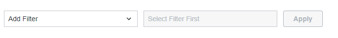
Filter Data widget is intended for data filtering. The filter options are listed in the drop down on the left side based on 'data' input parameter. "DataShape"->"fielDefinition" field is taken into account to extract the supported filter categories.
Usage Examples
Basic Usage
HTML
<ptcs-chip-data-filter id="dataFilterId"></ptcs-chip-data-filter>
Pure JS
let ptcsDataFilter = document.querySelector("dataFilterId");
if (ptcsDataFilter) {
ptcsDataFilter.addEventListener("change", event => {
console.log(ptcsDataFilter.query);
});
ptcsDataFilter.data = [
dataShape: {
fieldDefinitions: {
TextBasedCategory: {
name: 'textBasedCategory',
description: 'audit message text',
baseType: 'STRING',
ordinal: 3,
aspects: {}
},
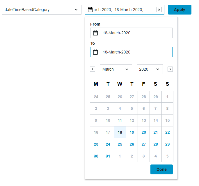
DateTimeBasedCategory: {
name: 'dateTimeBasedCategory',
description: '',
baseType: 'DATETIME',
ordinal: 1,
aspects: {}
}
}
}
];
}
Polymer code
    static get template() {
        return html`
            <ptcs-chip-data-filter query={{query}} on-change="__handleDataFilterChange" id="dataFilter"></ptcs-chip-data-filter>
        `;
    }
Component API
Properties
| Property | Type | Description | Triggers a changed event? |
|---|---|---|---|
| data | Object | The data for the filter options | No |
| query | Object | The query in JSON format, filter options | No |
| showListFilter | Boolean | Toggles filtering option in the category dropdown list (default: false) | No |
| hideFilterCounter | Boolean | Controls visibility of the label displaying the current number of filters (default: false) | No |
| daysContainingAnyData | Array [Date type] | Adds indicator dots that enable you to highlight days that contain data values | No |
| customBaseTypesMapping | Object | Maps base types to supported filters | No |
| sortFilters | Boolean | Deprecated. Sorts the list of filter options in the alphabetic sort order (default: true) | No |
| disableFilterSorting | Boolean | Prevents the applied filters from getting sorted automatically in an alphabetical order (default: false) | No |
| showAndHideFilters | Boolean | Controls the visibility of the Show/Hide filters button | No |
| chipsDisclosure | String | Specifies how to handle the "Show Filters" / "Hide Filters" toggle: 'link' - use a ptcs-link, 'icon' - use a ptcs-icon, 'none' - hide the disclosure toggle and always show the active filters / chips. Default: 'link'. |
No |
| columnFormat | String | A JSON string that contains a list of options to show in predefined order. The JSON data should have the same set of options as the data object. The Title field is optional and includes custom or a localizable label. Add __showThisField=false to hide option |
No |
| maxWidth | Number | The maximum width for the filter (in pixels) | No |
| topBarHeight | Number | Read-only property returning part top-bar height in pixels |
No |
| borders | String | Enable a border on part top-barusing letters tblr in any combination (top, bottom, left, right) |
No |
| categoryLabel | String | The text that is displayed above the drop-down list for the filter categories | No |
| conditionLabel | String | The text that is displayed above the drop-down list for the filter condition | No |
| valueLabel | String | The text that is displayed above the box which contains the value for the condition | No |
| rangeStartValueLabel | String | The text displayed above the first input box when filtering a range of values | No |
| rangeEndValueLabel | String | The text displayed above the second input box when filtering a range of values | No |
| unitsLabel | String | The text displayed above the drop-down list that is used to set the units when filtering by location or date | No |
| latitudeLabel | String | The text displayed above the input box for latitude when filtering by location | No |
| longitudeLabel | String | The text displayed above the input box for longitude when filtering by location | No |
When you specify a string for a label property, it is used instead strings values that are stored in the dictionary of the component.
Events
| Name | Data | Description |
|---|---|---|
| query-changed | { value: Object } | The generated data in JSON format |
Methods
None.
Styling
Parts
| Part | Description |
|---|---|
| selector | The container of all dropdowns |
| chip-container | The container element for chips |