ptcs-collapse
Visual
Overview
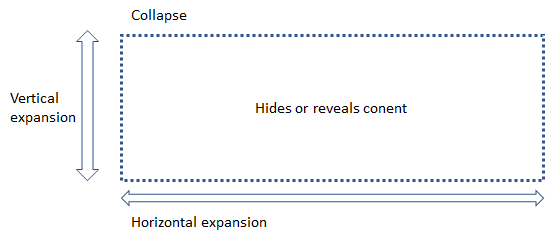
A Collapse control creates a collapsible block of content. The widget adjusts the max-height/max-width of the collapsible element to show/hide the content. The property is changed via a CSS transition, animating the state change. The animation speed is configurable via a CSS custom property.
Usage Examples
Basic Usage
<ptcs-collapse>
  <div>Visibility of this content can be toggled</div>
</ptcs-collapse>
Creates collapsible content that is intially hidden. When the visibility is toggled the element grows / shrinks vertically.
Horizontal expansion
<ptcs-collapse opened horizontal>
  <div>Visibility of this content can be toggled</div>
</ptcs-collapse>
Creates collapsible content that is intially visible. When the visibility is toggled the element shrinks / grows horizontally.
Component API
Properties
| Property | Type | Description |
|---|---|---|
| opened | Boolean | true if content is visible, false if it is hidden. Can be assigned manually. |
| horizontal | Boolean | If true, the orientation is horizontal; otherwise is vertical |
| transitioning | Boolean | When true, the element is transitioning its opened state. When false, the element has finished opening/closing. |
Events
| Name | Data | Description |
|---|---|---|
| opened-changed | When the opened propery has changed | |
| transitioning-changed | When the component starts or ends a transition |
Methods
| Signature | Description |
|---|---|
| show() | Show content |
| hide() | Hide content |
| toggle() | Toggle visibility |
Theming
--iron-collapse-transition-duration specifies the duration of the transition. The default valuie is 300ms
RTL
N/A
ARIA
To be specified