ptcs-behavior-valid
Overview
ptcs-behavior-valid is a behavior component that adds validation support to web components. You can use this component to validate the properties of other components.
The following is a list of states that are supported by the component:
undefined- the component has not enabled validation'unvalidated'- the component uses validation, but the validity is not yet determined.'invalid'- the component is invalid'valid'- the component is valid
The validity of the component is available as the attribute validity. If validation has not been enabled for the component (i.e. the validity is undefined), the attribute is not present.
If the component validates several properties, the resulting validity for the component is:
invalid, if any property is invalidunvalidated, if any property is unvalidated and none is invalidundefined, if all properties are undefinedvalid, if at least one property is valid and all other properties are either valid or undefined
Usage Example
To validate a component property, declare a validation function in the properties data using the validate keyword.
Example of enabling validation
import '../ptcs-behavior-validate/ptcs-behavior-validate.js';

const MyWC = PTCS.BehaviorValidate(PolymerElement) {
    static get properties() {
        return {
            value: {
                type:     Number,
                validate: '_validateValue(min, max)'
            },
            min: {
                type: Number,
            },
            max: {
                type: Number,
            }
        };
    }

    _validateValue(min, max) { /* Se below */ }
};
With this configuration, the _validateValue() function is called when any of the value, min, or max properties change.
A validation function should return:
undefinedif validation isn't activetrueif the property value is validfalseif the property value is invalid
Example of a validation function
_validateValue(min, max, value) {
    if (typeof min !== 'number' && typeof max !== 'number') {
        return undefined;
    }
    if (typeof min === 'number' && !(value >= min)) {
        return false;
    }
    if (typeof max === 'number' && !(value <= max)) {
        return false;
    }
    return true;
}
Note that the value of the validated property is available as the last parameter. It should not be specified in the validate expression.
External validation
Validation functions typically use client-side validation, where the result is returned instantly. In addition, the validation behavior supports server-side validation using the externalValidity property. External validation may take time to evaluate, and it may require input from a server.
The following is a list of states that are supported by the externalValidity property:
undefined, if server validation is not used (default)'unvalidated', if the validating process is waiting for a response from the server'invalid', if the server validation failed'valid', if the server validation succeeded
Validation message
The validation behavior creates a validation message (ptcs-validation-message) that contains the following items:
- an icon
- a title message
- a details message
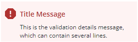
You can customize the message using component properties that are listed below.
The _insertValidationMessage method is called by the component to display the validation:
_insertValidationMessage(messageElement)
When you add validation to a component, make sure to implement this method and place the validation message at the appropriate location within the component.
Properties
| Property | Type | Description |
|---|---|---|
| _stayUnvalidated | Boolean | Components may delay the validation by assigning the property _stayUnvalidated to true. This means that the validation appears to be unvalidated even if the true validation is valid or invalid. |
| validationSuccessIcon | String | Icon for valid state. Default: "cds:icon_success" |
| validationErrorIcon | String | Icon for invalid state. Default: "cds:icon_error" |
| validationCriteriaIcon | String | Icon for unvalidated state. Default: "cds:icon_info" |
| validationMessage | String | The validation (title) message. This message is displayed in unvalidated and invalid state. |
| validationSuccessMessage | String | The validation success (title) message. This message is displayed in valid state. Default: "Success" |
| validationCriteria | String | The validation details message. This message is displayed in unvalidated and invalid state. |
| validationSuccessDetails | String | The validation success details message. This message is displayed in valid state. |
| hideValidationSuccess | Boolean | Hide validation message in valid state? |
| hideValidationError | Boolean | Hide validation message in invalid state? |
| hideValidationCriteria | Boolean | Hide validation message in unvalidated state? |
Methods
| Signature | Argument | Type | Description |
|---|---|---|---|
| enableValidationMessage | enable | Boolean | If enable is true, show success / failure messages instead of info message. If enable is false, always show info message |
| getValidity | None | Get current validity of component |