ptcs-file-upload
Visual
Overview
Usage Examples
Upload Manager
File upload uses the upload manager in order to perform the following actions: - Upload file - Get uploading progress
Basic Usage
<ptcs-file-upload upload-manager="[[uploadMgr]]"></ptcs-file-upload>
Component API
Properties
| Property | Type | Description | Default | Triggers a changed event? |
|---|---|---|---|---|
| disabled | Boolean | Set to True to disable the element | false | No |
| uploadManager | Object | Specifies the upload manager. Refer to the detailed section about the upload manager below. | No | |
| showRepositorySelector | Boolean | If TRUE, the component will include a repository selector. | false | No |
| showRepositoryPath | Boolean | If TRUE, the component will include a repository path that the user can upload the file(s) to. | false | No |
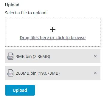
| fileUploadType | String | Sets the file upload control type (select/drag). If set to "Select file", the uploader is presented as a button that the user can click to open a file selection dialog box. If set to "drop zone", the file upload is presented as a drag-and-drop box where the user drags the files to upload, or alternatively the user can click anywhere in the box to browse for files. | "drag" | No |
| maxHeight | Number | Sets the maximum height (in pixels) for the component. If not set, the height for the component is not restricted. | No | |
| title | String | Defines the label text for the component. | "Upload" | No |
| titleStyle | String | Sets the label text style for the component. | "label" | No |
| description | String | Defines the description text for the component. | "" | No |
| descriptionStyle | String | Sets the description text style for the component. | "body" | No |
| disableInstantUpload | Boolean | If set to “true”, only placeholders for files are created, and the files are uploaded only after a submission. No progress indicators are shown. When set to "false", the files are uploaded with the content and progress indicators would show. | false | No |
| hideFileTypeIcon | Boolean | If set to “true”, the file type icon is not shown. | false | No |
| dropZoneLabel | String | Defines the label text for the drop zone for the component. | "Drag files here or click to browse" | No |
| dropZoneIcon | String | Defines the icon in the drop zone | No | |
| dropZoneHeight | Number | Defines the height for the drop zone box | No | |
| uploadedFileHeight | Number | Defines the height for an uploaded file box | No | |
| browseButtonLabel | String | Defines the label text of the browse button | "Browse" | No |
| browserButtonStyle | String | Defines the label style for the Browse button | "tertiary" | No |
| showUploadButton | Boolean | If set to “true”, the Submit button is available to submit the files selected for upload | false | |
| uploadButtonLabel | String | Defines the label text of the submit button | "Upload" | No |
| uploadButtonVariant | String | Sets the button style for the Submit button | "primary" | No |
| showDeleteAllButton | Boolean | If set to “true”, the “Remove All” button allows the user to cancel the upload and remove all uploaded files | ||
| deleteAllButtonLabel | String | Defines the label text for the “Remove All” button | false | No |
| filesList | Array | The uploaded files as an array of JS File objects | Yes | |
| fileNames | String | (ReadOnly) The names of the selected files | ||
| fullPaths | String | (ReadOnly) The full paths of the files with path | No | |
| allowedFileTypes | String | Enter file types separated by a comma to only allow specific types. For example: gif, pdf, jpg. | No | |
| allowedFileTypesMessage | String | The message to display when an unsupported file is added. | No | |
| allowedFileTypesMessageDetails | String | A secondary message that displays more information when an unsupported file is added. | No | |
| externalValidity | String | The component's validity as determined externally (server-side). Value: undefined, unvalidated, invalid, or valid |
No | |
| extraValidation | Function | Custom validation function to complement the component's client-side validation logic. Can return true (= valid), false (= invalid), or undefined (ignore validation) |
No | |
| fileRequired | Boolean | Require at least one file to be uploaded. | No | |
| fileRequiredMessage | String | The message to display when a required file is missing. | No | |
| fileUploadErrorDetails | String | A secondary message that displays more information about the validation failure message for a file. | No | |
| fileUploadErrorMessage | String | A message that displays as primary error message for a file. | No | |
| hideValidationCriteria | Boolean | Don't show a hint message about the required selection in unvalidated state? | ||
| hideValidationError | Boolean | Don't show a failure message when the validation failed? | ||
| hideValidationSuccess | Boolean | Don't show a success message when the validation is successful? | ||
| maxFileSize | Number | Sets a maximum size limit on each individual file in megabytes (MB). | No | |
| maxFileSizeFailureMessage | String | The message to display when a file exceeds the maximum allowed. | No | |
| maxFileSizeFailureTitle | String | The title of the the dialog box that displays when the file size exceeds the maximum allowed. | No | |
| maxNumberOfFiles | Number | Limits the maximum number of files that you can add to the upload list. | No | |
| maxNumberOfFilesFailureMessage | String | The message to display when the number of files added exceeds the maximum. | No | |
| maxUploadSize | Number | Sets a maximum size limit in MB for all selected files. | No | |
| maxUploadSizeFailureMessage | String | The message to display when the total upload size exceeds the maximum allowed. | No | |
| maxUploadSizeFailureTitle | String | The title of the dialog box that is displayed when the total upload size exceeds the maximum allowed. | No | |
| validationCriteria | String | A secondary message that displays more information about the validation failure/criteria message. | ||
| validationCriteriaIcon | String | An icon to display within the criteria status message (unvalidated). | "cds:icon_info" | |
| validationErrorIcon | String | An icon to display within the status message when the validation fails (invalid). | "cds:icon_error" | No |
| validationMessage | String | The validation (title) message to display when the validation is in invalid state. |
"File Upload Error(s)" | No |
| validationSuccessDetails | String | A secondary message that displays more information about the validation success message. | ||
| validationSuccessIcon | String | An icon to display within the status message when the validation succeeds (valid). | "cds:icon_success" | |
| validationSuccessMessage | String | The message (title) to display when the validation is successful. | "Success" | |
| validity | String | The component's validity status. Value: undefined, unvalidated, invalid, or valid |
||
| removeFileTooltip | String | Tooltip to display while hovering over the remove icon. |
Using the Upload Manager Interface
To use an upload manager with the component, it should have the following methods and properties:
upload(file, opts = {}, onprogress, onstatuschange)
Uploads the file to server. This method reports ongoing progress of the upload and the final status of the process.
Parameters
file: a Web API File object.opts: Options can contain following fields:repo: the repo name to upload the file to (used by TWX)path: a path on the repo (used by TWX)filename: can be different from file.name in case of duplicate filesreplace: if destination file should be replacedonprogress: This handler should be called by the upload manager when the uploading progress changes.e.progressshould contain the percents number (0 <= progress < 100). 100% will be displayed by the file upload only when the 200 status is reported.e.filenameshould be assigned with the file name.onstatuschange: This handler should be called by the upload manager when the upload status changes. In case of a successful uploade.statusshould be assinged to 200.e.filenameshould be assigned with the file name.
Returns
Object that contains the following methods that can be applied to the current upload:
cancel
Events
| Name | Data | Description |
|---|---|---|
delete-file |
ev.detail = { filename, repo, path } |
Generated when the user removes a file from the list |
upload-started |
ev.detail = { [filenames], repo, path } |
Generated when the upload starts |
upload-failed |
ev.detail = { [filenames], repo, path } |
Generated when the upload fails |
upload-complete |
ev.detail = { [filenames], repo, path } |
Generated when the upload is complete |
Methods
| Name | Description |
|---|---|
uploadAll |
Upload the files when "disable instant upload" is true |
deleteAll |
Removes all the files from the list. Pass "noconfirm" argument as true if you don't need the confirmation dialog to appear. |
clearFilesList |
Removes all the JS File object from filesList array |