Lit Web Component Development Guidelines
The ThingWorx Web Component SDK Library is a collection of web component widgets that are based on Lit. Initially, the library was based on Google Polymer. Because Polymer is now in maintenance mode and not being actively developed, the SDK Library is being migrated to its successor framework, Lit. This document addresses Lit web components development. For the Polymer guidelines, see Polymer Web Component Development Guidelines.
The web components are packaged as npm modules for developing UI and communicating with ThingWorx Composer back-end. You can use the ThingWorx Web Component SDK Utility mub to create widget extensions to import on the platform and use in Mashup Builder. The components create themselves in the PTCS namespace using the prefix ptcs- in their component name (such as ptcs-button).
Overview
This document is organized into sections as follows:
- Prerequisites
- SDK Web Component Folder Organization
- Building a Web Component: Declaring Dependencies
- Functional Styling
- Styling Demos
- Styling a Web Component
Prerequisites
The web components that are ported to Lit are based on Lit version 2. For development work, you should be familiar with Web Components and Lit development, and have a working knowledge of web component concepts such as templates, data binding, Shadow DOM, component life cycle callbacks, and CSS pseudo-classes. This includes using :host, :host(), and pseudo-element ::part to reference elements with matching part attribute in the shadow tree. To learn more about web components and Lit, see the following resources:
- The Mozilla Developer Network documentation has detailed information on Web Components. (https://developer.mozilla.org/en-US/docs/Web/Web_Components)
- The Web Fundamentals guides from Google. (https://developers.google.com/web/fundamentals/web-components)
- Lit v2 documentation (https://lit.dev/docs/)
For more information about Lit, refer to the interactive playgrounds and tutorials on the Getting Started page https://lit.dev/docs/getting-started/ on https://lit.dev.
About Lit
Lit is a framework developed by Google to build web components. It is developed by the team behind Polymer so it benefits from the lessons learned from Polymer. Both frameworks have similarities, but there are significant differences:
- Lit lacks Polymer's observers, notifiers, computed values, and two-way data-bindings.
- The Lit component lifecycle uses debouncing at a micro-task level for property assignments, whereas Polymer updates immediately on a property change, triggering every dependency on the property. The asynchronous batch update of property changes in Lit makes it much more performant in handling quasi-simultaneous property updates, but creates also timing considerations caused by the debouncing delay.
Therefore, many changes are required to migrate a Polymer web component to Lit.
SDK Web Component Folder Organization
The web components in the SDK library follow common organizational guidelines: The main folder of the component has the name of its component with the main implementation of the component in file component-name/component-name.js (e.g. ptcs-button/ptcs-button.js). Each web component is documented in a Markdown file named README.md under the root of the component folder. For example, the documentation for ptcs-button resides in ptcs-button/README.md. The README.md covers the component visual representation, anatomy, API, and parts that you can style.
For example, the ptcs-button folder contains:
- The component source file:
ptcs-button.js. - The component
README.mdfile in Markdown format. - A
testsubfolder for the component's unit tests. - A
demoSubfolder for the component's demo. - The component
package.jsonfile, which is used to declare dependencies.
Other subfolders may exist, like img for images or doc for additional documentation. Complex components may have additional files and folders, including subcomponents.
Typically, you only need to import the main file component-name.js in order to use it in your component.
Implementation Considerations
Model vs View
The state (model) of the component should be separated from the view. This cannot be stressed enough.
In practice this means that the full state of the component should be encoded by the properties returned by static get properties(). It should be possible to copy those properties to a new instance of the component and that instance should look and behave as the original.
There are several reasons for this:
- Encoding the component state in the DOM structure or as "invisible" properties may cause bugs that are difficult to fix.
- The separation of model and view results in code that contains fewer errors.
- The code is easier to read when the full state of the component can be understood by only inspecting the registered properties.
- The code is easier to read when all operations affect the properties only, which in turn cause the DOM to update.
- The code is easier to update when you can focus on either the state changes or on how to display the changes.
The component implementation should therefore consist of two layers:
- Manipulation of the state properties.
- Rendering of the component in response to property changes.
Lit's design enables you to follow this development practice.
Your code should not bypass the state properties and write state information directly into the DOM. The DOM should be updated indirectly, in separate code. As mentioned in the Lit documentation: To take best advantage of Lit's functional rendering model, your render() method should follow these guidelines:
- Avoid changing the component's state.
- Avoid producing any side effects.
- Use only the component's properties as input.
- Return the same result when given the same property values.
ARIA
WAI-ARIA (Web Accessibility Initiative – Accessible Rich Internet Applications) is a technical specification published by W3C (World Wide Web Consortium) that specifies how to increase the accessibility of web pages.
Supporting Aria means that the component should implement keyboard navigation and communicate its state using Aria attributes that can be used by screen readers, for example. PTC web components should support this specification. However, this is a recent requirement, so most of the existing components are not Aria enabled. All new components that will be added in future versions of the library should follow the Aria specification, if the component has any user interaction.
The SDK web components use a focus behavior that includes functionality for easily delegating focus to subcomponents to support TAB and SHIFT-TAB keyboard navigation as well as converting SPACE to a click on the focused element.
For more information, refer to the W3C Accessibility Standards Overview (https://www.w3.org/WAI/standards-guidelines) .
Getting Started
Development Tools and Versions
The ThingWorx Web Component SDK development is done in an environment based on NodeJS (http://nodejs.org/) as well as npm, gulp, gulp-cli, and aurelia. The ThingWorx Web Component SDK library version requirements are listed below for reference.
NodeJS
nodejs should be version 8 or later, the current version used for the SDK is 16.13.1. You can download node-v16.13.1-x64.msi from https://nodejs.org/download/release/v16.13.1/.
NPM
npm is included with the NodeJS installation. You should use version 5 or later. NodeJS 16.13.1 includes npm version 8.1.2. You can verify your npm version by running: npm -v. To update your npm version, run the following command:
npm install -g npm
Gulp and gulp-cli
To install gulp (http://gulpjs.com/) run the following command:
npm install -g gulp gulp-cli
Aurelia
To install the aurelia (https://aurelia.io/) framework, run the following command:
npm install aurelia-cli -g
The current aurelia-cli version used for the SDK is 3.0.1.
Download and Installation
- Download the ThingWorx Web Component SDK from the PTC Software Downloads page. The SDK is available under path ThingWorx Foundation version > ThingWorx Web Component SDK Library. The ZIP file is named [VERSION] WEB-Component-SDK-Library.zip.
- Extract the zipped contents to an empty folder named twx-wc-sdk in your project folder.
- Install the ThingWorx Web Component SDK Library and its dependencies by running the following command:
npm install twx-wc-sdk/ptcs-library
The Web Component SDK Library is installed and symbolic links for ptcs modules appear inside your node_modules folder.
After you complete the installation, you can use ptcs modules to create your own custom web components.
You can add your own project dependencies in the package.json file.
Note:
Check for any conflicts that adding project dependencies may cause with the dependencies of the ptcs-library.
Recommended Development Process
In order to have a fully functional Web Component which is a themed widget in the mashup builder, we recommend that you follow these steps:
- Build a prototype/beta (demo component).
- Rapid prototyping helps you identify gaps in the component specification and to align the design with UX intentions.
- Create a demo page that shows a working version of the component with the specifics of the component functionality.
- Creating a working demo helps you test and resolve issues at the component level instead of doing the same after you use the component as a widget in Mashup Builder.
- Style the component.
- Document the Web Component API and the
partattributes that are declared for styling. - Write tests for the component. The tests should use the public API of the web component.
- Consider writing tests before the final implementation, so that the tests fail until you achieve the required functionality.
- Publish your component to an npm registry, then use the Web Component SDK Utility to create a ThingWorx extension from the web component.
Building a Web Component: Declaring Dependencies
Complex components are created using subcomponents. Because there is an existing library of small components, it is easier to build complex components that have consistent behavior and styling. When designing a new complex component, you can select subcomponents that meet your user-experience requirements. Then, you can add new and more complex functionality to create the parent component structure. For example, you can use a primary ptcs-button as part of a submission form component, and would import it as follows:
import 'ptcs-button/ptcs-button.js';
Because component reuse is a common development methodology, most of the library components include other components within the SDK, in addition to external packages.
Common Imports
You can declare dependencies on other components as import statements at the top of the component file. The dependencies listed below are nearly the minimum required for the library components. A component can also include additional import statements for behaviors, unless the component is invisible or is used only for layout. In those cases, the components can inherit directly from the LitElement class.
Lit
Typically, the Lit inclusions are similar to the following:
-
import {LitElement, html, css} from 'lit'; -
You define a Lit component by creating a class extending the base
LitElementclass and registering it with the browser. - The component rendering template is written in HTML inside Lit's tagged template literal
htmlfunction. - Functional styling is declared in the static styles class field using Lit's tagged template literal
cssfunction. - For general styling of the component's visual appearance, see Styling below.
In addition, you can include Lit directives (https://lit.dev/docs/templates/directives/) as relevant, such as:
import {map} from 'lit/directives/map.js';import {choose} from 'lit/directives/choose.js';-
import {when} from 'lit/directives/when.js'; -
The
mapdirective is used to transform an iterable with a function. - The
choosedirective renders one of several templates based on a key value. - The
whendirective renders one of two templates based on a condition.
Polymer to Lit Migration
The main challenge when migrating Polymer components to Lit are the lifecycle differences and the mindset switch because the templates differ both semantically and syntactically.
Lifecycle
Whereas Polymer keeps all data bindings synchronized, Lit only triggers a new update if one has not already been triggered. When the Lit template is regenerated, all changed properties are mapped to the DOM at the same time. This batched update of Lit components is implemented in a reactive update cycle with three main steps that consist of several sub-steps:
- Pre-Update: This step includes invoking the
constructor()and preparing to request an update. - Update: This step is performed before the next frame is being painted, ending with the component's
render()method called to update its internal DOM. - Post-Update: This step starts by invoking
firstUpdated()and ends with resolving theupdateCompletepromise.
You can customize any of the standard lifecycle methods in this cycle. For more information, see https://lit.dev/docs/components/lifecycle/.
The different lifecycle models can cause issues for code that was originally developed for Polymer. In Lit, several properties can be changed without any synchronization during the batched processing, so that the component data can be out-of-sync with the DOM representation while the next update is being prepared in the debounce cycle that collects changes. Automated testing written for Polymer components is often affected because the changes in the DOM will not be available until after the update in Lit. Also, Polymer components often use computed properties that should be updated immediately when some other properties changes. All such code must be carefully reviewed when migrating a web component from Polymer.
Finally, most Polymer components use the ready function. This is called before the component is attached to the DOM, but in Lit, firstUpdated() is called after the component is attached, in the Post-Update phase of the cycle.
Template Instantiation
A Polymer template is only used when a component is instantiated to create the internal DOM structure and add dynamic two-way bindings. A Lit template consists of one-way bindings from the component to the template, which is re-instantiated when any relevant property changes. The Lit template can contain any JavaScript (TypeScript) logic and return vastly different results at every invocation, depending on the input.
Therefore, in Lit, the DOM rendering follows naturally from property mappings and JavaScript expressions. You can use standard JavaScript control flow constructs like conditional operators, function calls, and if or switch statements to render conditional content (see https://lit.dev/docs/templates/conditionals/). This is complemented by Lit built-in directives (https://lit.dev/docs/templates/directives/) such as choose and when.
Syntax Differences
Polymer and Lit declare component properties using a similar but not identical syntax. Polymer automatically translates camel case property names to kebab case attributes, but this translation is explicit in Lit. Polymer and Lit also differ in how properties are converted to and from attributes. For more information, see https://lit.dev/docs/components/properties/#attributes.
Styling
To enable styling for your component, include the following file:
ptcs-behavior-styleable/ptcs-behavior-styleable.js
This allows the component to be styled with ptcs-style-units, which are documented under Using The Style Aggregator of the Styling Web Components topic.
As a modern framework, Lit supports Constructable Stylesheets to let you separate the style sheet from the template.
Tooltip and Focus Behavior
To enable tooltip and focus functionality, include the tooltip and focus behaviors:
ptcs-behavior-focus/ptcs-behavior-focus.js
The focus behavior allows the component to highlight focused elements consistently and to follow keyboard navigation conventions used in ThingWorx web components to support accessibility requirements, such as using the SPACE key instead of a mouse click.
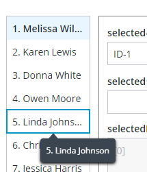
The focused List item has a blue border that is applied from the style theme. When the text of the list item is truncated, the full text is displayed in the tooltip when you place the mouse pointer over it, or when the item is focused.
ptcs-behavior-tooltip/ptcs-behavior-tooltip.js
The tooltip behavior provides the functionality required to display tooltips in addition to the focus behavior. Tooltips in the ThingWorx Web Component SDK are also used to display dynamic content such as label text that is truncated when it overflows a container of limited size, and data markers on charts.
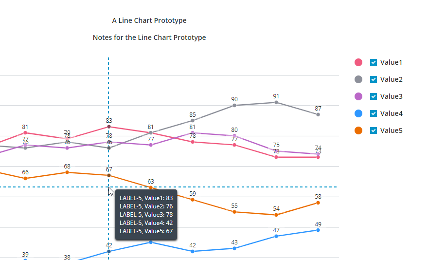
The image shows a tooltip that displays data values on a crosshair pointer for a chart. In this case, values are displayed for data series on the vertical axis of the crosshair.
Example
For example, the ptcs-button web component of the SDK library contains the following import statements:
import {LitElement, html, css} from 'lit';
import {PTCS} from 'ptcs-library/library.js';
import 'ptcs-icon/ptcs-icon.js';
import 'ptcs-label/ptcs-label.js';
import 'ptcs-behavior-styleable/ptcs-behavior-styleable.js';
import 'ptcs-behavior-focus/ptcs-behavior-focus.js';
import 'ptcs-behavior-tooltip/ptcs-behavior-tooltip.js';
import 'ptcs-behavior-tabindex/ptcs-behavior-tabindex.js';
...
In addition to dependencies that are mentioned in previous sections, the component uses additional subcomponents that are used to display icons within a button.
Declaring a Component Base Class
To create a component that supports styling and theming, in addition to focus and tooltip behavior, declare the base class as follows:
ACME.Component = class extends PTCS.BehaviorTooltip(PTCS.BehaviorFocus(PTCS.BehaviorStyleable(LitElement))) {
Note:
If the component extends an existing component that already has these behaviors, then they should not be specified again. For example:
ACME.SpecialButton = class extends PTCS.Button {
To avoid conflict with other namespaces such as PTCS when declaring custom web components, declare them in a custom namespace.
When adding new components, consider how they affect the size of the component files. Components should be as light-weight as possible.
Functional Styling
Functional styling is declared in the static get styles() section using the tagged template literal css function. For example:
ACME.Component = class extends PTCS.BehaviorTooltip(PTCS.BehaviorFocus(PTCS.BehaviorStyleable(LitElement))) {
 static get styles() {
        return css`
        :host {
            display: inline-flex;
            box-sizing: border-box;
        }`;
    }
Styling Demos
The ptcs-base-theme is an npm module used to apply basic styling to web components. You should only install it to view the demo pages of web components that are served by Lit. When the component is used as a widget in ThingWorx, this component is not used.
The web component demo pages use the following scripts to load styling:
<script type="module" src="../../ptcs-base-theme/ptcs-base-theme.js"></script>
or alternatively, using ptcs-multi-theme.js:
<script type="module" src="../../ptcs-base-theme/ptcs-multi-theme.js"></script>
The ptcs-multi-theme.js script adds a drop-down list to the upper-right corner of each demo page. This enables you to switch between the available themes, such as the PTCS Base Theme and PTCS Convergence Theme, when viewing the component demo.
Styling a Web Component
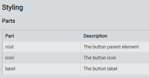
The SDK web components are designed to have their styling defined externally. Each component only includes functional CSS styling as part of the component itself. You should declare part attributes on the subelements of a component to expose them for styling. The available part attributes for each component are documented in the README.md file under each component folder. For example, the ptcs-button web component has following public parts:
Style themes allow you to create web components with a consistent look more easily. Instead of defining fixed styling for each component, you can map and customize theme values to create multiple themes that you can apply to multiple components.
The styling is defined for each web component in a separate JSON file, with the theme for the web components as a whole delivered in the mb-theme-engine.js file.
A style theme consists of:
- Theme properties
- Styles that bind theme properties to web components
For more information about styling and theming web components, see:
Browser Support
The Shadow DOM is supported in Chrome, Firefox (version 63 and later), Opera, and Safari. Microsoft Edge versions that are based on the Chromium browser engine are also supported.
The ThingWorx Web Component SDK does not support the Microsoft Edge Legacy browser. To support this browser, import a polyfill that enables you to embed web components. However, Edge Legacy has limitations that make web component development and debugging work more difficult compared to modern browsers with native support for the Shadow DOM.
- To load the Microsoft Edge Legacy polyfill for your web component demo page, add the following script:
<script src="../node_modules/@webcomponents/webcomponentsjs/webcomponents-loader.js"></script>
Adding a Web Component to ThingWorx Mashup Builder
After you finish developing and testing your custom web component, we recommend that you publish your widget to an npm registry.
Then, you can use the SDK utility (mub) to create widget extensions that you can import and use in Mashup Builder. The utility uses a JSON configuration file for each web component. You can create an extension that includes multiple web components by adding them to the mub/input/widgets.json file.
In addition to the JSON configuration file, you must create following files under your web component folder mub/input/ui/web-component:
- IDE and runtime custom CSS files.
- IDE and runtime custom JS code files.
For more information, see Creating Widget Extensions.