ptcs-confirmation
Visual

Overview
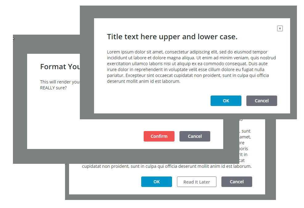
ptcs-confirmation is a modal style interaction web component to commit or cancel an operation that displays a confirmation dialog on top of a semi-opaque background overlay. It features:
-
A confirmation dialog title
-
A confirmation dialog message
-
Buttons for confirmation actions:
- A Primary action
- An optional Secondary action
- A Cancel action
-
Primary action button position (Left or Right)
-
Primary action button type (
primaryordanger) -
An optional Close ❌ button, that behaves as Cancel
Usage Examples
Basic Usage
<ptcs-confirmation title-text="Title of the Message" message-text="Lorem ipsum dolor sit amet."></ptcs-confirmation>
Confirmation Dialog with Close Button
~html
By default the confirmation dialog does not display a Close button. The Close button behaves the same as Cancel.
### Confirmation Dialog with Primary Action Button Position Reversed
~html
This changes the Primary action button position from leftmost to rightmost.
Component API
Properties
| Property | Type | Description | Default | Triggers a changed event? |
|---|---|---|---|---|
| mode | String | To indicate the dialog state (open or closed) | "closed" | No |
| titleText | String | The dialog title | " " | No |
| messageText | String | The dialog message text | " " | No |
| actionPosition | String | The position of the primary action button (left or right, default: left) |
"left" | No |
| displayCloseButton | Boolean | Toggle to display the optional Close button | false | No |
| primaryButtonStyle | String | This can be primary or danger |
"primary" | No |
| displaySecondaryAction | Boolean | Toggle to display optional secondary action button | false | No |
| primaryActionLabel | String | The label text of the primary action button | null | No |
| secondaryActionLabel | String | The label text of the secondary action button | null | No |
| hideCancelAction | Boolean | Hiding cancel action button | false | No |
| cancelActionLabel | String | The label text of the Cancel button | null | No |
| primaryActionIcon | String | The icon of the primary action button | null | No |
| secondaryActionIcon | String | The icon of the secondary action button | null | No |
| cancelActionIcon | String | The icon of the Cancel button | null | No |
| actionButtonTooltipField | String | The tooltip text of the primary action button | null | No |
| actionButtonTooltipIcon | String | The tooltip icon of the primary action button | null | No |
| secondButtonTooltipField | String | The tooltip text of the secondary action button | null | No |
| secondButtonTooltipIcon | String | The tooltip icon of the secondary action button | null | No |
| cancelButtonTooltipField | String | The tooltip text of the Cancel button | null | No |
| cancelButtonTooltipIcon | String | The tooltip icon of the Cancel button | null | No |
| closeButtonTooltipField | String | The tooltip text of the Close button | null | No |
Events
| Name | Description |
|---|---|
| primary-action | Triggered when clicking on the primary action button |
| secondary-action | Triggered when clicking on the secondary action button |
| close-action | Triggered when clicking on the Cancel and / or the Close button |
Methods
| Signature | Description |
|---|---|
| open() | Open the confirmation dialog |
| close() | Close the confirmation dialog. This isn't really needed, as the dialog closes when any action button or the Close button is clicked. |
Styling
Parts
| Part | Description |
|---|---|
| modal-overlay | The partly opaque grey background that covers the viewport |
| root | The root of the confirmation dialog |
| dialog | The container for the confirmation dialog components |
| close-button | The Close button in the dialog's top right corner |
| message-container | The container for the message title and message text |
| title | The confirmation dialog title |
| message | The confirmation dialog message |
| buttons-container | The container for the confirmation dialog buttons in the footer |
| primary-button | The Primary Action button |
| secondary-button | The Secondary Action button |
| cancel-button | The Cancel button |
States
| Attribute | Description | Part |
|---|---|---|
| mode | Is the confirmation dialog open or closed? | :host |