ptcs-button
Visual
Overview
A button can be activated through a click, a screen touch, or a key press. When a button is activated, any actions that are connected to the button are performed. A disabled button cannot be activated.
Usage Examples
Basic Usage
    <ptcs-button onclick="ok()" label="Ok"></ptcs-button>
    <ptcs-button variant="secondary" onclick="edit()" label="Edit"></ptcs-button>
    <ptcs-button variant="tertiary" onclick="cancel()" label="Cancel"></ptcs-button>
    function ok()
    {
      console.log("Clicked on Ok");
    }

    function edit()
    {
      console.log("Clicked on Edit");
    }

    function cancel()
    {
      console.log("Clicked on Cancel");
    }
Button with icon
~html
Component API
Properties
| Property | Type | Description | Default | Triggers a changed event? |
|---|---|---|---|---|
| buttonMaxWidth | Number | The maximum width of the button in pixels | No | |
| contentAlign | String | The alignment of the label. | "center" | No |
| disabled | Boolean | Disables the button | "false" | No |
| item | Object | Client data that is attached to the action event when the user activates the button | No | |
| icon | String | The path to the .png button icon | null | No |
| iconAlt | String | Sets the alt text for the icon | No | |
| iconSrc | String | The path to the .svg button icon | null | No |
| svgIcon | String | Specifies the ptcs-icon-library icon to display within the button | null | No |
| label | String | The button label | null | No |
| tooltip | String | The tooltip that appears when hovering over the button | No | |
| tooltipIcon | String | The icon for the tooltip | No | |
| variant | String | Specifies style variant of the button. | "primary" | Yes |
| iconWidth | String | Sets a fixed width for the icon (both iconWidth and iconHeight should be set, otherwise the icon default size is set) | No | |
| iconHeight | String | Sets a fixed height for the icon (both iconWidth and iconHeight should be set, otherwise the icon default size is set) | No | |
| iconSize | String | This property determines the size of the icon inside the button. This property has lower priority than iconWidth and iconHeight. | No | |
| iconPlacement | String | Displays the icon to the left, right, above, or below the text label. (left|right|top|bottom) |
"left" | No |
| size | String | Determines the size of the button. This property applies to all button variations except for Small Button (Variation 6). If fill is selected, the button will be the size of the parent container. If the builder wants further control, a custom width and height can be provided using the width and height properties. | No | |
| hideLabel | Boolean | Enables you to show or hide the button label. Despite the label being hidden, its value is retained internally for accessibility purposes through the use of aria-Label. | "false" | No |
| toggleButton | Boolean | When set to True, allows the button to function as a toggle. | No | |
| hideContent | Boolean | When True, the button hides its content in the active state but still reserves space for it. The content appears on hover, focus, or when pressed. Tooltips, if any, also appear on hover. | No | |
| selected | Boolean | When toggleButton set to True, toggles the selected state of the button. | No | |
| selectedIcon | Boolean | Displayed when toggleButton is set to true and the button is in the selected state. Replaces the default icon to indicate selection. | No |
Events
| Name | Data | Description |
|---|---|---|
| action | An event that occurs when a user activates a button that is enabled. This event is not generated when the button is in a disabled state. |
|
| click | standard | A standard DOM event that triggers when the button is clicked. |
Methods
The button has no methods
Styling
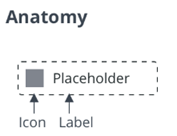
Parts
| Part | Description |
|---|---|
| root | The button parent element |
| icon | The button icon |
| label | The button label |
States
| Attribute | Description | Part |
|---|---|---|
| variant | Specifies the variant | :host |
| icon | The path to the PNG icon | :host |
| iconSrc | The path to SVG icon | :host |
| svgIcon | Specifies the ptcs-icon-library icon to display within the button | :host |
| hidden | Hides the part | icon, label, tooltip |
| contentAlign | The alignment of the label and the icon | :host |
| src | The icon path (SVG) | icon |
| mode | Does the button contain a label, an icon or both | :host |
| disabled | Disables the part | :host |
TODO
- special event for activation
- special event for focus
- special event for blur
- special event for disable state change
- support for key bindings (?)
- bind function / variable to button, so activation can be handled without events(?)