ptcs-chip
Visual

Overview
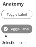
A chip can be in an on or off state. When the chip is engaged, it toggles the state. The chip uses the ptcs-behavior-binary/ptcs-behavior-binary.html behavior.
The chip can optionally show a selection icon when it is in the on state.
Usage Examples
Basic Usage
<ptcs-chip checked="{{active}}" label="Show"></ptcs-chip>
Assigns the variable active to true when the chip state is on, and to false when it is off.
Explicit variable values
<ptcs-chip variable="{{tool}}" label="Use tool" value-on="knife" value-off="fork"></ptcs-chip>
Assigns the variable tool to "knife" whenever the chip is on and "fork" otherwise.
Start in on state (checked)
<ptcs-chip variable="{{tool}}" label="Use tool" value-on="knife" value-off="fork" checked></ptcs-chip>
Component API
Properties
| Property | Type | Description | Default | Triggers a changed event |
|---|---|---|---|---|
| disabled | Boolean | Disables the chip | false | No |
| label | String | The displayed label | " " | No |
| labelalign | String | Determines the position of the label relative to the selection icon: left or right |
"left" | No |
| labelMaxWidth | String | The maximum width of the label | No | |
| icon | String | An icon that appears when the chip is on. | A checkmark inside of a circle | No |
| iconSrc | String | A URL to an icon set from wich icon selects an icon |
No | |
| hideIcon | Boolean | Suppresses showing the selection icon | false | No |
| state | Boolean | The current state. The state is on when set to true and off when set to false. | No | |
| checked | Boolean | The current state. The state is on when set to true and off when set to false. | false | No |
| tooltip | String | The tooltip that appears when hovering over the checkbox | No | |
| tooltipIcon | String | The icon for the tooltip | No | |
| valueOff | any | The value that the chip assigns to variable when the chip is turned off. |
false | No |
| valueOn | any | The value that the chip assigns to variable when the chip is turned on. |
true | No |
| variable | any | The variable that the chip monitors and assigns. | No | |
| iconWidth | String | Sets a fixed width for the icon (both iconWidth and iconHeight should be set, otherwise the icon default size is set) | No | |
| iconHeight | String | Sets a fixed height for the icon (both iconWidth and iconHeight should be set, otherwise the icon default size is set) | No |
Methods
No methods
Styling
The Parts of a Component
| Part | Description |
|---|---|
| label | The container that contains the label |
| icon | The icon of the chip that is displayed in the on state |
State attributes
| Attribute | Description | Part |
|---|---|---|
| checked | Current state (on: checked = true, off: checked = false) | :host |
| disabled | Is the checkbox disabled? | :host |
| hide-icon | Suppress showing the selection icon in the chip variant? | :host |
| labelalign | The alignment of the button label. You can set it to left or right. The default is left. | :host |