ptcs-breadcrumb
Visual
Overview
A Breadcrumb control shows the current location of the user. It provides a sequence of links to other locations or states.
You can show previously visited locations, or the current location of a user within a website hierarchy.
Usage Examples
Basic Usage
In the example, path is an array of strings.
<ptcs-breadcrumb items="[[path]]"></ptcs-breadcrumb>
You can set it using a Polymer data binding, or manually by assigning the property using JavaScript code.
The following code block shows setting up an event listener to navigate using the breadcrumb:
document.getElementById(...).addEventListener('ptcs-breadcrumb', ev =>
{
    console.log("Goto step " + ev.detail.index);
});
The breadcrumb link width changes dynamically according to the number of links to show, the length of the link text, or window resizing. The links can be truncated for different reasons:
- Links are truncated to a maximum width of
linkTruncationLengthwhenlinkTruncationis set totrue. - Links are truncated incrementally if they do not fit within the part
rootcontainer (regardless oflinkTruncationsetting), with a minimum link width of 34px. - Although the number of links to show is within the
overflowThresholdvalue, the layout will switch to show the breadcrumb with dropdown menu per the defaultoverflowThresholdof 4 (regardless of its actual assigned value), if the truncated links have reached the minimum width yet the breadcrumb still overflows. The layout will revert back to the assignedoverflowThresholdwhen possible (e.g. when the breadcrumb fits again thanks to breadcrumb navigation or window resizing). - Breadcrumbs are truncated incrementally until they fit if property
visibleBoundsTruncationis set totrueand the right edge of the rightmost item (breadcrumb link or separator) is not visible. This use case can apply for instance when the breadcrumb is displayed in a flex container.
Component API
Properties
| Property | Type | Description | Default |
|---|---|---|---|
| items | Array | An array of strings, where each string is a step in the breadcrumb path (used as input only) | [ ] |
| disabled | Boolean | Disables the breadcrumb | false |
| overflowThreshold | Number | Maximum number of breadcrumbs to display before switching to display an overflow dropdown | 4 |
| selector | String | The selector is the key that specifies the entry label when items is a list of objects, | " " |
| selectorUrl | String | If items is an array of objects, the selecturUrl should hold the key to the URL to use for each entry | " " |
| showCurrentLevel | Boolean | Deprecated. Should the "current" breadcrumb level be shown or not? | |
| hideCurrentLevel | Boolean | Hides the current level indicator | false |
| linkTruncation | Boolean | Truncates long breadcrumbs according to linkTruncationLength (or less) | false |
| linkTruncationLength | Number | The maximum width of each breadcrumb when truncated | 120 |
| visibleBoundsTruncation | Boolean | Truncate breadcrumbs if rightmost item (link or separator) is not visible? | false |
Events
| Name | Data | Description |
|---|---|---|
| ptcs-breadcrumb | ev.detail = { index, item } | Generated when the user clicks on a step in the breadcrumb path. index is the index into the path and item is the item (the step string) |
Styling
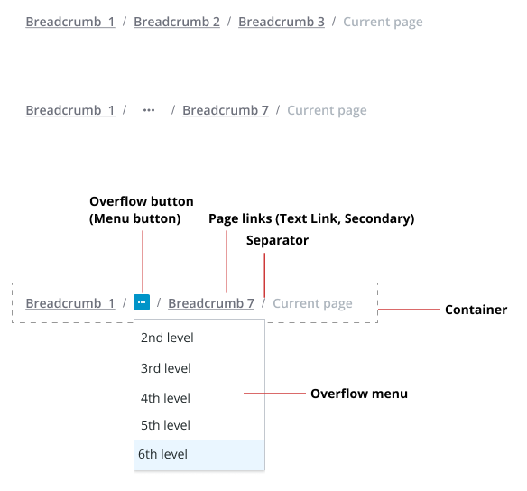
The Parts of a Breadcrumb
| Part | Description |
|---|---|
| root | The root of the component |
| body | A container for the list of breadcrumbs and separators |
| link | A ptcs-link breadcrumb entry |
| separator | A container for the forward slash '/' character that separates the crumbs |
| dropdown | A ptcs-dropdown list that contains overflow breadcrumb items (when the number of breadcrumbs exceeds the overflowThreshold value) |
ARIA
To be determined
TODO
- HTML dir attribute
- ARIA attributes (?)
- Support MS File Explorer feature, where each step separator is clickable and allows user to select any substep (?)
- Allow breadcrumb content to consist of arbitrarily complex markup (?)