ptcs-behavior-tooltip
Overview
ptcs-behavior-tooltip is a behavior that tracks the keyboard focus and displays a focus border and, when applicable, a tooltip. This builds on the ptcs-behavior-focus, see its README for details. In addition tooltips can be shown from mouse hover.
The tooltip itself is shown via a web component ptcs-tooltip-overlay.
Usage Example
import '../ptcs-behavior-tooltip/ptcs-behavior-tooltip.js';

const MyWC = PTCS.BehaviorTooltip(PolymerElement) {
    ...
};
This gives MyWC access to the tooltip behavior.
Component API
When adding tooltip support to your component, it gets the following properties:
        tooltip: {
            type: String
        },

        tooltipIcon: {
            type: String
        },

        // To supply the component-determined tooltip dynamically
        tooltipFunc: {
            type: Function
        }
If tooltipFunc is a function, the tooltip is retrieved by evaluating this function. Otherwise tooltip is used as-is. It tooltip doesn't exist, no tooltip is displayed.
Example
In image below, the tooltipFunc function has been used to retrieve truncated text, which was added as prefix to the tooltip text proper (with \n\n separator).
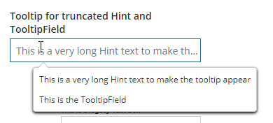
The hint text of the text field is truncated and is shown above the tooltip text ("This is the TooltipField")
Properties
| Property | Type | Description | Triggers a changed event? |
|---|---|---|---|
| tooltip | String | The tooltip string. Text preceding the first occurrence of \n\n separator will be put into part=truncation-overflow, with the rest (or all, if no separator) of the tooltip string put into part=text. This is used mainly to display partially hidden text (the truncation with ellipis overflow pattern) in the tooltip, in addition to any tooltip text proper |
No |
| tooltipIcon | String | The icon for the tooltip (if any) | No |
| tooltipFunc | Function | Used to return a dynamically computed tooltip string | No |
| disableTooltip | Boolean | Disables the tooltip. Default is false | No |
Escape Key
- Clicking on the Escape key will hide a displayed tooltip.
Styling
The tooltip overlay has following parts:
Parts
| Part | Description |
|---|---|
| tooltip | The tooltip container |
| pointer | The pointer of the tooltip |
| tooltip-icon | The tooltip icon |
| tooltip-text | The tooltip textual contents container |
| truncation-overflow | Tooltip text coming from e.g. truncation overflow |
| text | The tooltip text proper |