ptcs-chart-zoom-input
Visuals
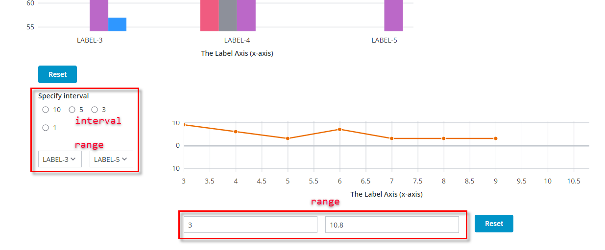
Chart zoom input controls in the Bar Chart (ptcs-chart-bar) for selecting an interval via radio buttons and a range using dropdown, and textfields for selecting a range in the Line Chart (ptcs-chart-line).
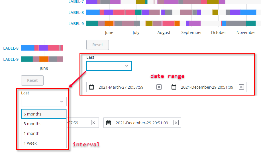
Chart zoom input controls for selecting an interval via dropdown and a range using datepickers in the Schedule Chart (ptcs-chart-schedule).
Overview
ptcs-chart-zoom-input is a subcomponent used to add zoom input controls to charts. It is used by ptcs-chart-zoom-interval for selecting an interval and by ptcs-chart-zoom-range for selecting a range. The input control uses one (or more) of:
- ptcs-datepicker, to select a date
- ptcs-textfield, to input a value
- ptcs-radio, to select a discrete value
- ptcs-dropdown, for selecting labels / an interval
This component can create subcomponents in the regular DOM (not in the shadow DOM) for direct styling access to content.
Usage Example
        <ptcs-chart-zoom-input part="pick" label="[[startLabel]]" part-names="[[_startPartNames]]"
                               enable-tabindex="[[_delegatedFocus]]"
                               disabled="[[disabled]]"
                               on-value-changed="_startChanged"
                               type="[[_type]]" value="[[_value(_anchorStart, anchor, minValue)]]"
                               hidden\$="[[_hideStart(origin, showAnchor)]]"></ptcs-chart-zoom-input>
Component API
Properties
| Property | Type | Description |
|---|---|---|
| type | Object | number, date, or array (of labels) |
| value | Object | The input value |
| partNames | String | Sets attribute part name |
| formatToken | String | Used for date formatting only, sets same property in ptcs-datepicker |
| hintText | String | Use for dates only, sets same property in ptcs-datepicker (default: "Select Date & Time") |
| propName | String | Property on range subcontrol that contains value |
| enableTabIndex | String | Sets attribute tabindex on the input control |
| disabled | Boolean | Is the control disabled? |
Styling
The attribute part value is assigned via property partNames.
State attributes
| Attribute | Description | Part |
|---|---|---|
| type | 'number', 'date', or array of labels | :host |