ptcs-chart-core-waterfall
Visual
Overview
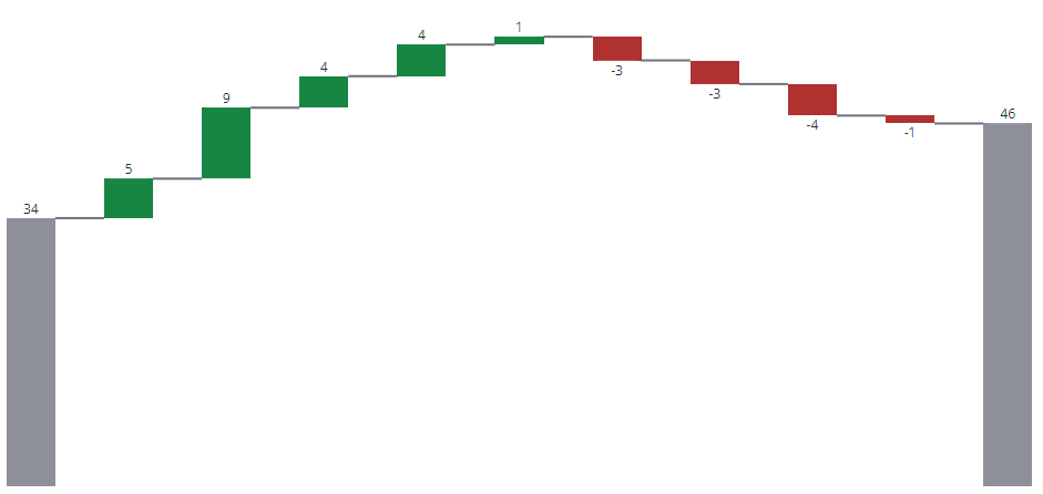
ptcs-chart-core-waterfall is a slotted core component for visualizing data as Waterfall charts.
Waterfall charts visualize changes to data. A bar in a waterfall chart can either represent:
- A summary, where the bar shows the current value
- A positive change
- A negative change
Optional connector lines can be added to emphasize that each bar represents a change to the same value.
Usage Example
                <ptcs-chart-core-waterfall id="chart" slot="chart" part="core-chart" style="pointer-events: auto"
                    tabindex\$="[[_delegatedFocus]]"
                    disabled="[[disabled]]"
                    data="[[data]]"
                    legend="[[legend]]"
                    tooltip-template="[[tooltipTemplate]]"
                    x-type="{{_labels}}"
                    x-min="{{_xMin}}"
                    x-max="{{_xMax}}"
                    y-min="{{_yMin}}"
                    y-max="{{_yMax}}"
                    y-value-format="[[yAxisNumberFormatSpecifier]]"
                    show-values="[[_showValues(sparkView, hideValues, showValues)]]"
                    flip-axes="[[flipAxes]]"
                    reverse-x-axis="[[reverseXAxis]]"
                    reverse-y-axis="[[reverseYAxis]]"
                    x-scale="[[_xScale]]"
                    y-scale="[[_yScale]]"
                    filter-legend="[[_selectedLegend]]"
                    show-y2-axis="[[_showY2Axis(showY2Axis, isReferenceLines)]]"
                    zoom-select="[[_zoomSelect(xZoomSelect, noXZoom, yZoomSelect, noYZoom)]]"
                    zoom-drag-x="[[_zoomDrag(xZoomDrag, noXZoom)]]"
                    zoom-drag-y="[[_zoomDrag(yZoomDrag, noYZoom)]]"
                    selection-mode="[[selectionMode]]"
                    unselectable="[[unselectable]]"
                    summary-bars="[[summaryBars]]"
                    hide-connector-lines="[[hideConnectorLines]]"
                    trend-colors="[[trendColors]]"
                    on-chart-selection="_onSelectionChanged"
                    on-zoom-selection="_onZoomSelection"></ptcs-chart-core-waterfall>
Component API
Properties
| Property |
Type |
Description |
| disabled |
Boolean |
Disables the Waterfall chart |
| stacked |
Boolean |
Is the data stacked? |
| data |
Array |
Received data in format = [x-value, [y-values], [state-values], {additional tooltip tokens by <key: value>}] |
| legend |
Array |
Names of legend items, for tooltip |
| filterLegend |
Array |
Index of selected legends |
| xType |
Object |
Generated xType |
| xMin |
Number |
Minimum x value in data |
| xMax |
Number |
Maximum x value in data |
| yMin |
Number |
Minimum y value in data |
| yMax |
Number |
Maximum y value in data |
| yValueFormat |
String |
The number format to use on the y-axis |
| xScale |
Function |
Scale that maps x-positions to x-axis |
| yScale |
Function |
Scale that maps y-positions to y-axis |
| flipAxes |
Boolean |
Swap the position of the x- and y-axes? |
| reverseXAxis |
Boolean |
Reverse the x-axis direction? |
| reverseYAxis |
Boolean |
Reverse the y-axis direction? |
| showValues |
String |
Shows the value of each bar. Supported values: "none", "inside", "outside", "inside-end" |
| zoomSelect |
Boolean |
Zoom by selecting two elements? |
| zoomDragX |
Boolean |
Zoom x-axis by click-dragging the mouse over the chart? |
| zoomDragY |
Boolean |
Zoom y-axis by click-dragging the mouse over the chart? |
| showY2Axis |
Boolean |
Display the secondary y-axis? |
| hideConnectorLines |
Boolean |
Hide Connector Lines between bars? |
| selectionMode |
String |
Set selection mode: "none" (default) - no bars can be selected. "single" - one bar can be selected. "multiple" - any number of bars can be selected. |
| unselectable |
Array |
Array of indexes, where data[index] is unselectable |
| summaryBars |
Array |
An array of x-indices that should show summary bars |
| trendColors |
Boolean |
Activate use-trend-colors attribute, if data has a single series |
| useTrendColors |
Boolean |
Computed property, set if trendColors is true and data is not stacked |
| tooltipTemplate |
String |
Custom tooltip to display when a data point on the chart is selected. You can show a title, text, data values, and create new lines. Use the following syntax: Add #title# before a string to show a title, #newline# to create a new line, ${} to display data from available bar chart tokens: ${label}, ${series}, ${value}). |
Events
| Name |
Data |
Description |
| series-click |
(serieIx, valueIx, x, y) |
Bar data |
| zoom-selection |
detail: {x: left, y: top, w: right - left, h: bottom - top} |
Selected area |
| chart-selection |
selection |
Chart selection |
Styling
Parts
| Part |
Description |
| bar |
A bar in the waterfall chart |
| bridge |
Connector line between two bars |
| value |
The bar value |
| drag-rect |
The zoom drag rectangle |
State attributes
| Attribute |
Description |
Part |
| disabled |
Is the Waterfall Chart disabled? |
:host |
| stacked |
Is the data stacked? |
:host |
| flip-axes |
Swap the positions of the x and y axes? |
:host |
| dragging |
Dragging mouse over chart? |
:host |
| Attribute |
Description |
Part |
| disabled |
Is the Schedule Chart disabled? |
:host |
| flip-axes |
Swap the positions of the x and y axes? |
:host |
| reverse-x-axis |
Reverse the x-axis? |
:host |
| reverse-y-axis |
Reverse the y-axis? |
:host |
| hide-connector-lines |
Hide the connector lines between bars? |
|
| use-trend-colors |
Use trend colors? |
:host |