ptcs-chart-core-schedule
Visual
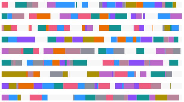
Overview
ptcs-chart-core-schedule is a slotted core component for visualizing schedule data. Schedule data consists of a collection of objects with associated schedule items. A schedule object is represented using a unique name, where each schedule item has the following properties:
| name |
description |
reason |
the reason for the item (e.g. 'Maintenance', 'Running', ... ) |
info |
optional info, to be displayed in the items tooltip |
start |
the start time of the item (a JavaScript Date) |
start |
the end time of the item (a JavaScript Date) |
color |
an optional CSS color for explicitly controlling the color of the item |
The syntax for the schedule data is therefore:
data ::= [
    object,
    [
        item+  // Any number of items here
    ]
]

object ::= <string>

item ::= {
    reason: <string>,
    info:   <string>?,
    start:  <Date>
    end:    <Date>
    color:  <CSS color, e.g. 'red' or '#8030F7'>?
}
Usage Example
                <ptcs-chart-core-schedule slot="chart" id="chart" part="core-chart" style="pointer-events: auto"
                    tabindex\$="[[_delegatedFocus]]"
                    disabled="[[disabled]]"
                    legend="[[legend]]"
                    tooltip-template="[[tooltipTemplate]]"
                    data="[[data]]"
                    selected-data="{{selectedData}}"
                    labels="{{labels}}"
                    x-min="{{_xMin}}"
                    x-max="{{_xMax}}"
                    y-min="{{_yMin}}"
                    y-max="{{_yMax}}"
                    flip-axes="[[flipAxes]]"
                    reverse-x-axis="[[!reverseXAxis]]"
                    reverse-y-axis="[[reverseYAxis]]"
                    x-scale="[[_xScale]]"
                    y-scale="[[_yScale]]"
                    filter-legend="[[_selectedLegend]]"
                    zoom-select="[[_zoomMouseOpt(zoomSelect, noXZoom, noYZoom)]]"
                    zoom-drag="[[_zoomMouseOpt(zoomDrag, noXZoom, noYZoom)]]"
                    selection-mode="[[selectionMode]]"
                    on-selection="_onChartSelection"></ptcs-chart-core-schedule>
Component API
Properties
| Property |
Type |
Description |
| data |
Array |
Schedule data |
| labels |
Array |
Labels array |
| disabled |
Boolean |
Is the schedule chart disabled? |
| xMin |
Number |
Minimum x value in data |
| xMax |
Number |
Maximum x value in data |
| yMin |
Number |
Minimum y value in data |
| yMax |
Number |
Maximum y value in data |
| xScale |
Function |
Scale that maps x-positions to x-axis |
| yScale |
Function |
Scale that maps y-positions to y-axis |
| flipAxes |
Boolean |
Swap the position of the x- and y-axes? |
| reverseYAxis |
Boolean |
Reverse the y-axis direction? |
| legend |
Array |
Array of strings that specifies the legend names |
| filterLegend |
Array |
Array to hide or show the corresponding legend |
| zoomSelect |
Boolean |
Zoom by selecting two elements? |
| zoomDrag |
String |
Zoom by click-dragging the mouse over the chart: 'x' || 'y' || 'xy' || undefined |
| dragging |
Boolean |
Dragging the mouse over the chart? |
| selectedData |
Object |
Selected chart data |
| selectionMode |
String |
Set selection mode: "none" (default) - no items can be selected. "single" - one item can be selected. "multiple" - any number of items can be selected. |
| tooltipTemplate |
String |
Custom tooltip to display when a data point on the chart is selected. You can show a title, text, data values, and create new lines. Use the following syntax: Add #title# before a string to show a title, #newline# to create a new line, ${} to display data from available bar chart tokens: ${label}, ${series}, ${value}). |
Events
| Name |
Data |
Description |
| series-click |
Info about schedule item |
Event generated when the user selects a schedule item |
| chart-selection |
selection |
Chart selection |
Styling
Parts
| Part |
Description |
| group |
A row in the schedule chart |
| task |
An entry within a group |
| drag-rect |
The zoom drag rectangle |
State attributes
| Attribute |
Description |
Part |
| disabled |
Is the Schedule Chart disabled? |
:host |
| flip-axes |
Swap the positions of the x and y axes? |
:host |
| dragging |
Dragging mouse over chart? |
:host |