Bottleneck Analysis Chart
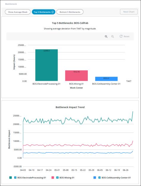
The bottleneck analysis chart identifies the top production bottlenecks so that you can prioritize the operational improvement initiatives that will have the most impact on your manufacturing processes. The data displayed in the bottleneck chart is determined by the applied filters. Below the main chart, two additional panes provide details about the data that is displayed and selected in the main bottleneck chart. The title for the main bottleneck chart includes the name of the site selected in the filter. Each bar in the main bottleneck chart represents a work center in the site and area (if any) that are selected in the applied filter and shows the work center’s bottleneck impact. The bottleneck impact in hours is displayed at the top of each bar.

The bottleneck impact for an individual work center indicates how far the work center’s actual performance is from its expected performance. This is calculated as the deviation from TAKT for the work center multiplied by the total demand for the work center. TAKT is the time required to produce a unit of material in order to meet the customer demand for a given time frame. The deviation from TAKT is the difference between the actual cycle time for a work center (how long it actually takes the work center to produce a unit of material) and the TAKT time for the work center. As a result, the greater the deviation from TAKT, the larger the bottleneck impact is for the work center.
The TAKT line in the bottleneck chart is at 0, as it does not represent a specific TAKT value but rather provides the baseline to show how far from TAKT each work center is performing. A negative number for a bar indicates that the work center is producing below (better than) TAKT.
Three buttons at the top of the screen determine the main chart view:
• Top 5 Bottlenecks—Displays the five work centers that have the highest bottleneck impact on your processes. These top bottlenecks are displayed in descending order, with the largest on the left. This is the default view.
If no good count has been produced for completed job orders on a work center, then that work center is the largest bottleneck. The deviation from TAKT in this situation is technically infinite and cannot be calculated. For readability, when such a work center is displayed in the bottleneck chart, it is calculated as 1.25 times the highest calculable bottleneck. An asterisk appears at the start of the work center name in this case. |
• Bottom 5 Bottlenecks—Displays the five work centers with the least bottleneck impact on your processes. These bottom bottlenecks are displayed in ascending order, with the lowest on the left.
• Show Average Week—Displays the bottleneck chart data normalized to a 168 hour week. This has no impact on the bottom panes.
Hover over a bar in the chart to see the work center name and bottleneck impact in hours for that bar in a tool tip.
To zoom in, click  You can also zoom in by clicking and dragging over the portion of the chart that you want to see in more detail. To zoom out, click
  . Click Reset to return to the full chart display. Zooming or resetting the chart does not impact the filtered information.
To navigate to the waterfall chart, select the bar for a work center and click Next Chart.
Bottom Panes
Below the main bottleneck chart, two panes display additional information, depending on whether a bar is selected in the main bottleneck chart. These bottom panes are not impacted by the Show Average Week toggle.

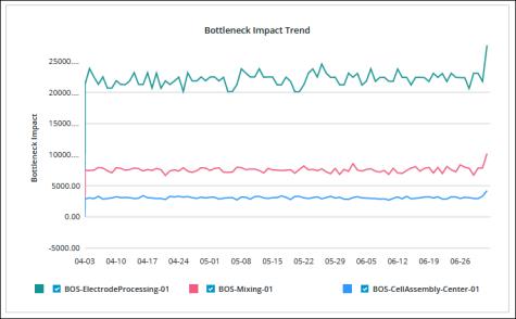
When no bar is selected in the chart, the Bottleneck Impact Trend chart on the left displays the trend information for each work center in the bottleneck chart. Hover over a day in the trend line to view a tooltip with the value for that day. A day is considered to be midnight to midnight in the current user’s local time zone. Use the checkboxes below the trend chart to remove and add back trend lines for the individual work centers.
When the bar for a work center is selected in the chart:

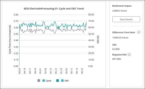
• The Cycle and OEE Trend chart on the left displays the OEE and actual cycle time trend information for the selected work center. Hover over a day in the trend line to view a tooltip with the value for that day. A day is considered to be midnight to midnight in the current user’s local time zone. Depending on the data that is displayed, the chart lines for the cycle and OEE values can overlap, appearing to be a single line. Use the checkboxes below the trend chart to remove and add back either trend line for ease of viewing.
• The Bottleneck Impact pane on the right shows details for the bottleneck impact of the selected work center, including:
◦ Bottleneck Impact—The total number of hours for the bottleneck impact for the selected work center. Click View Details to see the information used in calculating the bottleneck impact.
◦ Difference From Next—The difference between the bottleneck impact for the selected work center and the next most impactful bottleneck.
◦ OEE—The actual OEE for the selected work center.
◦ Required OEE—The OEE that is required for the selected work center to meet its demand.
The formula for calculating the required OEE is as follows: [the sum of (ideal cycle time * demand allocated to the work center) for each material] / TAKT for the work center
For more information on ideal cycle time, see Material Settings Tab. For more information on allocating demand, see Demand Allocation Tab
Impact Details Window
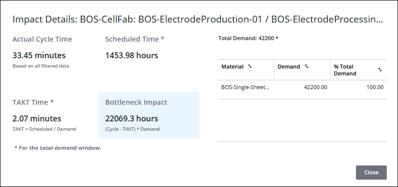
The Impact Details window shows additional information that is used in calculating the bottleneck impact for the work center.

The window title includes the name of the area and the work center for which the bottleneck impact information is displayed. This information includes:
• Actual Cycle Time—The actual cycle time for the filtered demand window or date range. This value is calculated as the total production time for the time frame (scheduled shifts and overtime) divided by the total good count of the materials produced across all job orders that were completed during that time frame.
• Scheduled Time—The total duration of scheduled shifts within the selected demand window.
• TAKT Time—The TAKT time for the work center.
• Bottleneck Impact—The calculated bottleneck impact for the work center. This value is calculated as the actual cycle time minus the TAKT time, multiplied by the total demand for the work center.
• Total Demand—The total demand for the work center for the demand window. This is the Total Demand value on the Demand Settings tab for the work center.
When demand for the demand window is set on materials and there is demand specified on one or more materials, a table also lists every material that was produced on this work center during the demand window. For each material, the material demand is displayed, along with its percentage of the total demand.
When the demand for the demand window is set on materials, but there is no demand entered on any material, then DPM uses the manually specified TAKT value for the work center to calculate the bottleneck impact. In this scenario, there is no Total Demand value to display. For more information, see Configuring Bottleneck Analysis with TAKT Only.