Time Loss Waterfall Chart
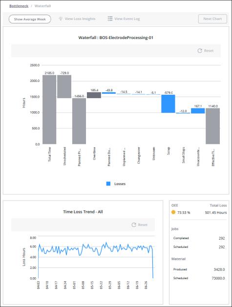
The time loss waterfall chart visualizes global losses, providing a framework for understanding high-level loss categories. The data displayed in the waterfall chart is determined by the applied filters. The title for the waterfall chart includes the name of the equipment selected in the filters. If a specific material is selected in the filters, then the chart title also includes the name of the selected material.
Below the main chart, two additional panes provide details about the data displayed and selected in the main waterfall chart.

The number of hours for each bar in the waterfall chart is displayed at the top of the bar. The direction of the bar is indicated by whether the number is positive or negative. A positive number indicates that the bar is presented from the bottom up; a negative number indicates that the bar is presented from the top down.
Use the Show Average Week toggle to view the data in the main waterfall chart normalized to a 168 hour week. The information in the bottom panes is not impacted by this view.
Click View Loss Insights to explore data from the ThingWorx Analytics Server identifying the most impactful scenarios related to time loss. For more information, see Viewing Loss Insights.
When the applied equipment filter is for a site, area, or work center, and the filtered date range is 1 month (31 days) or less, click View Event Log to open a read-only event log showing the loss events for the currently displayed data.
Hover over a bar in the chart to see the total time for that bar in a tool tip.
After selecting a bar in the chart, you can use the right and left arrow keys on your keyboard to navigate to other bars and view their tooltips. Once you have navigated to a blue bar, you can press ENTER to select the bar. This is particularly useful in situations where you have both very large and very small bars in the chart, as the small bars can be difficult to hover over and select. |
To zoom in, click  You can also zoom in by clicking and dragging over the portion of the chart that you want to see in more detail. To zoom out, click
  . Click Reset to return to the full chart display. Zooming or resetting the chart does not impact the filtered information.
Understanding the Grey and Blue Bars
The blue bars on the waterfall chart represent time loss, grouped into the high-level loss categories. In the waterfall chart, these are the loss categories that are set as the Event Category when entering a loss event, and any time loss that has not yet been accounted for. Only those loss categories that have data for the selected equipment and date range are displayed as blue bars in the waterfall chart. The time loss displayed in each blue bar, except for Unaccounted Time, is the sum of all loss events with that event category on all work units within the selected Equipment filter, including previous pacemakers.
• Planned Downtime—Scheduled time during which the equipment is non-operational, for example, during routine maintenance.
• Unplanned Downtime—Time that was not scheduled during which the equipment is non-operational, for example, during a power loss.
• Changeover—Time that is spent reconfiguring equipment to produce a different material.
• Speed Loss—A loss in efficiency while the equipment is operational, for example, when the equipment running is impaired.
• Small Stops—Time lost to minor stops in operation that are too small to be considered downtime.
• Scrap—The time loss equivalent for scrapped material, based on ideal cycle time. The time loss for scrap is calculated as the number of scrapped units multiplied by the ideal cycle time for that material on that equipment.
• Unknown—Time loss with an unknown cause.
• Unaccounted Time—Time loss for which no loss event has been entered. If the filtered date range includes the current date, this includes all unaccounted time up to the current time. If there is overproduction or you have inadvertently logged more loss time than the duration of your production blocks, the Unaccounted Time calculation can result in a negative value. This causes the bar to appear positive in the waterfall chart.
Selecting any blue bar in the main waterfall chart, except for Unaccounted Time, changes the information displayed in the bottom panes.
The grey bars on the waterfall chart represent time that is not time loss.
• Total Time—The total number of hours in the date range for all pacemakers within the selected Equipment filter. For example, you’ve applied a Date Range filter of April 5 through April 14, and an Equipment filter for Site A. The date range has a total of 10 days or 240 hours. Site A has 4 work centers. Each work center has 1 pacemaker, for a total of 4 pacemakers. The total time displayed in the waterfall chart is 960 hours, or 10 days multiplied by 24 hours, multiplied by 4 pacemakers.
• Unscheduled—Time that is outside of a scheduled shift and time during shifts that are designated as overtime shifts. Overtime shifts are not considered to be scheduled shifts.
• Planned Production—Time that is scheduled for production as scheduled shifts. Overtime shifts are not considered to be scheduled shifts.
• Overtime—Time that is worked outside of scheduled shifts and during shifts that are designated as overtime shifts. A shift is designated as an overtime shift when the Overtime checkbox is selected for the shift in > . Overtime shifts are not considered to be scheduled shifts.
• Effective Time—The total time that is being used to effectively produce materials. This is calculated by subtracting all losses from the planned production time plus any overtime. If there is overproduction, this can result in a negative Unaccounted Time value, which can cause the Effective Time value to appear negative in the waterfall chart.
For more information, see Time Calculations in DPM.
The following image shows examples of times that would be included in the Planned Production, Unscheduled, and Overtime bars.

In this example:
• The time from 08:00 to 13:00 is Planned Production. Shift 1 and Shift 2 are scheduled shifts.
• The time from 13:00 to 17:00 is Unscheduled. This includes both the times when there is no scheduled shift and time during the overtime shift.
• The time from 14:00 to 17:00 is Overtime. This includes:
◦ The time during the overtime shift, from 14:00 to 16:30.
◦ The time from 16:30 to 17:00 when Job Order C was in production after the overtime shift ended and outside of a scheduled shift.
Bottom Panes
Below the main waterfall chart, two panes display additional information for the data displayed in the main waterfall chart. These bottom panes are not impacted by the Show Average Week toggle.
The pane on the left displays the Time Loss Trend chart. When no blue bars are selected in the main waterfall chart, the trend chart displays the total loss hours across all loss categories for all pacemakers within the selected Equipment filter for each day in the date range. In this display, the chart title is Time Loss Trend – All. When a blue bar is selected, the time loss values displayed are for that loss category only. In this display, the chart title includes the loss category for the selected bar, for example, Time Loss Trend – Scrap. This trend chart has the same zoom functionality as the main waterfall chart.
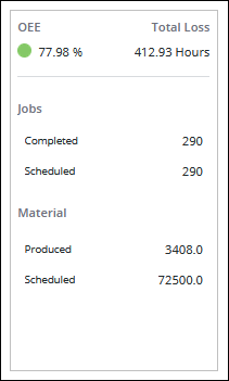
When a grey bar, the blue bar for the Unaccounted loss category, or nothing is selected in the main waterfall chart, the pane on right displays summary information for the filtered equipment and date range that are shown in the main waterfall chart.

This information includes:
• OEE—The OEE (overall equipment efficiency) value.
• Total Loss—The total loss hours. This is the sum of the loss hours for the filtered date range and equipment. If the date range includes the current date, this sum includes all unaccounted time through the end of the current production block. If the Unaccounted Time bar’s value is negative, this can result in a negative Total Loss value.
• Jobs—
◦ Completed—The number of job orders that were completed during the date range.
◦ Scheduled—The number of job orders that were scheduled during the date range. Scheduled job orders are those job orders in any status that have a planned end date or completion date during the date range.
• Material—
◦ Produced—The number of good materials produced for job orders that were completed on the selected equipment during the date range.
◦ Scheduled—The number of materials scheduled to be produced during the date range. This is the sum of the target quantities for all of the scheduled job orders.
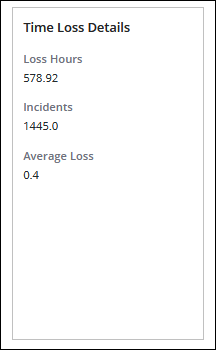
When the blue bar for a loss category other than Unaccounted is selected in the main waterfall chart, the pane on the right displays Time Loss Details for the selected loss category.

These details include:
• Loss Hours—The total loss hours for the loss category.
• Incidents—The number of loss events represented in the blue bar.
• Average Loss—The average loss, calculated as Loss Hours divided by Incidents.