| allowDecimals |
Boolean |
Allows decimal values when using numeric entry mode. |
|
No |
| allowNegativeValues |
Boolean |
Allows negative values when using numeric entry mode. |
|
No |
| allowResize |
Boolean |
Enables users to resize the text field horizontally at runtime |
false |
No |
| counter |
Boolean |
Adds a characters counter at the end of the field |
|
No |
| decimalPlaces |
Number |
Sets the number of allowed decimal places for the numeric value. |
0 |
No |
| disabled |
Boolean |
Disables the component |
false |
No |
| hasText |
Boolean |
A read-only property that indicates whether the text has a non-empty value. |
|
No |
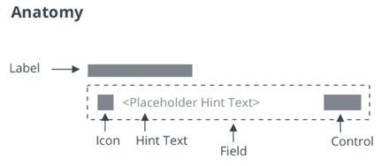
| hintText |
String |
The hint text to show for an empty text field |
"" |
No |
| icon |
String |
Specifies the icon with an icon set |
"" |
No |
| iconSet |
String |
A URL to an SVG icon set from which to select an icon (identified via icon) |
|
No |
| label |
String |
The label that is shown for the text field |
"" |
No |
| labelAlignment |
String |
Aligns the label to the right, left, or center. |
"left" |
No |
| mask |
String |
Specifies the mask of the following format: a-alpha, 9-numeric, *-alphanumeric |
"" |
No |
| maxNumberOfCharacters |
Number |
Allows only specified amount of characters. When this property is used with numeric mode enabled and negative numbers allowed, the minus sign counts as one of the characters. |
1000000 |
No |
| errorThreshold |
String |
Lets users set error threshold above which the error should be shown. It can be set in percentage (for example, 43%) as well as numberOfCharacters (for example, 43). |
0.9 |
No |
| password |
Boolean |
If true, characters are masked |
false |
No |
| readOnly |
Boolean |
This attribute indicates that the user cannot modify the value of the control |
false |
No |
| showClearText |
Boolean |
Deprecated. Adds a clear-text button at the end of the field |
|
No |
| hideClearText |
Boolean |
Hides the clear-text button at the end of the field |
false |
No |
| text |
String |
The initial value of the control. Supports two-way data binding |
"" |
Yes |
| textAlignment |
String |
Sets the text alignment to left, right or center. |
"left" |
No |
| tooltip |
String |
The tooltip that appears when hovering over the text field, or when it has keyboard focus |
"" |
No |
| tooltipIcon |
String |
The icon for the tooltip |
"" |
No |
| iconWidth |
String |
Sets a fixed width for the icon (both iconWidth and iconHeight should be set, otherwise the icon default size is set) |
|
No |
| iconHeight |
String |
Sets a fixed height for the icon (both iconWidth and iconHeight should be set, otherwise the icon default size is set) |
|
No |
| validity |
String |
Returns the value of validation: "undefined", "unverified", "invalid" or "valid" |
|
No |
| extraValidation |
Function |
Custom client validation function. This is invoked with the text component itself as parameter, so that it can use any ptcs-textfield property for custom validation. Can return true (= valid), false (= invalid), or undefined (ignore validation) |
|
No |
| externalValidity |
String |
Controls the state of the validation. You can set this property to unvalidated, valid, or invalid. |
|
No |
| hideValidationCriteria |
Boolean |
Don't show validation criteria in unvalidated state? |
|
No |
| hideValidationError |
Boolean |
Don't show validation error state? |
|
No |
| hideValidationSuccess |
Boolean |
Don't show validation success state? |
|
No |
| required |
Boolean |
Validation criterion: Need to enter text |
|
No |
| requiredMessage |
String |
The message that is displayed when no text is entered. |
"A value is required" |
No |
| minlength |
Number |
Validation criterion: minimum text length |
|
No |
| minLengthFailureMessage |
String |
The message to display when the value is invalid because of min length |
|
No |
| minValue |
Number |
Sets the minimum numeric value for the widget. |
|
No |
| minValueFailureMessage |
String |
The message to display when the numeric value is under the minimum. |
"" |
No |
| maxlength |
Number |
Validation criterion: maximum text length |
|
No |
| maxLengthFailureMessage |
String |
The message to display when the current value exceeds the maximum character length. |
|
No |
| maxValue |
Number |
Sets the maximum numeric value for the widget. |
|
No |
| maxValueFailureMessage |
String |
The message to display when the numeric value is over the maximum. |
"" |
No |
| numericFormatToken |
String |
Enter a localization token to format of the numeric value. When a format token is set, it overrides the AllowDecimals, AllowNegativeValues and DecimalPlaces properties. |
|
No |
| numericInputMode |
Boolean |
Enables the numeric input mode for the widget. In this mode, only numeric entry is supported. |
false |
No |
| numericValue |
Number |
Sets or retrieves the numeric value of the widget. |
0 |
No |
| stepSize |
Number |
Controls the step size for the numeric value when using keyboard shortcuts. |
1 |
No |
| validationCriteria |
String |
The validation details message |
|
No |
| validationCriteriaIcon |
String |
Icon for criteria state (unvalidated). |
"cds:icon_info" |
No |
| validationErrorIcon |
String |
Icon for error state (invalid). |
"cds:icon_error" |
No |
| validationMessage |
String |
The validation (title) message |
|
No |
| validationSuccessDetails |
String |
The validation success details message |
|
No |
| validationSuccessIcon |
String |
Icon for success state (valid). |
"cds:icon_success" |
No |
| validationSuccessMessage |
String |
The validation success (title) message. |
"Success" |
No |