ptcs-chart-pie
Visual
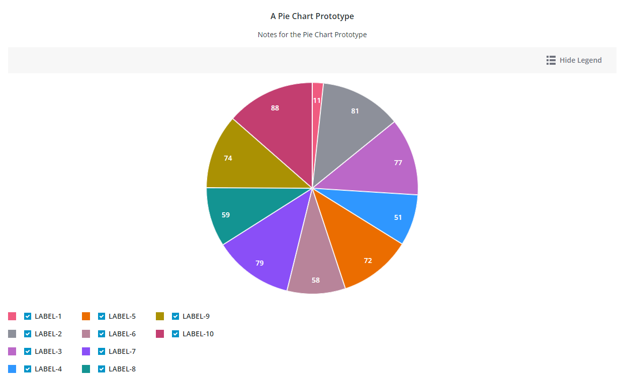
Overview
ptcs-chart-pie is a compound component that enables you to visualize data as a pie or a donut chart. In addition to the pie chart area, the component has areas for a title, notes, legend, and an action bar area that contains controls for the legend visiblity, zoom, and selecting all slices when multiple selection is enabled.
Usage Examples
Basic Usage
<ptcs-chart-pie items="[[pie-chart-data]]"></ptcs-chart-pie>
Component API
Properties
| Property | Type | Description | Default |
|---|---|---|---|
| titleLabel | String | The chart title | |
| titlePos | String | Specifies the title position. Supported values: "top", "bottom", "left", or "right" | top |
| titleAlign | String | Specifies the title alignment. Supported values: "left", "center", or "right" | center |
| titleVariant | String | The variant assigned to the title ptcs-label |
header |
| notesLabel | String | The notes text | |
| hideNotes | Boolean | Hide the notes? | false |
| notesPos | String | Specifies the notes position. Supported values: "top", "bottom", "left", or "right" | bottom |
| notesAlign | String | Specifies the notes alignment. Supported values: "left", "center", or "right" | center |
| chartState | String | Specifies the chart 'error' state. Supported values: data, loading, no-data or error |
data |
| iconStateLoading | String | Specifies the icon to display when the chart data is loading | |
| labelStateNoData | String | Specifies the text to display when the chart is not bound to a data source | |
| iconStateNoData | String | Specifies the icon to display when the chart is not bound to a data source | |
| labelStateEmpty | String | Specifies the text to display when the bound infotable does not contain any data | |
| iconStateEmpty | String | Specifies the icon to display when the chart is empty | |
| labelStateError | String | Specifies the text to display when the chart data cannot be loaded | |
| iconStateError | String | Specifies the icon to display when the chart data cannot be loaded | |
| hideLegend | Boolean | Hide the chart legends area | false |
| legendPos | String | Specifies the legend position. Supported values: "top", "bottom", "left", or "right" | "right" |
| legendAlign | String | Specifies the alignment of the legend. Supported values: "start", "center", or "end" | start |
| legendShape | String | Specifies the shape of the legend. Supported values: "square", "circle", "none" | square |
| filterLegend | Boolean | If true, each legend item has a checkbox that allows the user to hide or show the corresponding data | false |
| actionBar | String | Specifies the action bar position. Supported values: "top", "bottom" | top |
| sparkView | Boolean | Displays chart preview by hiding certain parts e.g. legend | false |
| legendMaxWidth | Number | Sets the maximum width of each legend label | |
| selectionMode | String | Set selection mode: "none" (default) - no slices can be selected. "single" - one slice can be selected. "multiple" - any number of slices can be selected. The "multiple" option displays a link in the Action bar area for selecting / un-selecting all slices. |
"none" |
| donut | Number | Sets the size of the hole in the center of the pie chart. Use this property to display a Donut chart. Supported values are between 0 and 0.99 | |
| polar | Boolean | Uses the radius to visualize the difference between values. Each category is displayed at an equal angle | false |
| padAngle | Number | Sets the size of the padding between the Pie chart slices | |
| startAngle | Number | Sets the start angle for the chart | |
| endAngle | Number | Sets the end angle for the chart | |
| cornerRadius | Number | Specifies the corner radius for the chart slices | |
| highlightSelection | Boolean | When enabled, the selected slices are pushed out and offset from the main chart | false |
| showValues | String | Shows the value of each slice. Supported values: "none", "inside", "outside" | inside |
| valuePos | String | Sets the position of the data labels relative to the slices. Supported values: marker, in, out or out with line |
marker |
| percentLabel | Boolean | Converts and displays the data values as percentages | false |
| insideLabelShowHide | Boolean | Shows a data label next to a donut chart slice when it is in a selected, hover, or focus state | false |
| singleInsideValueLabel | String | The variant assigned to the Inside Value Label ptcs-label |
header |
| data | Array | The chart data | |
| tooltipTemplate | String | Custom tooltip to display when a data point on the chart is selected. You can show a title, text, data values, and create new lines. Use the following syntax: Add #title# before a string to show a title, #newline# to create a new line, ${ |
|
| disabled | Boolean | Is the pie chart disabled? |
Events
| Name | Data | Description |
|---|---|---|
| series-click | no data | |
| selected-data-changed | selection | Chart selection |
Styling
The Parts of a Pie Chart
A ptcs-chart-pie consist of these sub-components:
- ptcs-chart-layout, for chart layouts
- ptcs-chart-legend, for chart legend
- ptcs-chart-core-pie, for the pie charts
- ptcs-toolbar, for the
Select All/Clear Alllink, theShow Legend/Hide Legendbutton to toggle legend visibility.
Parts
| Part | Description |
|---|---|
| chart-layout | The ptcs-chart-layout subcomponent |
| title-area | The chart title area container |
| title-label | The chart title |
| notes-area | The chart notes area container |
| notes-label | The chart notes title |
| core-chart | The ptcs-chart-core-pie subcomponent |
| legend-area | The legend area container |
| legend | The ptcs-chart-legend subcomponent |
| action-bar-area | The action bar area container |
| action-bar | The ptcs-toolbar subcomponent |
The title-label and notes-label are assigned the same maximum width as their parents (title-area and notes-area).
State attributes
| Attribute | Description | Part |
|---|---|---|
| disabled | Is the Pie Chart disabled? | :host |