ptcs-list-shuttle
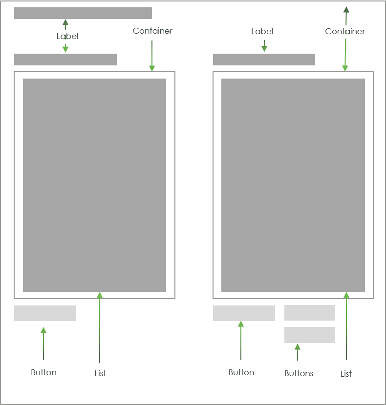
Visual
Overview
A ptcs-list-shuttle allows the user to select items from a source list and move it to a target list, where the items can be rearranged. Items in the target list can be moved back to the source list.
The list-shuttle supports both single and multiple selection mode. The source-list can be filtered.
Usage Examples
Basic Usage
<ptcs-list-shuttle items="[[itemsIn]]" selected-items="[[itemsOut]]></ptcs-list>
Single selection list shuttle
<ptcs-list single-select ...></ptcs-list>
List shuttle that hides the search filter
<ptcs-list hide-filter ...></ptcs-list>
Component API
Properties
| Property | Type | Description | Default | Triggers a changed event? |
|---|---|---|---|---|
| addLabel | String | Label for the add button | "Add" | |
| disabled | Boolean | Is the list-shuttle disabled? | false | |
| hideFilter | Boolean | Hide the source-list search filter? | ||
| idSelector | Any | Selects a string from each item in items as the identifier for each list item. If unassigned, the 'selector' acts as the identifier. If a string then items should be an array of objects, where idSelector specifies the (string) property to use as a unique identifier. If a function, then the function is called with each item and should return a string that represents the item | ||
| items | Array | A Javascript array with the list data. | [ ] | |
| label | String | Title label for the list shuttle | "" | |
| labelAlignment | String | Alignment of the "main" label.possible options are 'left', 'center' and 'right'. | "left" | |
| labelType | String | Variant to use for the "main" label. possible options are 'label', 'header', 'sub-header', and 'body'. | "label" | |
| labelUp | String | Label for the move up button | "Up" | |
| labelDown | String | Label for the move down button | "Down" | |
| removeLabel | String | Label for the remove button | "Remove" | |
| selectedItems | Array | The subset of the items in items that occurs in the target list |
[ ] | Yes |
| selector | Any | Selects a string from each item in items to be displayed as the list item label. If unassigned, items should be an array of strings. If a string then items should be an array of objects, where selector specifies the (string) property to display. If a function, then the function is called with each item and should return a string that represents the item | ||
| singleSelect | Boolean | Use single (true) or multiple (false) selection mode in the lists? | false | |
| selectAllLabel | String | Label for selecting all of the source / target list items | "Select All" | |
| clearSelectedItemsLabel | String | Label for clearing the source / target list items selection | "Clear Selected Items" | |
| sourceLabel | String | Label for the source list | "Source" | |
| sourceLabelAlignment | String | Alignment of the source list label. possible options are 'left', 'center' and 'right'. | "left" | |
| sourceLabelType | String | Variant to use for the label above the source list. possible options are 'label', 'header', 'sub-header', and 'body'. | "label" | |
| sourceFilter | String | The current text in the source-list search filter. | "" | Yes |
| targetLabel | String | Label for the target list | "Target" | |
| targetLabelType | String | Variant to use for the label above the target list. possible options are 'label', 'header', 'sub-header', and 'body'. | label | |
| targetLabelAlignment | String | Alignment of the target list label. possible options are 'left', 'center' and 'right'. | "left" | |
| externalValidity | String | The component's validity as determined externally (server-side). Value: undefined, unvalidated, invalid, or valid |
No | |
| required | Boolean | If true, the target list must contain at least one item. | false | No |
| requiredMessage | String | The message to display when required target list item(s) is missing. | No | |
| targetListMaxItems | Number | The maximum number of target list items. | No | |
| targetListMaxItemsFailureMessage | String | The error message when the number of target item(s) exceeds limit targetListMaxItems. |
No | |
| targetListMinItems | Number | The minimum number of target list items. | No | |
| targetListMinItemsFailureMessage | String | The error message when the number of target item(s) is less than targetListMinItems. |
No | |
| hideValidationCriteria | Boolean | Don't show a hint message about the required selection in unvalidated state? | false | |
| hideValidationError | Boolean | Don't show a failure message when the validation failed? | false | |
| hideValidationSuccess | Boolean | Don't show a success message when the validation is successful? | false | |
| validationCriteria | String | A secondary message that displays more information about the validation failure/criteria message. | ||
| validationCriteriaIcon | String | An icon to display within the criteria status message (unvalidated). | "cds:icon_info" | |
| validationErrorIcon | String | An icon to display within the status message when the validation fails (invalid). | "cds:icon_error" | No |
| validationOutput | String | Reflects the internal validition (Value: undefined, unvalidated, invalid, or valid) |
Yes | |
| validationMessage | String | The validation (title) message to display when the validation is in invalid state. |
No | |
| validationSuccessDetails | String | A secondary message that displays more information about the validation success message. | ||
| validationSuccessIcon | String | An icon to display within the status message when the validation succeeds (valid). | "cds:icon_success" | |
| validationSuccessMessage | String | The message (title) to display when the validation is successful. |
Styling
State attributes
| Attribute | Description | Part |
|---|---|---|
| disabled | Is list-shuttle disabled? | :host |
| vertical | Is the list-shuttle in vertical mode (lists stacked on top of each other) or in horizontal mode (lists side-by-side)? | :host |
Parts
| Part | Description |
|---|---|
| add-button | The add button |
| button | Part name used on all buttons |
| buttons | Button container (= source-buttons and target-buttons) |
| down-button | The down button |
| head | Container for the title label |
| label | The shuttle title label |
| remove-button | The remove button |
| source-buttons | Container for the button associated to the source list |
| source-list | The source list |
| source-list-parent | Container for the source list (previously 'source-list-container') |
| target-buttons | Container for the buttons associated to the target list |
| target-list | The target list |
| target-list-parent | Container for the target list (previously 'target-list-container') |
| up-button | The up button |
Note: A part name collision of the imported source and target lists has caused a part name change. The list has a part list-container and the part import
process adds a prefix to imported list parts (source- and target-, respectively), causing a clash with the earlier ptcs-list-shuttle part names for the
list containers.