ptcs-kpi-dial
Visual
Overview
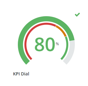
The KPI Dial displays a metric's value in context of defined target ranges. The dial can be configured for a traditional, gauge-like layout, or a horizontal/vertical bar layout.
Usage Examples
Basic Usage
<ptcs-kpi-dial layout="horizontal" label="My Label" min-value="10" max-value="20" value="13" unit-of-measure="kg" show-unit-of-measure icon-position="left" valueFormat="0.00" direction="right to left" label-alignment="center"></ptcs-kpi-dial>
Component API
Properties
| Property | Type | Description | Default |
|---|---|---|---|
| label | String | Specifies the text of the KPI label. | Label |
| layout | String | Controls the type of layout used to display the KPI value. Options: dial, horizontal, vertical. |
dial |
| value | Number | Sets the KPI value. | |
| valueFormat | String | Sets the format of the KPI value. | 0000 |
| tooltipValueFormat | String | Sets the format of the KPI value inside the tooltip. | |
| minValue | Number | Sets the minimum value to display on the KPI. | 0 |
| maxValue | Number | Sets the maximum value to display on the KPI. | 100 |
| direction | String | Specifies the direction of the value tracker on the dial, horizontal, or vertical layouts. | dial: clockwise, horizontal: left to right, vertical: bottom to top |
| iconPosition | String | Specifies the position of the KPI status icon relative to the value label. Options: left, center, right |
left |
| labelType | String | The text type of the KPI label. Options: caption, body, label, title, large-title, sub-header, header, large-header. |
label |
| labelAlignment | String | Controls the alignment of the KPI's label. Options: left, center, right. |
left |
| unitOfMeasure | String | Specifies the unit of measurement for the KPI value. | |
| showUnitOfMeasure | Boolean | Displays the unit of measurement next to the KPI value. | false |
| startAngle | Number | Sets the start angle of the value and target trackers on the dial layout. Options: 0 - 360. |
45 |
| endAngle | Number | Sets the end angle of the value and target trackers on the dial layout. Options: 0 - 360. |
315 |
| stateFormat | Object | Defines the KPI target values for the value tracker. It is used to apply a custom icon and color for each value in range. | |
| maxIconSize | Number | Sets the maximum size of the KPI icon. The icon grows or shrinks relative to the size of the container |
Events
| Name | Description |
|---|---|
| click | A click event that is generated when the user clicks on the KPI Dial using the mouse, or by pressing on the Space/Enter keys while in focus. |
Styling
The Parts of a KPI Dial
| Part | Description |
|---|---|
| root | The root element that conatins the KPI value and trackers. |
| label | The KPI label. |
| value-ctr | The container of the KPI value. |
| value | The value label. |
| UOM | The unitOfMeasure label. |
| value-tracker | The background bar for the maximum value. |
| value-tracker-filling | The value bar display, filling the area up to the value's percentage. |
| target-range-tracker | A smaller bar that shows target ranges with formatting. |
| icon | The KPI icon according to the stateFormat. |