ptcs-dropdown
Visual
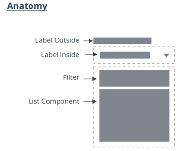
Anatomy
Overview
The Dropdown allows the user to select from a list of choices. The selection can be a single item or multiple items. The list of items is only visible when the user interacts with the dropdown.
Usage Examples
Basic Usage
<ptcs-dropdown items="[[options]]"></ptcs-dropdown>
Multi select dropdown
<ptcs-dropdown items="[[options]]" multi-select></ptcs-dropdown>
Component API
Properties
| Property | Type | Description | Default | Triggers a changed event? |
|---|---|---|---|---|
| alignment | String | Alignment of the selected value and of the items in the drop-down list | 'left' | |
| noMatchesLabel | String | The text to use when filtering the dropdown in case none of the items match. | ||
| autoSelectFirstRow | Boolean | Automatic select first item when items list is changed (true). No pre-defined selection otherwise | false | |
| clearSelectionItem | Boolean | Toggle to display an item to clear a selection in single selection list | false | |
| clearSelectionLabel | String | The custom text to display in the item to clear a selection in single selection list | " " | |
| disabled | Boolean | Is the drop-down disabled? | false | |
| displayMode | String | When displayMode is set to "default", a drop-down icon is displayed in the select box. When displayMode is set to "small", a small ptcs-button is displayed. Note: This property is deprecated and will be removed in a future release. | "default" | |
| variant | String | Enables the user to select a dropdown variant. If the selected variant is not "default" or "small", the dropdown should adopt the styling of the respective button type, including all its states. Note: This property replaces displayMode, which is deprecated and will be removed in a future release. | "default" | |
| filter | Boolean | Enables the display of a filter text-field box in the dropdown list. | false | |
| filterHintText | String | The hint text to display in the filter of the dropdown list. | "Filter" | |
| grouping | String | Enables grouping in the popup list. Selects a string from each item in items to be used as a grouping key. If grouping is a string, it specifies a field in the item that contains the grouping key. If grouping is a function, the function will be called with each item and should return the grouping key. |
||
| hideGroupsLabel | Boolean | Controls visibility of group labels. If true, all group labels are hidden. If a function, it will be called for each group and should return a boolean to determine visibility. | ||
| hintText | String | The text to display in the selected value box when no item is selected. Note: This value is inherited by the drop-down list as its hintText property. It is also used as the label for the "reset selection" option. | " " | |
| itemMeta | Object | Consists of three parts: itemMeta.type is one of "text" (default), "link", "image", or "checkbox". The value specifies whether the selected value and list items are a label, link, image, or a checkbox. When it is a link, the link label is specified by itemMeta.label and the target by itemMeta.target. The item value is used as the href of the link | type: "text" | |
| items | Array | A JavaScript array with the drop-down data | [ ] | |
| label | String | An optional label above the drop down | " " | |
| labelAlignment | String | Specifies the horizontal alignment of the dropdown's label. Acceptable values are: "left", "center", and "right". When using button variants, this property also affects the alignment of the select-button. | 'left' | |
| labelPosition | String | Controls the position of the label. Options: "top", "left", "right". | 'top' | |
| selectAllLabel | String | The text to display for the item used to select all items in the drop-down list. The item is displayed at the top of the list when no items are selected in multiple selection mode. | "Select All" | |
| clearSelectedItemsLabel | String | The text to display for the item used to clear all selections in the drop-down list. The item is displayed at the top of the list when one or more items are selected in multiple selection mode. | "Clear Selected Items" | |
| metaSelector | Any | The same as selector but selects the meta string instead. If metaSelector is "falsy", the meta string is not displayed | null | |
| multiSelect | Boolean | Enables multiple selection mode. Set to false by default. | false | |
| rowHeight | String | Sets the minimum height of the list items in the drop-down list. | '34' | |
| selected | Number | Contains the index of the selected item when selectMode is set to "single". | ||
| selectedIndexes | Array | An array with the indexes of the selected items | [ ] | yes |
| selectedItems | Array | An array with the selected items | [ ] | yes |
| selectedValue | Object | Contains the value of the (according to valueSelector) selected item when selectMode is set to "single". | yes | |
| selector | Any | Selects a string from each item in items to be displayed as the drop-down item label. If unassigned, items should be an array of strings. If a string, then items is an array of objects, where selector specifies the (string) property to display. If a function, then the function is called for each item and should return a string that represents the item. | null | |
| tooltip | String | The tooltip that appears when hovering over the dropdown (if different from the label text or ellipsis overflow text) | No | |
| tooltipIcon | String | The icon for the tooltip | No | |
| treatValueAsString | Boolean | Deprecated. Returns selectedValue as string when set to true and returns the original object when set to false. | ||
| returnOriginalValue | Boolean | Returns selectedValue in the original object format when set to true and as a string when set to false. | false | |
| valueHide | Boolean | Hides the selected value field. For example, you can enable the property to only show the drop-down icon. | false | |
| valueSelector | Any | Selects a string from each item in items to be displayed as the drop-down item value. If unassigned, uses selector instead. If a string, then items is an array of objects, where valueSelector specifies the (string) property to display. If a function, then the function is called for each item, and should return a string that represents the item. | false | |
| extraValidation | Function | Custom validation function to complement the component's client-side validation logic. This is invoked with the dropdown component itself as parameter, so that it can use any ptcs-dropdown property for custom validation. Can return true (= valid), false (= invalid), or undefined (ignore validation) |
||
| externalValidity | String | Dropdown validity as determined externally (server-side). Value: undefined, "unvalidated", "invalid", or "valid" |
||
| hideValidationCriteria | Boolean | Don't show a hint message about the required selection in unvalidated state? | ||
| hideValidationError | Boolean | Don't show a failure message when the validation failed? | ||
| hideValidationSuccess | Boolean | Don't show a success message when the validation is successful? | ||
| required | Boolean | Validation criterion: Require a selection in the drop-down list. | ||
| requiredMessage | String | The message to display when a list item is not selected. | "A selection is required" | |
| validationCriteria | String | A secondary message that displays more information about the validation failure/criteria message. | ||
| validationCriteriaIcon | String | An icon to display within the criteria status message (unvalidated). | "cds:icon_info" | |
| validationErrorIcon | String | An icon to display within the status message when the validation fails (invalid). | "cds:icon_error" | |
| validationMessage | String | The validation (title) message to display when the validation is in invalid or unvalidated states. |
||
| validationSuccessDetails | String | A secondary message that displays more information about the validation success message. | ||
| validationSuccessIcon | String | An icon to display within the status message when the validation succeeds (valid). | "cds:icon_success" | |
| validationSuccessMessage | String | The message (title) to display when the validation is successful. | "Success" | |
| validity | String | Dropdown validity status. Value: undefined, unvalidated, invalid, or valid |
||
| iconPlacement | String | Determines if the icon is placed to the left or the right of the selected value / hint-text when the dropdown variant is not "default" and "small". Valid values are "left" and "right", any other value will be ignored. | ||
| icon | String | Determines which icon is shown in the dropdown. | ||
| multiLine | Boolean | Determines whether list items can be displayed across multiple lines. | false | No |
| listMarginTop | Number | The gap between the dropdown and the list. | 8 | No |
| labelMaxWidth | Number | Sets maximum width for the dropdown's label. Once max width is reached, label will truncate. | No | |
| singleLineLabel | Boolean | Determines whether the label should be restricted to a single line or can be displayed across multiple lines. | ||
| multiSelectCountLabel | String | Custom string for displaying the number of selected items. Use the placeholder {count} to dynamically insert the selected item count (e.g. "{count} items selected"). When this property is set, it overrides the default count display logic and will be the only string used for multi-selection. |
Methods
No methods
Styling
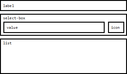
The Parts of a Component
| Part | Description |
|---|---|
| label | The dropdown label |
| select-box | The container that contains the selected value and the dropdown icon / button |
| select-button | The button that shows the selected value and the dropdown icon |
| value | The selected value |
| icon | The icon of the dropdown icon / dropdown button |
| list | The dropdown list |
State attributes
| Attribute | Description | Part |
|---|---|---|
| closed | Is the dropdown list closed (hidden) | :host |
| disabled | Is the dropdown disabled | :host |
| open | Is the dropdown list is open (visible) | :host |
| hidden | Is the dropdown label hidden? | label |
| display-mode | see property displayMode | select-box |
| hidden | Is the dropdown value hidden ? | value |