ptcs-menu-button
Visual
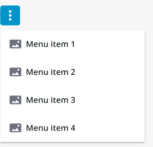
Overview
A menu button is a button that opens a menu.
Usage Examples
Basic Usage
<ptcs-menu-button items="[[items]]"></ptcs-menu-button>
Component API
Properties
| Property | Type | Description | Default | Triggers a changed event? |
|---|---|---|---|---|
| disabled | Boolean | Disables the button | false | No |
| blockOutsideClick | Boolean | When set to true, users cannot interact with other elements on the page until the menu is closed. The first click closes the menu, and the second click is required to interact with another element. When set to false, users can click on other elements even when the menu is open. A single click closes the menu and also interacts with other elements. | false | No |
| offset | Number | The distance between the button and the menu edge. | 8 | No |
| openOnHover | Boolean | Determines whether hovering the button will trigger the menu. | false | No |
| buttonVariant | String | Set a button variant. | "tertiary" | No |
| menuPopupClass | String | Sets a custom class attribute value to style popup menus (see below). |
No | |
| icon | String | Sets an icon. | "cds:icon_more_vertical" | No |
| iconSrc | String | Sets an icon source. | No | |
| contentAlign | String | Align the label in button to the left, right or center. | "center" | No |
| buttonMaxWidth | Number | Set a maximum width for the button widget. | No | |
| label | String | The text label in button. | No | |
| tooltip | String | The tooltip that appears when hovering over the button | No | |
| tooltipIcon | String | The icon for the tooltip | No | |
| displayIcons | Boolean | When false, icon data is ignored by the menu, and no icons are rendered. This property is ignored when menuItemsMode is set to label or icon. | false | No |
| menuItemsMode | String | Controls the appearance of menu items. Options: icon+label label icon | icon+label | No |
| allowMissingIcons | Boolean | When allowMissingIcons is false, and displayIcons is true, a default icon will be assigned to any Menu Item that has no icon data associated with it. | false | No |
| alignItemLabels | Boolean | When set to True, the text labels are left-aligned, and a placeholder blank icon is used to reserve space. When set to False, space is not reserved, and text labels are not left-aligned. This property will come into effect only if displayIcons and allowMissingIcons are True. | false | No |
| menuMaxWidth | String | Sets the maximum width the menu can be reduced to. May be defined by a custom value, in pixels. If set to "auto", the menu will assume the width of its widest menu item. | "auto" | No |
| menuMinWidth | String | Sets the minimum width the menu can be reduced to. May be defined by a custom value, in pixels. If set to "auto", the menu will not become narrower than its widest menu item. | "auto" | No |
| maxMenuItems | String | Defines the maximum number of visible dropdown menu and submenu items. | 5 | No |
| iconPlacement | String | Displays the icon to the left, right, above, or below the text label. (left|right|top|bottom) |
"right" | No |
| menuPlacement | String | Sets the placement of the menu in relation to its button. The property lets you choose to place the menu on the top/bottom(vertically) or left/right(horizontally) of the button. The exact alignment of the menu will be auto adjusted based on the menu button’s position on the page. Options: "vertical" / "horizontal". | "vertical" | No |
| menuIconSize | Number | Setting the size will set the width and the height of the icon | No | |
| hideLabel | Boolean | Enables you to show or hide the button label. Despite the label being hidden, its value is retained internally for accessibility purposes through the use of aria-Label. | "false" | No |
Custom Class Styling
Components that use the submenu flyovers (such as the ptcs-menubar) may have a custom styling clash because the flyovers are added as ptcs-menu-submenu elements under the document body, making it harder to style these items differently when coming from different components. The menuPopupClass property simplifies styling customization of the flyovers: The submenu items use CSS variables for styling, so their value can be set from a single class-based rule off ptcs-menu-submenu, such as:
    ptcs-menu-submenu.purple {
      --ptcs-menu-button--menu-background: #dec8fa;
      --ptcs-menu-button--item-background: #dec8fa;
      --ptcs-menu-button--item-background-hover: #c493ff;
      --ptcs-menu-button--item-background-selected: #9e57f5;
      --ptcs-menu-button--item-background-pressed: #b489e9;
    }
The following CSS variables are currently declared for ptcs-menu-button styling:
--ptcs-menu-button--menu-background--ptcs-menu-button--item-font-family--ptcs-menu-button--item-font-weight--ptcs-menu-button--item-font-style--ptcs-menu-button--item-font-size--ptcs-menu-button--item-font-decoration--ptcs-menu-button--item-color--ptcs-menu-button--item-background-hover--ptcs-menu-button--item-font-family-hover--ptcs-menu-button--item-font-weight-hover--ptcs-menu-button--item-font-style-hover--ptcs-menu-button--item-font-size-hover--ptcs-menu-button--item-font-decoration-hover--ptcs-menu-button--item-color-hover--ptcs-menu-button--item-background-selected--ptcs-menu-button--item-font-family-selected--ptcs-menu-button--item-font-weight-selected--ptcs-menu-button--item-font-style-selected--ptcs-menu-button--item-font-size-selected--ptcs-menu-button--item-font-decoration-selected--ptcs-menu-button--item-color-selected--ptcs-menu-button--item-background-pressed--ptcs-menu-button--item-font-family-pressed--ptcs-menu-button--item-font-weight-pressed--ptcs-menu-button--item-font-style-pressed--ptcs-menu-button--item-font-size-pressed--ptcs-menu-button--item-font-decoration-pressed--ptcs-menu-button--item-color-pressed--ptcs-menu-button--item-background-disabled--ptcs-menu-button--item-font-family-disabled--ptcs-menu-button--item-font-weight-disabled--ptcs-menu-button--item-font-style-disabled--ptcs-menu-button--item-font-size-disabled--ptcs-menu-button--item-font-decoration-disabled--ptcs-menu-button--item-color-disabled
Events
| Name | Data | Description |
|---|---|---|
action |
ev.detail = { item } |
Generated when the user clicks on a "leaf" in the menu tree (an item without a submenu) |
button-clicked |
Generated when there are no menu items and the user clicks the button | |
menu-opened |
ev.detail = { menu } |
Generated when the opens the menu from the button and passes the new menu dom element as the detail. |
Slots
| Slot | Description |
|---|---|
trigger |
Slot for the trigger/icon element instead of the default button |