Styling Visual SDK Components
Overview
Technically, there are four ways to style Visual SDK components:
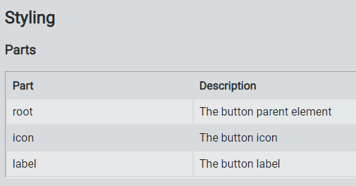
From a practical viewpoint, the project's Theme Designer is the preferred option for styling. The Visual SDK components all expose their stylable parts via part attributes, listed in a Parts table under the Styling section, such as:

The Theme Designer lets you leverage the part information to create themed styling, packaged with the <ptcs-style-unit> supported by the Style Aggregator.
Background
Web components use Shadow DOM, which creates a new style scope for elements inside the Shadow DOM hierarchy. Plain CSS only works when formatting non-complex components or when using inheritable properties, since CSS rules that are defined externally to the component do not reach into its Shadow DOM.
Components with Shadow DOM can define an interface using CSS variables for basic formatting, as CSS variables cross the Shadow DOM boundary. These interfaces only work for fairly simple components. Components that consist of several subparts and have many states (such as normal, hover, selected, disabled, hover + selected, and more) can greatly increase the number of variables.
You can combine multiple style modules into one common import file, which you can include with a single import statement. You can use these files to create theme modules that style all components consistently – as done by the Theme Designer.
Each README file of the Visual SDK components documents the following parts of the styling interface: * Subparts that can be individually styled using style modules * State attributes such as disabled * CSS variables that can style the component
Using Plain CSS
You can use plain CSS to style components like any other element. The following CSS styles ptcs-button components as large buttons:
ptcs-button
{
  color: #FAFAFA;
  background-color: #2B80D5;
  padding: 0px 60px;
  font-size: 24px;
  font-weight: bold;
  height: 80px;
  border-radius: 6px;
}
All <ptcs-button> components are now displayed with the large button style. Since there are multiple button styles, it is recommended that you bind each style to a class:
ptcs-button.large
{
  ...
}
Now, you can add large buttons as follows:
<ptcs-button class="large">Save</ptcs-button>
Plain CSS styling can only be used for styling the host part of the component or for specifying inheritable properties. The next sections describe ways to penetrate into the Shadow DOM.
Using CSS Variables
A component can expose various parts of its Shadow DOM for styling using CSS variables (CSS Custom Properties). The CSS variable can either specify a single property value, such as border color, or a collection of properties, a CSS mixin.
The component's README must document any CSS variables that it provides for styling.
Using CSS Shadow Parts
The CSS Shadow Parts specification defines the ::part() pseudo-element on shadow hosts, allowing shadow hosts to selectively expose chosen elements from their shadow tree to the outside page for styling purposes.
The ::part syntax can be used to locally override an existing styling coming from theming (without changing the actualy theme styling definitions), or for some special case custom style.
Examples
A web component that uses ptcs-value-display and overrides the background-color of its disclosure button container:
        ptcs-value-display::part(show-button) {
          background-color: #c9c9c9;
        }
Change the color of the SVG icon part="icon-img" when ptcs-dropdown is disabled:
        ptcs-dropdown[disabled]::part(icon-img) {
            fill: #adb5bd;
        }
Change the color of the SVG icon with part="icon-img"on hover over part="clear-button":
        [part=clear-button]:hover::part(icon-img) {
          fill: #ffffff;
        }
See the References for further information.
Using the Style Aggregator
The Style Aggregator pushes style information into the Shadow DOM of web components, where it affects the Shadow DOM elements. The Style Aggregator therefore only works on browsers that has a native support for Shadow DOM. IE, Baidu, and Opera Mini have no Shadow DOM support, but those browsers are not supported by the Visual SDK.
Browser support for Shadow DOM
The Style Aggregator takes its styling information from <ptcs-style-unit> elements. The <ptcs-style-unit> can identify a target component in two ways: - Directly - Using the components name and variant - Contextually - Using a chain of part names in component
Examples of direct styling:
Surround all ptcs-label components with a red border:
<ptcs-style-unit wc="PTCS-LABEL">
  :host {
    border: 1px solid red;
  }
</ptcs-style-unit>
Change all ptcs-button in variant small to a pale green color:
<ptcs-style-unit wc="PTCS-BUTTON.small">
  :host {
    background: palegreen;
  }
</ptcs-style-unit>
If a component is set to a variant, then you can only style the variant. For example, in the example above, if you change "PTCS-BUTTON.small" to "PTCS-BUTTON", only buttons that do not specify a variant are styled.
Examples of contextual styling:
Style content in the clear-button part when it occurs in a ptcs-textfield component:
<ptcs-style-unit wc="PTCS-TEXTFIELD" part="clear-button">...</ptcs-style-unit>
Style content in the clear-button part when it occurs in the date-field part in a ptcs-datepicker component:
<ptcs-style-unit wc="PTCS-DATEPICKER" part="date-field:clear-button">...</ptcs-style-unit>
The wc attribute specifies a component where the styling starts. If the component contains sub-components, use the part attribute to navigate down within the hierarchy and apply the style to the correct Shadow DOM.
References
[1] Shadow DOM styling, Polymer documentation