Creating Custom Chart Tooltips
Tooltips are used to provide detailed information about data points on a chart widget. A tooltip is automatically displayed when you place the pointer on a data point at run time. By default, the tooltip content in chart widgets is created using data from the chart or the bound data source. You can create custom tooltips to do the following:
• Provide additional information related to a data point on the chart.
• Localize tooltip content using localization tables.
• Display additional data from a column in the bound infotable.
• Display more complex information on multiple lines.
The following charts support custom tooltips:
You can customize the tooltip content and formatting using the ValuesTooltip property on all supported charts.
 |
The Pareto chart has an additional LineValuesTooltip property that enables you to customize the tooltip of a cumulative percentage line.
|
Creating a Custom Tooltip
To add a localization token in Composer:
1. Open the Default localization table.
2. On the Localization Tokens tab, click Add. The New Localization Token pane opens.
3. Under Name, enter a name for the token.
4. Under Token Value, enter the custom tooltip message using the available variables and formatting options for the chart type.
5. Click  to add the token, and then click Save to save the entity.
to add the token, and then click Save to save the entity.You can add localized tooltips for supported locale in your application. To add localization support for your tooltips, add tokens to each localization table in ThingWorx. For more information about working with localization tables, see Localization Tables.
To display a custom tooltip on a chart widget in Mashup Builder:
1. Select a chart widget on the canvas, and then open the Properties panel.
2. In the ValuesTooltip property input box, specify the tooltip content in one of the two ways:
◦ Type a pattern for the custom tooltip using the available variables and formatting options for the selected chart widget.
◦ Click  and select a localization token with a custom tooltip message.
and select a localization token with a custom tooltip message.3. Click Save.
The custom tooltip content is displayed when you hover on a data point on the chart at run time.
Predefined Variables and Formatting Options
The following variables and formatting options are available for all supported chart widgets:
• #title#—Displays the text before the first line break as a title. You can only define a title at the start of the tooltip message.
• #newline#—Creates a new line break.
• ${Data:<Infotable-field>}—Displays the value under a specified infotable field.
• ${DataSourceN:<Infotable-field>}—Displays the value under a specified infotable field for data source. Use this option to specify a data source when a chart displays data from multiple sources.
In addition to the global variables, each chart widget supports a specific set of variables that display data for the chart. The following sections list the variables and formatting options for chart widgets in Mashup Builder.
Bar and Line Chart
The Bar and Line Chart widgets display tooltips when you hover on a bar, column, or data point. The default tooltips are defined in the BarChartDefaultTooltip and LineChartDefaultTooltip localization tokens as:
${label}, ${series}: ${value}
• ${label}—The data label on the axis.
• ${series}—The data series name for the selected bar.
• ${value}—The data point value on the axis.
Schedule Chart
The Schedule Chart widget displays tooltips when you select or hover on an event. The tooltip content is defined in the ScheduleChartDefaultTooltip localization token as:
#title#${reason}#newline#Start: ${start}#newline#End: ${end}#newline#Duration: ${duration}
The following predefined variables are available for the Schedule Chart widget:
• ${reason}—The reason for the schedule event.
• ${start}—The date and time for the start of the event.
• ${end}—The date and time for the end of the event.
• ${duration}—The time difference between the start and the end of the event.
For more information about the Schedule Chart, see Schedule Chart Widget.
Waterfall Chart
The Waterfall Chart widget displays tooltips when you select or hover on a bar or a column. The default tooltip content is defined in the WaterfallChartDefaultTooltip localization token as:
${label}, ${series}: ${value}#newline##step#${total} in total#step#
• ${label}—The selected bar label on the axis.
• ${series}—The data series name for the selected bar.
• ${value}—The bar value on the axis.
• ${total}—The total value of the bar.
• #step#<variables>#step#—Used to display different tooltips for the summary bars at the start and the end of the data range. You can use enclose parts of the tooltip in #step# to display additional information only for bars that represent changes to the total value. For example, in the default tooltip, the following part of the tooltip is only displayed for trend columns:
#step#${total} in total#step#
Pareto Chart
The Pareto Chart widget supports two types of custom tooltips:
• ValuesTooltip—Displayed when you select a category on the chart. The default tooltip is stored in the ParetoChartDefaultTooltip token as:
${label}, ${total}#newline#${series}, ${value}#newline#${perc} of total#newline#Cumulative value, ${percCum}
• LineValuesTooltip—Displayed when you select a data point on the cumulative percentage line. The default tooltip is stored in the ParetoChartLineDefaultTooltip token as:
${label}, ${total}#newline#${perc} of total#newline#Cumulative value, ${percCum}
The following predefined variables are available:
• ${label}—The data point label on the axis.
• ${series}—The data series name that the data point is part of.
• ${value}—The data point value on the axis.
• ${total}—The value of the total.
• ${perc}—The percentage value out of the total number for all data categories.
• ${percCum}—The cumulative percentage value of the data.
For more information see, Pareto Chart Widget.
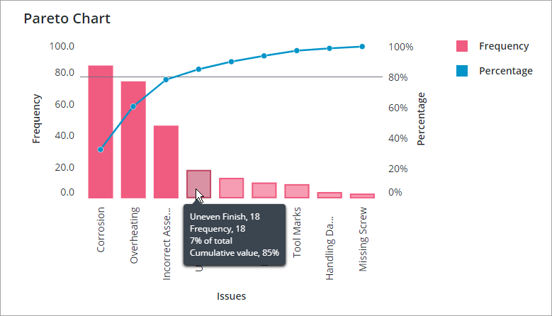
Example: Pareto Chart
You can combine the predefined variables with text to customize the tooltip content. The following example shows custom tooltips for data bars on the Pareto Chart widget using the ParetoChartDefaultTooltip property:
${label}: ${total}
The tooltip shows content from two variables: the first variable displays the data label and the second displays the total value.
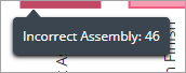
Creating Multi-Line Tooltips
You can add line breaks to create tooltips that display values and text on multiple lines. To display the second variable and its value on a new line, add #newline# to the tooltip message:
${label}#newline#Frequency: ${total}
The message content after #newline# is displayed on a new line.
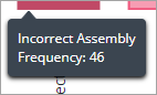
Adding a Title
To highlight the category label on the first line, add #Title# at the start of the tooltip:
#title#${label}#newline#Frequency: ${total}
Titles are highlighted using a larger font size and a bold font. They are also separated from the body of the tooltip by a divider line.
| | You can only use #title# to format the first line in a tooltip. |
Displaying Content from the Data Source
In addition to the predefined variables that are available for each chart, you can display data from an infotable using the following variables:
Variable | Data | Description |
|---|---|---|
${Data:<Infotable-field>} | Single Source | Displays values under the specified infotable field for reach row. |
${DataSourceN:<Infotable-field>} | Multiple Sources | Displays the value under a specified infotable field for data source. Use this option to specify a data source when a chart displays data from multiple sources. Replace N with the data source property number and <Infotable-field> with the name of the infotable column with the values that you want to display. |
These variables enable you to display content from an infotable column. For example, you can display additional context about the selected data that is not displayed on the chart. The following image shows a Line Chart widget with one data series. The chart measures output for a production line. In addition to the daily output on the chart, the tooltip displays the average production for the past three days. The tooltip message is defined as follows:
${label}, ${series}: ${value}#newline#3-day avg: ${Data:3DayAvr}
Where ${Data:3DayAvr} is the column name that contains a three-day average value for each data point.

In this example, the tooltip is displayed for one data series. When a chart contains more than one series, the three day average data may not be relevant to all data series. Make sure that the custom tooltip values are relevant for each data series on the chart. For more information about the infotable format for each chart, refer to the relevant widget topic.