Waterfall Chart Widget (Themable)
Introduction
The Waterfall Chart widget displays a responsive waterfall chart in your mashup. The widget enables you to visualize cumulative change as values are added to or subtracted from an initial value.
Each increase or decrease can be colored to highlight a positive or a negative change when there is a single data series in your chart.
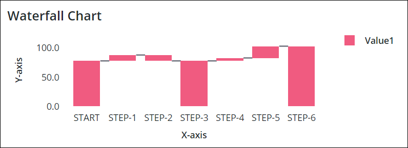
When you drag the Waterfall Chart widget to your workspace, it appears as shown below:
 | • The Waterfall Chart widget is available for ThingWorx version 9.2.0 and later. • The Waterfall Chart widget is available as a standard widget in the platform and as a web component that you can import from an SDK. • The Waterfall Chart supports only a single data source. If you want to use data from multiple sources, you may merge the data in to a single infotable and use it in the chart. |
Data Format
You must create an infotable with field definitions that represent the data structure for the chart. The infotable must include a field definition for the X and Y-axis values. Each infotable row represents a category on the X-axis and its corresponding Y-axis value. The following table lists the data format for an example infotable:
X Axis | Y Axis Value | Y Axis Value N | Y Axis | Y Axis | |||||
|---|---|---|---|---|---|---|---|---|---|
Field Definition | x:{name:'x',baseType:'STRING'} | Value1:{name:'Value1',baseType:'NUMBER'} | Value2:{name:'Value2',baseType:'NUMBER'} | {Selectable: True, baseType: 'BOOLEAN"} | {ShowTotal: False, baseType: 'BOOLEAN'} | ||||
Use | Defines the X-axis values for the chart bar or column. The data must have a STRING base type. Each row is displayed as a category on the X-axis. The defined name for this column is the option that you should select for the XAaxisField widget property. | Defines the Y-axis value and the legend label for the category. | Defines the Y-axis value and the legend label for each additional data series. |
Waterfall Chart supports non selectable bars. This means you can hover over and focus on the bars in the chart but cannot select it. You must create an additional column Selectable in the infotable data source. The values or bars are interactive and set to True by default. You may set the value to False to make the bar non selectable. The field is not case sensitive. The NonSelectableData property in the properties list controls whether the user can click to select the data on the chart. For more information, see the property table. |
Defines whether an increase or decrease in the value is displayed as a stacked or overlapped bar over a full bar in the chart. The value is set to False by default. You may set the value to True to display the stacked or overlapped bars. You must create an additional column ShowTotal in the infotable data source. The field is not case sensitive. The ShowTotal property in the properties list controls whether the bars appear stacked or overlapped. For more information, see the property table. | ||||
Base Type | STRING | NUMBER | NUMBER | BOOLEAN | BOOLEAN | ||||
Row Example | Game:'Cash In'—Where Cash In is the category name to show on the X-axis | Player1:100—The Y-axis value for the category | Player2: 100 — The Y-axis value for the second data series | For example, see the image for multi series data below. | For example, see the image for single series data below. |
| | • The first and the last x axis values give the corresponding y axis values and are displayed as summary values in the chart. • If the y axis value is empty in the infotable, it displays the current value as a regular full bar in the chart. If the y value is “0”, it displays an empty bar in the chart. |
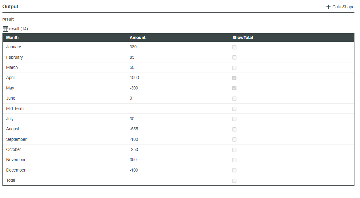
• Single Series Data:
The following image shows an example of single series data returned from an infotable with field definition for the y-axis:
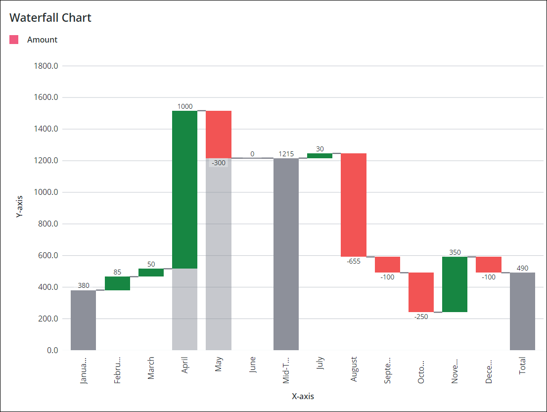
The following image shows the Waterfall Chart widget with a sample single series data loaded in the mashup. The trend colors that are set using the UseTrendColors property highlight the increase and decrease of values. The bar for April is stacked and the bar for May is overlapped over full bars in the image.
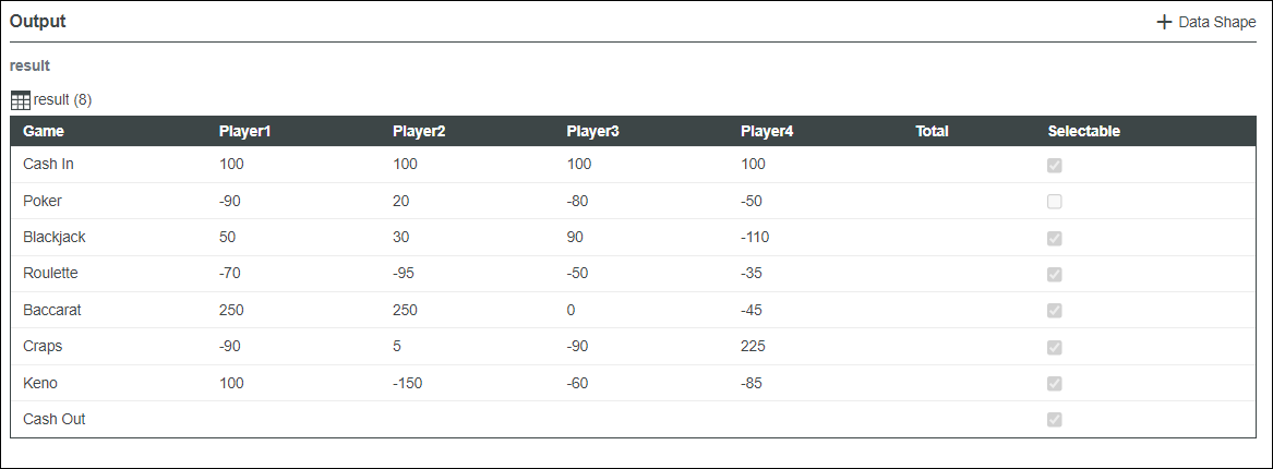
• Multi Series Data:
The following image shows an example of multi series data returned from an infotable with field definition for the y-axis:
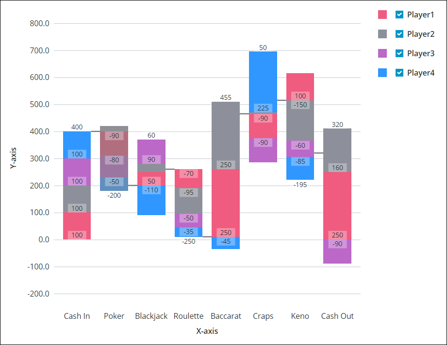
The following image shows the Waterfall Chart widget with a sample data loaded in the mashup.
Binding a Data Source
To bind the chart to a data source, perform the following steps:
1. On the Data panel, add a data service that returns an infotable with the correct data format for the widget.
| | Make sure that the service is triggered by an event at run time. |
2. Bind the All Data property of the data service to the Data property of the chart.
3. Select the chart, then on the Properties panel, use the XAxisField property to select the infotable column to use for the X-axis.
By default, all the columns in the infotable are automatically displayed on the Y-axis chart. To select the data series manually:
a. Set the NumberOfSeries property to a fixed number.
b. Select the infotable column for each data series using the DataField1..N properties.
4. Click Save, then View Mashup.
The data is now displayed on the chart. Each additional column in the bound infotable is displayed as a data series. After you bind a data source, consider adding labels using the Label, XAxisLabel, and YAxisLabel properties.
You can also configure the widget using additional properties. For example:
• To show ruler lines, enable the ShowXAxisRuler and ShowYAxisRuler properties.
• To show trend colors for an increase or decrease in the value, enable the UseTrendColors property.
• To enable zoom along the vertical or horizontal axis, enable the HorizonalZoom and the VerticalZoom properties.
• To apply state formatting to the chart, use the DataSeriesStyle property. For more information, see Example: Applying State Formatting to Charts.
For more information about the available configuration options, refer to the properties table below.
 | To update the chart data automatically at run time, create an Auto Refresh function and bind it to the data service that returns the chart data. For more information, see Auto Refresh. |
Adding a Secondary Axis
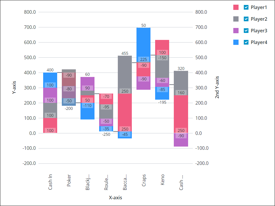
You can add a secondary Y axis in the chart using the ShowSecondYAxis property. The following image shows a waterfall chart with a secondary Y axis.
The following table lists properties that you can use to enable and configure the secondary Y-axis:
Property Name | Description | Base Type | Default Value | Bindable? (Y/N) | Localizable? (Y/N) |
|---|---|---|---|---|---|
ShowSecondYAxis | Adds a secondary Y-axis to the chart. When you select this property, SecondYAxisFormat, SecondYAxisLabel, and SecondYAxisLabelAlignment properties appear on the list. | BOOLEAN | False | Y | N |
SecondYAxisLabel | Specifies the text label for the secondary Y-axis. | STRING | Secondary Y-axis | Y | Y |
SecondYAxisLabelAlignment | Aligns the label for the secondary Y-axis. You can position the label at the Top, Middle, or Bottom. By default, the label is positioned in the middle. | STRING | Middle | N | N |
SecondYAxisFormat | Sets the format for the secondary Y-axis values. You can use this property to determine how the displayed data looks. For example, you can set the number of digits to display after the decimal point. | STRING | 0000.0 | Y | N |
Property Table
The following table lists properties that are available in ThingWorx 9.4 or later:
Property Name | Description | Base Type | Default Value | Bindable | Localizable |
|---|---|---|---|---|---|
SampleSize | Species the number of data points to display on the chart. | NUMBER | n/a | N | N |
ShowZoomButtons | Shows zoom in and out buttons on the chart toolbar when horizontal or vertical zoom is enabled. | BOOLEAN | False | N | N |
EmptyChartIcon | Specifies the icon to display when the chart is empty. | Media Entity | not visible | N | N |
EmptyChartLabel | Specifies the text to display when the chart is empty. | STRING | [[ChartStateLabelEmpty]] | N | Y |
ErrorStateIcon | Specifies the icon to display when the chart is empty. | Media Entity | error | N | N |
ErrorStateLabel | Specifies the text to display when the chart is empty. | STRING | N | Y | |
LoadingIcon | Specifies the icon to display when the chart data is loading. | Media Entity | chart loading icon | N | N |
NoDataSourceIcon | Specifies the icon to display when the chart is not bound to a data source. | Media Entity | bind | N | N |
NoDataSourceLabel | Specifies the text to display when the chart is not bound to a data source. | STRING | [[ChartStateLabelNoData]] | N | Y |
The properties of the Waterfall Chart widget are listed below.
Property Name | Description | Base Type | Default Value | Bindable? (Y/N) | Localizable? (Y/N) | ||
|---|---|---|---|---|---|---|---|
CustomClass | The user defined CSS class to apply to the top div of the widget. Multiple classes can be entered, separated by space. | STRING | n/a | Y | N | ||
Data | The infotable data source for the chart. | INFOTABLE | n/a | Y | N | ||
DataField1 — DataField24 | These properties are listed when you set NumberOfSeries to a fixed number. You can use these properties to select the infotable column to use for each data series. | Infotable Column | n/a | N | N | ||
DataLabel1 — DataLabel24 | These properties are listed when you set NumberOfSeries to a fixed number. This property sets the label text that is displayed in the legends area for the respective data series. | STRING | n/a | Y | N | ||
DataSeriesStyle | Opens the state formatting configuration dialog box. This property appears when NumberOfSeries is set to Auto. The state definition is applied to all series on the chart. You can style the series based on data values to spot trends and patterns more easily. | State Definition | n/a | N | N | ||
DataSeriesStyle1 — DataSereisStyle24 | These properties are listed based on the number that you set for the NumberOfSeries property. You can use these properties to apply a separate state definition to each data series on the chart. | State Definition | n/a | N | N | ||
Disabled | Disables the widget in the mashup. The widget is displayed in the mashup but you cannot click or select it. | BOOLEAN | False | Y | N | ||
DirectSelectionZoom | Allows you to zoom in by selecting two data items on the chart. The options that are available to you for this property are Horizontal Axis, Vertical Axis, Both, and None. This property appears on the properties list when you select HorizontalZoom | STRING | None | Y | N | ||
DragSelectionZoom | Allows you to zoom in to a specific part of the chart by drawing a selection box around the data range that you want to view. The options that are available to you for this property are Horizontal Axis, Vertical Axis, Both, and None. This property appears on the properties list when you select HorizontalZoom | STRING | None | Y | N | ||
ExternalPadding | Sets the padding from the axes. Padding value is a percentage of the bar width. | NUMBER | 25 | Y | N | ||
HideConnectorLines | Hides the connector lines used to highlight the change between each value in the data sequence. | BOOLEAN | False | Y | N | ||
HideDataTooltips | Hides tooltips that are displayed on hovering or selecting a data point on the chart.
| BOOLEAN | False | N | N | ||
HideLegend | Hides the legend area. When you select this property, the LegendAlignment, LegendFilter, LegendMarkerShapes, LegendMaxWidth, and LegendPosition properties do not appear on the properties list. | BOOLEAN | False | Y | N | ||
HideNotes | Hides the notes area. When you select this property, the Notes, NotesAlignment, and NotesPosition properties do not appear on the properties list. | BOOLEAN | False | Y | N | ||
HideXAxis | Hides the X-Axis. | BOOLEAN | False | Y | N | ||
HideYAxis | Hides the Y-Axis. | BOOLEAN | False | Y | N | ||
HorizontalAxisLabelsRotation | Sets the rotation angle of labels on the horizontal axis. You can enter a value from — 180 to 180. | NUMBER | Autosize | N | N | ||
HorizontalAxisMaxHeight | Sets a maximum height for the horizontal axis. | NUMBER | 85 | Y | N | ||
HorizontalZoom | Allows you to zoom in on the horizontal axis. When you select this property, the HorizontalRangeZoom, HorizontalSliderZoom, DirectSelectionZoom, and DragSelectionZoom properties appear on the properties list. | BOOLEAN | False | Y | N | ||
HorizontalRangeZoom | Adds controls that allow you to specify a value range to zoom in on the horizontal axis. When you select this property, the following HorizontalStartZoomLabel and HorizontalEndZoomLabel properties appear on the properties list. | BOOLEAN | False | Y | N | ||
HorizontalRangeZoomDateFormat | Sets the date format within the date selection box when using a range selection zoom.
| STRING | n/a | N | N | ||
HorizontalRangeZoomDateWidth | Sets the width of the date selection box on the horizontal axis when zooming is enabled.
| NUMBER | 332px | N | N | ||
HorizontalStartZoomLabel | Specifies the text label for the start of the range selection. | STRING | n/a | Y | Y | ||
HorizontalEndZoomLabel | Specifies the text label for the end of the range selection. | STRING | n/a | Y | Y | ||
HorizontalSliderZoom | Adds a slider control that allows you to display data between a minimum and a maximum value on the horizontal axis. When you select this property, the HorizontalSliderZoomMaxLabel and HorizontalSliderZoomMinLabel properties appear on the properties list. | BOOLEAN | False | Y | N | ||
HorizontalSliderZoomMaxLabel | Specifies the label for the maximum value of the slider zoom control. | STRING | n/a | Y | Y | ||
HorizontalSliderZoomMinLabel | Specifies the label for the minimum value of the slider zoom control. | STRING | n/a | Y | Y | ||
InternalPadding | Sets the padding between the series of data. Padding is a percentage of the bar width. | NUMBER | 25 | Y | N | ||
Label | Displays the label text for the Waterfall Chart. | STRING | Waterfall Chart | Y | Y | ||
LabelType | Selects the label type for the Waterfall Chart as Large Header, Header, Sub-Header, Large Title, Title, Label, Body, or Caption. | STRING | Sub-Header | Y | N | ||
LabelAlignment | Aligns the label of the Waterfall Chart widget to the Left, Center, or Right. | STRING | Left | N | N | ||
LabelPosition | Sets the position of the label at the Top or Bottom. | STRING | Top | N | N | ||
LabelReset | Sets the label that is displayed in the reset button for the zooming control. | STRING | Reset | Y | Y | ||
LegendAlignment | Aligns the legend text to the Top, Middle, or Bottom. The options that are available to you for this property depend on the setting of the LegendPosition property. | STRING | Top | N | N | ||
LegendFilter | Adds a legend filter that allows the user to filter the chart at runtime. | BOOLEAN | False | N | N | ||
LegendMarkerShapes | Sets the marker shape of the legend as Square, Circle, or None. | STRING | Square | N | N | ||
LegendMaxWidth | Sets a maximum width for the legend area. | NUMBER | 736 | Y | N | ||
LegendPosition | Sets the position of the legend at the Top, Bottom, Left, or Right. | STRING | Right | N | N | ||
NonSelectableData | Uses True or False values from the selectable infotable field to control whether users can click to select data on the chart. Each value within the field applies to all data series on the same row. | BOOLEAN | False | N | N | ||
Notes | Specifies the text to display within the notes area on the chart. You can enter a string or select a localization token. | STRING | n/a | Y | Y | ||
NotesAlignment | Aligns the note text to the Left, Right, or Center within the notes area. | STRING | Left | N | N | ||
NotesPosition | Sets the position of the notes area at the Top or Bottom. | STRING | Bottom | N | N | ||
NumberOfReferenceLines | Sets the number of reference lines to display on the chart. Reference lines are used to highlight the chart data relative to a specific value. You can add up to 24 lines and configure the label, axis, and value of each line. For example, when you set a value from 1–24 to this property, corresponding properties ReferenceLine1Label — ReferenceLine24Label and ReferenceLine1Value — ReferenceLine24Value appear on the properties list. | NUMBER | 0 | N | N | ||
NumberOfSeries | Sets the number of data series to display on the chart. Automatic setting displays all data series. | NUMBER | Auto | N | N | ||
NumberOfYLabels | Sets the number of labels to display on the Y axis.
| NUMBER | Auto | N | N | ||
Orientation | Specifies the orientation of the chart. You can display the cumulative change along a horizontal or vertical axis. | STRING | Vertical | N | N | ||
ResetToDefaultValue | Resets the input for this widget to the default values. | n/a | n/a | Y | N | ||
RulersInFront | Shows the rulers in front of the data values. By default, the rulers are displayed behind the data. | BOOLEAN | False | Y | N | ||
SeriesClicked | Triggers an event when you click on a data point. | n/a | n/a | Y | N | ||
SelectedData | An infotable that contains the selected data on the chart. | INFOTABLE | n/a | Y | N | ||
SelectionMode | Controls how many data points a user can select at the same time. The options are Single, Multiple, and Default. Choose Multiple to allow a user to select more than one data point. | STRING | Default | Y | N | ||
ShowHideLegend | Adds a show/hide button that enables you to show or hide the chart legend at run time.
| BOOLEAN | False | N | N | ||
ShowTotal | Use True or False values under the ShowTotal infotable field to control whether trend values are displayed relative to a full bar or column. When set to True, additions are stacked and subtractions overlap the bar or column using a different color. | BOOLEAN | False | N | N | ||
ShowValues | Shows the values labels on the chart. When you select this property, ValuesPosition property appears on the list. | BOOLEAN | False | Y | N | ||
ShowXAxisRuler | Shows the X-Axis ruler. | BOOLEAN | False | Y | N | ||
ShowYAxisRuler | Shows the Y-Axis ruler. | BOOLEAN | False | Y | N | ||
ShowZeroValueRuler | Shows the zero value ruler. | BOOLEAN | False | Y | N | ||
ShowZoomButtons | Shows zoom in and out buttons on the chart toolbar when horizontal or vertical zoom is enabled.
| BOOLEAN | False | N | N | ||
SparkView | Shows a simplified view of the chart visualization. Enable this property to hide labels, legends, and rulers. | BOOLEAN | False | Y | N | ||
TabSequence | The sequence number of the Waterfall Chart widget when you press the TAB. | NUMBER | n/a | N | N | ||
UseTrendColors | Highlights trends using different colors when the chart displays data from one series.
| BOOLEAN | False | Y | N | ||
ValuesTooltip | Allows you to display a custom tooltip when a data point is selected. You can show a title, text, data values, and create new lines. Use the following syntax: Add #title# before a string to show a title, #newline# to create a new line, ${<token_name>} to display data from available chart tokens, and ${Data:<infotable_column>} or ${DataSourceN:<infotable_column>} to display values from an infotable column. Add a ${total} token to display the total and enclose the token in #step# to display the total for steps only. For example: #title#Tooltip Title#newline#${label},${total}#newline#${data:Column3}#step#${total} in total#step#. | STRING | WaterfallChartDefaultTooltip | Y | N | ||
ValuesPosition | Sets the position of the data value labels relative to the chart bars as Outside bar or Overlap bar. | STRING | Outside bar | N | N | ||
VerticalAxisMaxWidth | Sets a maximum width for the vertical axis. | NUMBER | 85 | Y | N | ||
VerticalZoom | Allows you to zoom in on the vertical axis. When you select this property, a VerticalSliderZoom property appears on the properties list. | BOOLEAN | False | Y | N | ||
VerticalSliderZoom | Adds a slider control that allows you to display data between a minimum and a maximum value on the vertical axis. When you select this property, the VerticalZoomMaxLabel and VerticalZoomMinLabel properties appear on the properties list. | BOOLEAN | False | Y | N | ||
VerticalZoomMaxLabel | Specifies the text label for the maximum value of the slider zoom control. | STRING | n/a | Y | Y | ||
VerticalZoomMinLabel | Specifies the text label for the minimum value of the slider zoom control. | STRING | n/a | Y | Y | ||
XAxisField | Infotable field that represents the data for the X-Axis. | INFOTABLE | n/a | N | N | ||
XAxisLabel | Displays the text label for the X-Axis. | STRING | X-axis | Y | Y | ||
XAxisLabelAlignment | Aligns the X-Axis label to the Left, Center, or Right. | STRING | Center | N | N | ||
YAxisFormat | Sets the format for the Y-Axis values. | STRING | 0000.0 | Y | N | ||
YAxisLabel | Displays the text label for the Y-Axis. | STRING | Y-axis | Y | Y | ||
YAxisLabelAlignment | Aligns the Y-Axis label to the Top, Middle, or Bottom. | STRING | Middle | N | N | ||
YAxisMaximumValues | Sets the maximum range for the Y-Axis values. Be default, the range is automatically calculated based on the widget data. The value for this property is ignored if the chart data contains a larger value. | STRING | n/a | Y | N | ||
YAxisMinimumValues | Sets the minimum range for the Y-Axis values. By default, the range is automatically calculated based on the widget data. The value for this property is ignored if the chart data contains a smaller value. | STRING | n/a | Y | N |