Bar Chart Widget (Themable)
Watch the following video on how to add the widget to a mashup and configure basic widget properties. To open the video in a new tab, click the title on the player.
Introduction
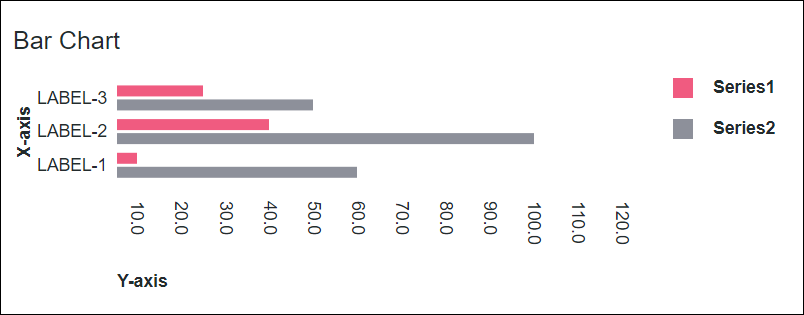
The Bar Chart widget displays a bar chart in your mashup.
The Bar Chart is designed to compare the quantities of units, where the Y-axis represents the quantity. The data series can be grouped and stacked.
 | The Bar Chart widget is available as a standard widget in the platform and as a web component that can be imported from an SDK. |
Data Format
You must create an infotable with field definitions that represent the data structure for the chart. The infotable must include a field definition for the X and Y-axis values. You can add multiple data series by adding additional columns with field definitions for the data series values. Each infotable row represents a category on the X-axis and its corresponding Y-axis values. The following table lists the data format for the infotable:
X Axis | Y Axis Value | Y Axis Value N | |
|---|---|---|---|
Field Definition | x:{name:'x',baseType:'STRING'} | value1:{name:'value1',baseType:'NUMBER'} | value2:{name:'value2',baseType:'NUMBER'} |
Use | Defines the X-axis values for the chart bar or column. The data must have a STRING base type. Each row is displayed as a category on the X-axis. The defined name for this column is the option that you should select for the XAaxisField widget property. | Defines the Y-axis value and the legend label for the category. | Defines the Y-axis value and the legend label for each additional data series. |
Base Type | STRING | NUMBER | NUMBER |
Row Example | x:'Apple'—Where Apple is the category name to show on the X-axis | value1:10—The Y-axis value for the category | value2:30—The Y-axis value for the second data series |
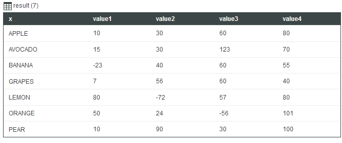
The following image shows an example of returned data from a infotable with four field definitions for the y-axis:
For the interval zoom control options, you must create an infotable which consists of two fields: label and duration. The base type of data in the two fields should be STRING. The following image shows the returned data format of a data service:
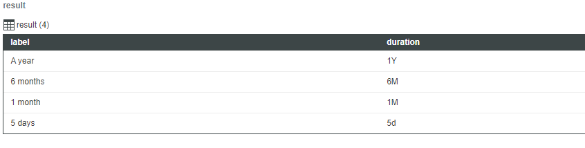
The values that you can use in the duration field and the range that these represent follow:
• Y — year
• M — month
• W — week
• d — day
• h — hour
• m — minute
• s — second
• ms — millisecond
| | The characters are case sensitive. For example, “M” represents month and “m” represents minute. |
Binding a Data Source
To bind the chart to a data source, perform the following steps:
1. On the Data panel, add a data service that returns an infotable with the correct data format for the widget.
| | Make sure that the service is triggered by an event at run time. |
2. Bind the All Data property of the data service to the Data property of the chart.
3. Select the chart, then on the Properties panel, use the XAxisField property to select the infotable column to use for the X-axis.
By default, all the columns in the infotable are automatically displayed on the Y-axis chart. To select the data series manually:
a. Set the NumberOfSeries property to a fixed number.
b. Select the infotable column for each data series using the DataField1..N properties.
4. Click Save, then View Mashup.
The data is now displayed on the chart. Each additional column in the bound infotable is displayed as a data series. After you bind a data source, consider adding labels using the Label, XAxisLabel, and YAxisLabel properties.
You can also configure the widget using additional properties. For example:
• To show ruler lines, enable the ShowXAxisRuler and ShowYAxisRuler properties. You can specify the axis to use as a reference for the ruler line using theYAxisRulerAlignment property. You can align the lines with the marks on the primary axis or the secondary axis. By default, the lines are aligned with the primary axis markers.
• To enable zoom along the vertical or horizontal axis, enable the HorizonalZoom and the VerticalZoom properties.
• To apply state formatting to the chart, use the SeriesStyle property. For more information, see Example: Applying State Formatting to Charts.
For more information about the available configuration options, refer to the properties table below.
 | To update the chart data automatically at run time, create an Auto Refresh function and bind it to the data service that returns the chart data. For more information, see Auto Refresh. |
Adding a Secondary Axis
You can add a secondary axis to represent two different measurements for one category on the X-axis using the SecondYAxis property. The secondary axis displays data from one or more data series. For example, you can plot a data series on the secondary axis of a column chart to show a percentage value. The following figure shows a column chart with a secondary axis.
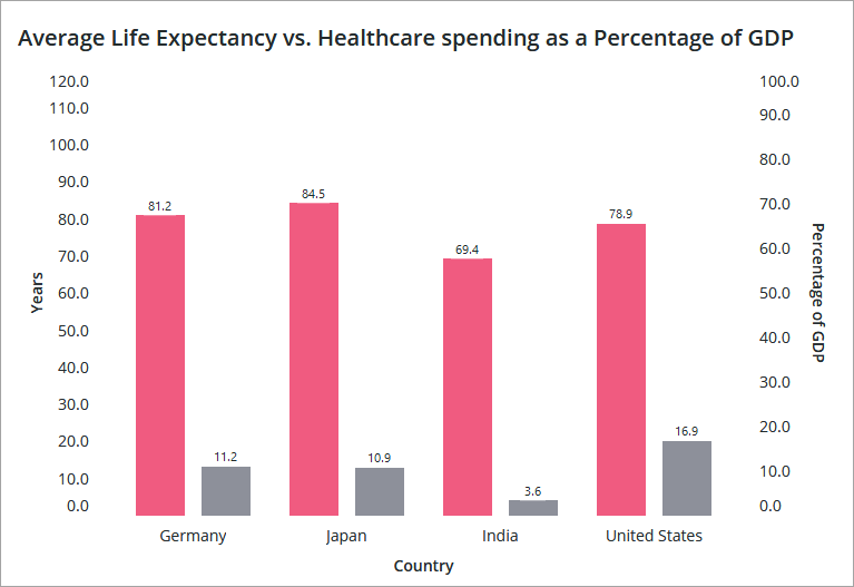
The primary axis measures quantitative data and the secondary axis measures percentage values. Each Y-axis has a maximum value property axis.
| | The secondary Y-axis properties are available only in ThingWorx 9.1 and later. |
When you set NumberofSeries to a fixed number, DataFieldN and UseSecondAxisSeriesN properties are displayed for each data series. By default, all data series are displayed on the primary Y-axis. To display a data series on the secondary Y-axis, enable the UseSecondAxisSeriesN property for any data series that you want to display on the secondary axis.
To add a secondary Y-axis to the chart, bind an infotable that contains two or more columns with data values.
1. Select the chart, and then open the Properties panel.
2. Select the check box next to the SecondYAxis property. Additional properties for the secondary axis are listed.
3. To configure the secondary axis data manually, perform the following steps:
a. Set the NumberOfSeries property to a specific value.
b. Select the infotable column to use for each data series on the chart using the DataField..N properties.
| | By default, all data is displayed on the primary axis. |
c. Enable the UseSecondAxisSeriesN property for each data series that you want to display on the secondary axis.
4. Click Save and then View Mashup.
The secondary axis is now configured and the infotable data is displayed. After you add a secondary axis, use the SecondYAxisLabel property to set a label. You can use the SecondYAxisMinValue and the SecondYAxisMaxValue properties to set scale on the secondary axis.
The following table lists properties that you can use to enable and configure the secondary Y-axis:
Property Name | Description | Base Type | Default Value | Bindable? (Y/N) | Localizable? (Y/N) |
|---|---|---|---|---|---|
SecondYAxis | Adds a secondary Y-axis to the chart. | BOOLEAN | False | Y | N |
SecondYAxisLabel | Specifies the text label for the secondary Y-axis. | STRING | Secondary Y-axis | Y | Y |
SecondYAxisLabelAlignment | Aligns the label for the secondary Y-axis. You can position the label at the Top, Middle, or Bottom. By default, the label is positioned in the middle. | STRING | Middle | No | N |
SecondYAxisFormat | Sets the format for the secondary Y-axis values. You can use this property to determine how the displayed data looks. For example, you can set the number of digits to display after the decimal point. | STRING | 0000.0 | Y | N |
SecondYAxisMaxValue | Sets a maximum range for the secondary Y-axis values. By default, the range is automatically calculated and all of the data is displayed. | NUMBER | N/A | Y | N |
SecondYAxisMinValue | Sets a maximum range for the secondary Y-axis values. By default, the range is automatically calculated based on the widget data. | NUMBER | N/A | Y | N |
UseSecondYAxis1..n | Displays the values for data series n on the secondary Y-axis. This property is available when you change NumberOfSeries from Auto to a fixed number. | BOOLEAN | False | N | N |
YAxisRulerAlignment | Specifies the Y-axis to use as a reference for ruler lines. You can align ruler lines with the data value markers of the primary or the secondary Y-axis. | STRING | Primary Y-axis | Y | N |
SecondYAxisSeriesDisplay | Controls how data series are stacked for the secondary Y-axis on the chart. You can stack and combine the values, stack as a percentage of the total value, or group values. By default, the data series are grouped. | STRING | Grouped | Y | N |
Widget Properties
The following table lists properties that are available in ThingWorx 9.4 or later:
Property Name | Description | Base Type | Default Value | Bindable | Localizable | ||
|---|---|---|---|---|---|---|---|
EmptyChartIcon | Specifies the icon to display when the chart is empty. | Media Entity | not visible | N | N | ||
EmptyChartLabel | Specifies the text to display when the chart is empty. | STRING | [[ChartStateLabelEmpty]] | N | Y | ||
ErrorStateIcon | Specifies the icon to display when the chart is empty. | Media Entity | error | N | N | ||
ErrorStateLabel | Specifies the text to display when the chart is empty. | STRING | N | Y | |||
HideDataTooltips | Hides tooltips that are displayed on hovering or selecting a data point on the chart.
| BOOLEAN | False | N | N | ||
LoadingIcon | Specifies the icon to display when the chart data is loading. | Media Entity | chart loading icon | N | N | ||
NoDataSourceIcon | Specifies the icon to display when the chart is not bound to a data source. | Media Entity | bind | N | N | ||
NoDataSourceLabel | Specifies the text to display when the chart is not bound to a data source. | STRING | [[ChartStateLabelNoData]] | N | Y |
The following table lists properties that are available in ThingWorx 9.3.5 and later:
Property Name | Description | Base Type | Default Value | Bindable | Localizable |
|---|---|---|---|---|---|
ShowZoomButtons | Shows zoom in and out buttons on the chart toolbar when horizontal or vertical zoom is enabled. | BOOLEAN | False | N | N |
The following table lists properties that are available in ThingWorx 9.3.2 and later:
Property Name | Description | Base Type | Bindable | Localizable | ||
|---|---|---|---|---|---|---|
NumberOfYLabels | Sets the number of labels to display on the Y axis.
| NUMBER | N | Y |
The following table lists the chart properties that are available in ThingWorx 9.2 and later:
Property Name | Description | Base Type | Bindable | Localizable |
|---|---|---|---|---|
NumberOfReferenceLines | Specifies the number of reference lines to display on the chart. You can add up to 24 reference lines. Additional properties are added for each reference line. | NUMBER | Y | N |
ReferecneLineNLabel | Sets the text label of the reference line. | STRING | Y | Y |
ReferecneLineNValue | Sets the value of the reference line. You can specify a numeric or a date value based on the axis type. | NUMBER or DATETIME | Y | N |
ReferenceLineNAxis | Specifies the axis to use for the reference line. This property is available only when a chart contains two axes with continuous data, such as numbers or dates. | STRING | N | N |
The properties of the Bar Chart widget are listed below.
Property Name | Description | Base Type | Default Value | Bindable? (Y/N) | Localizable? (Y/N) | ||
|---|---|---|---|---|---|---|---|
ChartType | Sets the type of the chart as Bar Chart or Column Chart. | STRING | Bar Chart | N | N | ||
CustomClass | The user defined CSS class to apply to the top div of the widget. Multiple classes can be entered, separated by space. | STRING | n/a | Y | N | ||
Data | The infotable data source for the chart. | INFOTABLE | n/a | Y | N | ||
DataField1 — DataField24 | These properties are listed when you set NumberOfSereis to a fixed number. You can use these properties to select the infotable column to use for each data series. | Infotable Column | n/a | N | N | ||
DataLabel1 — DataLabel24 | These properties are listed when you set NumberOfSereis to a specific number. You can use the properties to specify a custom label for each data series in the legend. For more information, see Customizing the Chart Legend.
| STRING | n/a | N | Y | ||
DataSeriesStyle | Opens the state formatting configuration dialog box. This property appears when NumberOfSeries is set to Auto. The state definition is applied all series on the chart.
| State Definition | n/a | N | N | ||
DataSeriesStyle1 — DataSereisStyle24 | These properties are listed based on the number that you set for the NumberOfSereis property. You can use these properties to apply a separate state definition to each data series on the chart. | State Definition | n/a | N | |||
Disabled | Disables the widget in the mashup. The widget is displayed in the mashup but you cannot click or select it. | BOOLEAN | False | Y | N | ||
DirectSelectionZoom | Allows you to zoom in by selecting two data items on the chart. The options that are available to you for this property are Horizontal Axis, Vertical Axis, Both, and None. This property appears on the properties list when you select HorizontalZoom | STRING | None | Y | N | ||
DragSelectionZoom | Allows you to zoom in to a specific part of the chart by drawing a selection box around the data range that you want to view. The options that are available to you for this property are Horizontal Axis, Vertical Axis, Both, and None. This property appears on the properties list when you select HorizontalZoom | STRING | None | Y | N | ||
ExternalPadding | Sets the padding from the axes. Padding is a percentage of the bar width. | NUMBER | 25 | Y | N | ||
GroupPadding | Sets the padding between the groups of series of data. Padding is a percentage of the bar width. | NUMBER | 25 | Y | N | ||
HideLegend | Hides the legend area. When you select this property, the LegendAlignment, LegendFilter, LegendMarkerShapes, LegendMaxWidth, and LegendPosition properties do not appear on the properties list. | BOOLEAN | False | Y | N | ||
HideNotes | Hides the notes area. When you select this property, the Notes, NotesAlignment, and NotesPosition properties do not appear on the properties list. | BOOLEAN | False | Y | N | ||
HideValues | Hides all the value labels on the chart. | BOOLEAN | False | Y | N | ||
HideXAxis | Hides the X-Axis. | BOOLEAN | False | Y | N | ||
HideYAxis | Hides the Y-Axis. | BOOLEAN | False | Y | N | ||
HorizontalAxisMaxHeight | Sets a maximum height for the horizontal axis. | NUMBER | 85 | Y | N | ||
HorizontalAxisLabelsRotation | Sets the rotation angle of labels on the horizontal axis. You can enter a value from — 180 to 180. | NUMBER | Autosize | N | N | ||
HorizontalZoom | Allows you to zoom in on the horizontal axis. When you select this property, the HorizontalIntervalControl, HorizontalRangeZoom, and HorizontalSliderZoom, DirectSelectionZoom, and DragSelectionZoom properties appear on the properties list. | BOOLEAN | False | Y | N | ||
HorizontalIntervalControl | Adds controls that allow you to zoom in on the horizontal axis according to specific intervals. The available options are None, which is the default selection and Dropdown list. When you select Dropdown list, the HorizontalIntervalControlLabel and HorizontalIntervalData properties appear on the properties list. | STRING | None | N | N | ||
HorizontalIntervalControlLabel | Specifies the text label for the interval zoom controls for the horizontal axis. | STRING | n/a | Y | Y | ||
HorizontalIntervalData | The data source for the interval zoom control options. When you select an entry from the horizontal interval dropdown list, the chart is zoomed in according to the selected duration value and the start/end anchor point. | INFOTABLE | n/a | Y | N | ||
HorizontalIntervalAnchorPoint | Allows you to select the anchor position of the interval range within the data set. Select Start to place the interval at the start of the data set, or End to place the interval at the end. For example, if you specify a 3 — month interval in a 12 — month data set, you can select Start to show the first 3 months or End to show the last 3 months of the data set. This property appears when you select the ShowHorizontalAnchorPointControl property. | STRING | Start | Y | N | ||
HorizontalIntervalAnchorPointLabel | Specifies the label for the interval anchor point for the horizontal axis. This property appears when you select the ShowHorizontalAnchorPointControl property. | STRING | n/a | Y | Y | ||
HorizontalRangeZoom | Adds controls that allow you to specify a value range to zoom in on the horizontal axis. When you select this property, the following HorizontalStartZoomLabel and HorizontalEndZoomLabel properties appear on the properties list. | BOOLEAN | False | Y | N | ||
HorizontalRangeZoomDateFormat | Sets the date format within the date selection box when using a range selection zoom.
| STRING | n/a | N | N | ||
HorizontalRangeZoomDateWidth | Sets the width of the date selection box on the horizontal axis when zooming is enabled.
| NUMBER | 332px | N | N | ||
HorizontalStartZoomLabel | Specifies the text label for the start of the range selection. | STRING | n/a | Y | Y | ||
HorizontalEndZoomLabel | Specifies the text label for the end of the range selection. | STRING | n/a | Y | Y | ||
HorizontalSliderZoom | Adds a slider control that allows you to display data between a minimum and a maximum value on the horizontal axis. When you select this property, the HorizontalSliderZoomMaxLabel and HorizontalSliderZoomMinLabel properties appear on the properties list. | BOOLEAN | False | Y | N | ||
HorizontalSliderZoomMaxLabel | Specifies the label for the maximum value of the slider zoom control. | STRING | n/a | Y | Y | ||
HorizontalSliderZoomMinLabel | Specifies the label for the minimum value of the slider zoom control. | STRING | n/a | Y | Y | ||
InternalPadding | Sets the padding between the series of data. Padding is a percentage of the bar width. | NUMBER | 25 | Y | N | ||
Label | Displays the label text for the bar chart. | STRING | Bar Chart | Y | Y | ||
LabelType | Selects the label type for the bar chart as Header, Sub-Header, Label, or Body. | STRING | Sub-Header | Y | N | ||
LabelAlignment | Aligns the label of the bar chart widget to the Left, Center, or Right. | STRING | Left | N | N | ||
LabelPosition | Sets the position of the label at the Top or Bottom. | STRING | Top | N | N | ||
LabelReset | Sets the label that is displayed in the reset button for the zooming control. | STRING | Reset | Y | Y | ||
LegendAlignment | Aligns the legend text to the Top, Middle, or Bottom. The options that are available to you for this property depend on the setting of the LegendPosition property. | STRING | Top | N | N | ||
LegendFilter | Adds a legend filter that allows the user to filter the chart at runtime. | BOOLEAN | False | N | N | ||
LegendMarkerShapes | Sets the marker shape of the legend as Square or Circle. | STRING | Square | N | N | ||
LegendMaxWidth | Sets a maximum width for the legend area. | NUMBER | 736 | Y | N | ||
LegendPosition | Sets the position of the legend at the Top, Bottom, Left, or Right. | STRING | Right | N | N | ||
MultipleDataSources | Uses multiple data sources for the chart series. This allows you to visualize data from multiple sources on the chart. | BOOLEAN | False | N | N | ||
Notes | Specifies the text to display within the notes area on the chart. You can enter a string or select a localization token. | STRING | n/a | Y | Y | ||
NotesAlignment | Aligns the note text to the Left, Right, or Center within the notes area. | STRING | Left | N | N | ||
NotesPosition | Sets the position of the notes area at the Top or Bottom. | STRING | Bottom | N | N | ||
NumberOfSeries | Sets the number of data series to display on the chart. Automatic setting displays all data series. | NUMBER | Auto | N | N | ||
ResetToDefaultValue | Resets the input for this widget to the default values. | n/a | n/a | Y | N | ||
ReverseXAxis | Displays the X-Axis values in the reverse order. | BOOLEAN | False | N | N | ||
ReverseYAxis | Displays the Y-Axis values in the reverse order. | BOOLEAN | False | N | N | ||
RulersInFront | Shows the rulers in front of the data values. By default, the rulers are displayed behind the data. | BOOLEAN | False | Y | N | ||
SeriesClicked | Triggers an event when you click on a data point. | n/a | n/a | Y | N | ||
SeriesDisplay | Controls the way multiple data series are displayed on the chart. You can stack or group the data values from each series using Stacked or Grouped. Select 100% Stacked to show the data series as a percentage of the total value. | STRING | Grouped | Y | N | ||
ShowHorizontalAnchorPointControl | Adds controls for adjusting the anchor value for the horizontal axis. When you select this property, the HorizontalIntervalAnchorPoint and HorizontalIntervalAnchorPointLabel properties appear on the properties list. | BOOLEAN | False | Y | N | ||
ShowHideLegend | Adds a show/hide button that enables you to show or hide the chart legend at run time.
| BOOLEAN | False | N | N | ||
ShowXAxisRuler | Shows the X-Axis ruler. | BOOLEAN | False | Y | N | ||
ShowYAxisRuler | Shows the Y-Axis ruler. | BOOLEAN | False | Y | N | ||
ShowZeroValueRuler | Shows the zero value ruler. | BOOLEAN | False | Y | N | ||
SparkView | Shows a simplified view of the chart visualization. Enable this property to hide labels, legends, and rulers. | BOOLEAN | False | Y | N | ||
TabSequence | The sequence number of the bar chart widget when you press the TAB. | NUMBER | n/a | N | N | ||
ValuesPosition | Sets the position of the data value labels relative to the chart bars as Outside bar or Overlap bar. | STRING | Outside bar | N | N | ||
VerticalAxisMaxWidth | Sets a maximum width for the vertical axis. | NUMBER | 85 | Y | N | ||
VerticalZoom | Allows you to zoom in on the vertical axis. When you select this property, a VerticalSliderZoom property appears on the properties list. | BOOLEAN | False | Y | N | ||
VerticalSliderZoom | Adds a slider control that allows you to display data between a minimum and a maximum value on the vertical axis. When you select this property, the VerticalZoomMaxLabel and VerticalZoomMinLabel properties appear on the properties list. | BOOLEAN | False | Y | N | ||
VerticalZoomMaxLabel | Specifies the text label for the maximum value of the slider zoom control. | STRING | n/a | Y | Y | ||
VerticalZoomMinLabel | Specifies the text label for the minimum value of the slider zoom control. | STRING | n/a | Y | Y | ||
XAxisField | Infotable field that represents the bar content for the X-Axis. Multiple XAxisField infotable sources appear on the properties list when you select MultipleDataSources property. | INFOTABLE | n/a | N | N | ||
XAxisLabel | Displays the text label for the X-Axis. | STRING | X-axis | Y | Y | ||
XAxisLabelAlignment | Aligns the X-Axis label to the Top, Middle, or Bottom. | STRING | Middle | N | N | ||
YAxisFormat | Sets the format for the Y-Axis values. | STRING | 0000.0 | Y | N | ||
YAxisLabel | Displays the text label for the Y-Axis. | STRING | Y-axis | Y | Y | ||
YAxisLabelAlignment | Aligns the Y-Axis label to the Left, Right, or Center. | STRING | Left | N | N | ||
YAxisMaximumValues | Sets the maximum range for the Y-Axis values. Be default, the range is automatically calculated based on the widget data. The value for this property is ignored if the chart data contains a larger value. | STRING | n/a | Y | N | ||
YAxisMinimumValues | Sets the minimum range for the Y-Axis values. By default, the range is automatically calculated based on the widget data. The value for this property is ignored if the chart data contains a smaller value. | STRING | n/a | Y | N |