Adding Tooltips to Widgets
You can use tooltips to provide additional context or help for widgets in your mashup. You can specify tooltips for widgets using the TooltipField and TooltipIcon properties on the Properties panel for widgets in Mashup Builder. During the mashup run time, tooltips appear when you place the pointer on a widget, or when the widget is in a focused state after you select it using the TAB key.
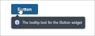
The following image shows a tooltip with an icon for the Button widget. The tooltip appears when you place the pointer on the widget.
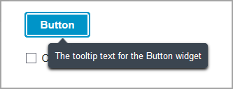
The following image shows a tooltip without an icon. The tooltip appears when the widget is in a focused state after you press the TAB key.
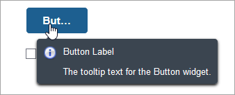
Tooltips are also used to display truncated widget labels. In the following example, the Button widget has a narrow width and the label is truncated. When the tooltip appears, the full label is displayed in addition to the tooltip text and icon.
Adding text and Icons Tooltip for Widgets
You can specify the text for the TooltipField property in one of the following ways:
• Create a binding to the property from a data source
• Type the tooltip text manually in the property field
• Click the globe icon and select a localization token
To add an icon, select a media entity in the TooltipIcon property field.
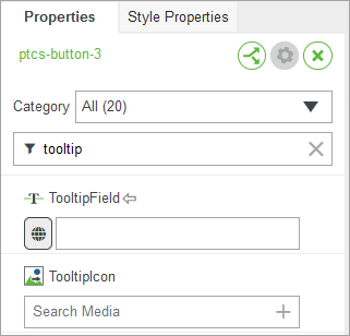
 | • You cannot display an icon without text within a tooltip. When you leave the ToolTipField property empty, the tooltip is not displayed, unless it is used to show the full text for a truncated label. |
Styling Tooltips in a Mashup
By default, tooltips are responsive and they are automatically sized to fit the text and the icon. You can apply styles to tooltips by editing the mashup style theme. To edit the tooltip style settings, perform the following steps:
1. Select the current mashup style theme on the Style Properties panel, and then click View. The style theme entity opens in Composer.
2. On the Styles tab, under the Elements settings, expand > .
3. Edit the style settings under the following categories as required:
◦ Size—The minimum and maximum width setting for the tooltip container
◦ Background Color—The color of the tooltip container
◦ Borders—The color and style of borders for the tooltip container
◦ Box Shadow—The style settings for the tooltip container shadow
◦ Text—The font type, weight, size, and style for the tooltip text
4. Click Save to save the style theme.
The styles that you defined are now visible when a tooltip appears on the mashup. For more information about using the styles tab for style themes, see Using the Styles Tab.