Using State Formatting in a Mashup
You can use state formatting to change the appearance of widgets and their elements based on rules and values that you define. For example, you can highlight a data value in a Value Display widget for a deployed asset in the field based on whether it is available, offline, or returns an error. You can also use state formatting in a Grid widget that is bound to an Auto Refresh function. The state formatting is automatically applied based on the new values when the data set is updated. This enables you to monitor the data changes in real time and to spot trends and patterns more easily.
A state definition is a type of visualization entity that you can use to apply state formatting to widgets in a mashup. Each state definition contains style definitions that are applied according to a defined set of values and conditions. You can use state formatting to highlight important information by using specific colors or icons based on the current value to style widgets. This makes it easier to identify and understand patterns, analyze data, and detect critical issues in widgets that are displaying data that is returned from a service. For more information about state and style definitions, see Style and State Definitions.
After you create a state definition entity, you must define the values to match and define the style definitions to apply when the widget value matches the condition. For example, the following state definition contains five conditions and styles that reflect the status of a device:
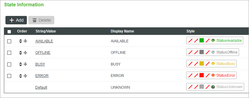
The device has five states that are triggered by a specific string value. Each state has a unique style definition entity that is applied to the widget. You can select an existing style definition entity, or create a new custom style definition using the entity picker.
 |
Custom style definitions that you create using the entity picker are not saved as an entity.
|
Supported Widgets
By default, themed widgets are styled using the mashup style theme. When you apply state formatting to a widget, style definitions are applied instead. The state definition styles override the mashup style theme, style properties, and style definitions. The following types of widgets support state formatting:
• In ThingWorx 9.0 and later, you can apply state definitions to standard and legacy widgets that are not themed, such as:
◦ Gauge
◦ LED Display
◦ Pie Chart
◦ Progress Gauge
◦ Shape
◦ Tag Cloud
|
|
The Grid Advanced widget is the only exception to this rule.
|
• In ThingWorx 9.1 and later, the following themed widgets support state formatting:
◦ Dropdown
◦ List
In the following figure, state formatting is used to highlight different values under a specific column within a Grid Advanced widget. The state definition has three states and conditions that correspond to a style definition. When a value in a cell matches one of the defined states, a style definition is applied to the cell.
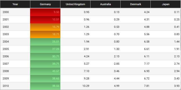
You can define state formatting for columns or rows, depending on your data. For more information, see Advanced Grids (Themable).
Formatting Conditions
The following table lists the available conditions that you can set within the state definition entries.
Type | Operator | Description | ||
|---|---|---|---|---|
Numeric | • Less than (<) • Less than or equal to (≤) | Matches all number values that are lower than or equal to the specified number. | ||
String/Value | Equal to | Matches strings or numbers that match a specified value.
|
Using state formatting, you can apply different style definitions for following types of data:
• Boolean numbers or strings, such as True or False, or 0 and 1.
• A numeric range of values, such as numbers between 0 and 10.
• Numbers less than or equal to a specific value.
• Positive and negative values.
Applying State Formatting when a State is Not Matched
In some cases, the widget data does not match any of the defined conditions within a state definition. You can select a default style to apply when none of the conditions within a state definition are matched in one of the following ways:
• Optional—When you create a or modify a state definition entity.
• Required—When you apply a state definition that does not have a default style to a widget. You must choose a style definition to apply in the state formatting dialog box.
Using Media Entities to Display Icons within Widgets
State definitions use style definitions which can contain media entities. You can create media entities to use as icons, shapes, and directional arrows that change based on the current value. This is useful when you want to highlight critical information using visual representation. For example, the following image shows four Value Display widgets with state formatting. Each widget displays a numeric value and an icon.
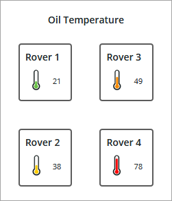
A different icon is displayed for each widget based on states within the applied style definition. For more information, see Media