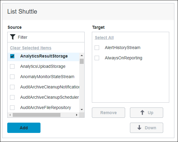
List Shuttle Widget (Themable)
You can use the List Shuttle widget to select items from an existing list, the source, and place them on a new list, the target. In the target list, order the selected items and remove the unwanted items from the source list.
 |
The List Shuttle widget is available as a standard widget in the platform and as a web component that you can import from an SDK.
|
Data Format
You can configure the ListShuttle widget items using data from an infotable that is formatted using to the following structure:
|
Filed Definition
|
Display Field
|
IDField
|
|---|---|---|
|
Description
|
Represents the label of the list Shuttle item at run time.
|
Represents the actual ID of the list Shuttle item. This value is also stored in the SelectedItems property.
|
|
Base Type
|
STRING or NUMBER
|
STRING or NUMBER
|
Defining List Items
To define list items, bind an infotable that is formatted using the required data format.
1. On the Data panel, add a data service that defines list items for the widget. You can define items using the infotable format that is outlined in the previous section.
2. Bind the All Data property of the data service to the Data property of the List Shuttle widget.
3. On the Properties panel, select the infotable field for the following properties:
◦ DisplayField— The data for the item labels.
◦ IDField—The ID for the items.
4. Click Save, then View Mashup.
The list items are displayed within the widget at run time.
Validating the Number of Selected Items
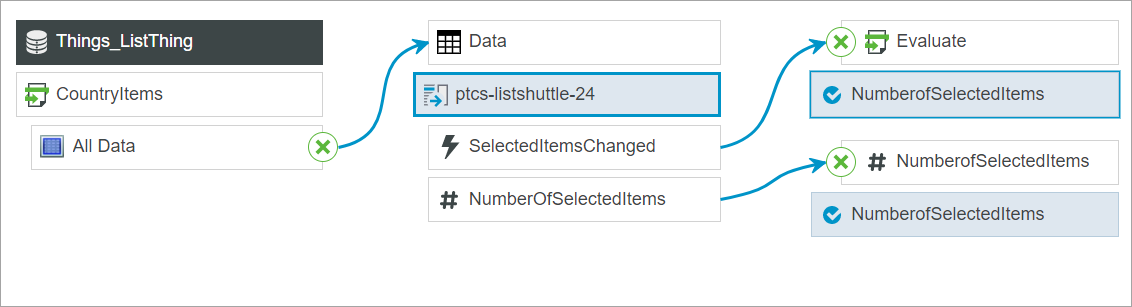
In ThingWorx 9.4 or later, you can use the NumberOfSelectedItems property to track and validate the number of selected items in the list at run time. For example, you can bind the property to a Validator function. You can also show an error message and restrict the user from saving the page if the number of selected items does not match a specific value.
The following example shows a binding between a property and a Validator function. The SelectedItemsChanged event is used to validate the NumberOfSelectedItems property using a function. At run time, the function checks the number of selected items and displays an error message when the validation fails.
Widget Properties:
Property Name | Description | Base Type | Default Value | Bindable? (Y/N) | Localizable? (Y/N) | ||
|---|---|---|---|---|---|---|---|
TabSequence | Sets the sequence in which the widget is highlighted when you press TAB. | NUMBER | n/a | N | N | ||
DisplayField | The infotable field that represents the data value. | INFOTABLE | n/a | N | N | ||
ListFormat | Applies a specific renderer for the data that is displayed. In ThingWorx 9.1 and later, you can use this property to apply state formatting to the widget. | Renderer and State Formatting | n/a | N | N | ||
Disabled | Disables the widget in the mashup. The widget appears but it is not available to use. | BOOLEAN | False | Y | N | ||
CustomClass | Defines the CSS class name for the top div element of the widget. When entering multiple classes, separate each class with a space. | STRING | n/a | Y | N | ||
SelectedItems | The infotable source for the items that are selected in the list. | INFOTABLE | n/a | Y | N | ||
SingleSelect | Sets single selection or multiple selection. | BOOLEAN | False | Y | N | ||
HideFilter | Shows or hides the filter on the source list. | BOOLEAN | False | Y | N | ||
IDField | The infotable field that contains the IDs of list items. You must specify the ID field when items share the same display name.
| Field Names | n/a/ | n/a | N | ||
Data | The data source for the widget. | INFOTABLE | n/a | Y | N | ||
ListShuttleLabel | The text that appears in the label of the List Shuttle widget. | STRING | List Shuttle | Y | Y | ||
ListShuttleLabelAlignment | Aligns the label to the Left, Right or Center in the widget. | STRING | Left | Y | N | ||
ListShuttleLabelType | Sets the type of the label as Header, Sub-Header, Label or Body. | STRING | Sub-Header | Y | N | ||
NumberOfSelectedItems | Returns the number of selected items in the List Shuttle.
| NUMBER | n/a | Y | N | ||
SourceListLabel | The text that appears in the label of the source list. | STRING | Source | Y | Y | ||
SourceListLabelAlignment | Aligns the label to the Left, Right or Center in the source list. | STRING | Left | Y | N | ||
SourceListLabelType | Sets the type of the label as Header, Sub-Header, Label or Body. | STRING | Label | Y | N | ||
TargetListLabel | The text that appears in the label of the target list. | STRING | Target | Y | Y | ||
TargetListLabelAlignment | Aligns the label to the Left, Right or Center in the target list. | STRING | Left | Y | N | ||
TargetListLabelType | Sets the type of the label as Header, Sub-Header, Label or Body. | STRING | Label | Y | N | ||
ResetToDefaultValue | Resets the lists to their default values. | n/a | n/a | Y | N |
Validation Properties
| | The following Validation properties for the List Shuttle widget are only available in ThingWorx 9.4 and later. |
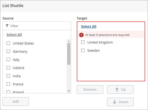
In addition to the common validation properties, you can use the TargetListMaxItems and the TargetListMinItems properties to restrict the number of selected items in the widget. When the number of items selected is outside of the range, a failure message is displayed.
Property Name | Description | Base Type | Default Value | Bindable? (Y/N) | Localizable? (Y/N) | ||
|---|---|---|---|---|---|---|---|
ValidationState | A bindable property that sets the validation state. You can set this property to undefined, unvalidated, valid, or invalid. | STRING | Undefined | In | N | ||
ValidationOutput | A bindable property used to retrieve the output of the widget validation. Returned values are undefined, unvalidated, valid, or invalid. | STRING | n\a | Out | N | ||
ValueRequired | Require an item to be added to the target list. | BOOLEAN | False | In | N | ||
RequiredMessage | The message to display when ValueRequired is set to true, and an item is not added to the target list. | STRING | A selection is required | In | Y | ||
Validate | An event that triggers when the widget value is changed. Bind this event to a service or function to apply a validation expression. | EVENT | n/a | Out | N | ||
ShowValidationSuccess | Show a success message when the validation is successful. | BOOLEAN | False | In | N | ||
ValidationSuccessIcon | Select an SVG icon to display within the status message when the validation succeeds. | IMAGELINK |  success success | N\A | N | ||
ShowValidationFailure | Show a failure message when the validation fails. | BOOLEAN | False | In | N | ||
ValidationFailureIcon | Select an SVG icon to display within the status message when the validation fails. | IMAGELINK |  error error | N\A | N | ||
ShowValidationCritera | Shows a hint message about the required input when editing the list. | BOOLEAN | False | In | N | ||
ShowValidationState | A bindable service that enables you to display the validation state before a user interacts with the widget at run time. By default, the validation state is only displayed after user interaction.
| Service | n/a | In | N | ||
ValidationCriteriaIcon | Select an SVG icon to display within the hint message for the validation criteria. | IMAGELINK |  Info Info | N\A | N | ||
SuccessMessage | The message to display when the validation is successful. | STRING | n/a | In | N | ||
SuccessMessageDetails | A secondary message that displays more information about the validation success message. | STRING | n/a | In | Y | ||
CriteriaMessage | The message to display when the validation fails. | STRING | n/a | Y | Y | ||
CriteriaMessageDetails | A secondary message that displays more information about the validation failure message. | STRING | n/a | In | Y | ||
TargetListMinItems | Sets the minimum number in the target list. | NUMBER | n/a | In | N | ||
TargetListMinItemsFailureMessage | The message to display when the number of selected items in the target list is lower than the TargetListMinItems value. | STRING | ${value} Is the minimum number of items | In | Y | ||
TargetListMaxItems | Sets the maximum number of items in the target list. | NUMBER | n/a | In | N | ||
TargetListMaxItemsFailureMessage | The message to display when the number of selected items in the target list is higher than the TargetListMaxItems value. | STRING | ${value} Is the maximum number of items | In | Y |