List Widget (Themable)
The List Widget is a widget that enables you to display rows of data.

 |
The List widget is available as a standard widget in the platform and as a web component that can be imported from an SDK.
|
Data Format
You can configure List widget items using data from an infotable that is formatted using to the following structure:
|
Filed Definition
|
Display Field
|
Value Field
|
State Field
|
|---|---|---|---|
|
Description
|
Represents the label of the list item at run time.
|
Represents the actual value of the list item. This value is also stored in the SelectedText property.
|
An optional infotable field that represents the state of the items in the list. This property can be used to enable or disable the items in the list. Supported values: Enabled or Disabled
|
|
Base Type
|
STRING or NUMBER
|
STRING or NUMBER
|
STRING
|
Defining List Items
To define list items, bind an infotable that is formatted using the required data format.
1. On the Data panel, add a data service that defines list items for the widget. You can define items using the infotable format that is outlined in the previous section.
2. Bind the All Data property of the data service to the Data property of the List widget. A binding is created.
3. On the Properties panel, select the infotable field for each one of the following properties:
◦ DisplayField— The data for the item labels.
◦ ValueField— The actual values of item labels.
◦ StateField— An optional field that defines the enabled or disabled state of each data item.
4. Click Save, then View Mashup.
The list items are displayed within the widget at run time.
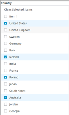
Enabling Multiple Selection
You can enable multiple selection in the list by setting the widget MutliSelect property to true. Multiple selection adds check boxes that enable users to select one or more items in a list. In addition, a control is added above the items that enables users to clear or select all items.
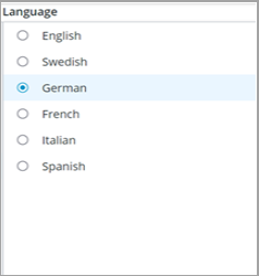
Configuring Single Selection
By default, the widget supports single item selection. A selected item is highlighted using a background color.

To enable radio button selection when using single selection mode, set the RadioButtonSelection property to true. The button is displayed to the left of the list. The list items are displayed as a radio button group which indicates to the users that only one item can be selected at a time.
Adding a Filter
You can add a filter to the list by setting the widget Filter property to true. The filter is displayed at the top of the list, and it enables users to quickly filter items in the list.

Clearing Item Selection
You can add an empty item that enables users to clear the selection in a single selection list by setting the widget ClearSelection property to true. You can also change the label of the empty item by using the ClearSelectionLable property.
| | This property is not available when multiple selection mode is enabled. |

Applying State Formatting
You can use State Formatting to highlight the current status of the list items based on a string or a numeric value. For more information, see Example: Applying State Formatting to a List Widget (ptc.com).

Widget Properties
Property Name | Description | Base Type | Default Value | Bindable (Y/N) | Localizable(Y/N) | ||
|---|---|---|---|---|---|---|---|
Label | The text that is displayed as the widget label. | STRING | List | Y | Y | ||
LabelAligment | Aligns the label to the left, right, or center. | STRING | Left | Y | N | ||
Aligment | Aligns the items in the list to the left, right, or center. | STRING | Left | Y | N | ||
ClearselectionItem | Adds a blank selection item to the list. Enables the user to clear a selection. | BOOLEAN | True | Y | N | ||
ClearselectionLabel | Specifies a custom text for the clear selection item in the list. It is set to None by default. | STRING | None | Y | Y | ||
MultiSelect | Enables the user to select multiple items in the list. | BOOLEAN | False | N | N | ||
StateField | Specifies the info table to use for disabling or enabling items on the list. | INFOTABLE | n/a | N | N | ||
Disabled | Disables the widget in the mashup. The widget is displayed in the mashup but you cannot click it. | BOOLEAN | False | Y | N | ||
ShowListFilter | Adds a filter inside the list to filter the list items at run time. | BOOLEAN | False | N | N | ||
FilterHintText | Displays a hint text for the list filter. | STRING | n/a | N | Y | ||
AutoSelectFirstRow | Sets the first row as the selected option on the list.
| BOOLEAN | n/a | N | N | ||
RadioButtonSelection | Displays radio buttons next to list items when using single selection mode. | BOOLEAN | False | N | N | ||
RowHeight | Sets the row height for the single line. | NUMBER | 34 | Y | N | ||
CustomClass | Defines the CSS to the top Div of the widget. Multiple classes can be entered, separated by space. | STRING | n/a | Y | N | ||
TabSequence | The sequence in which widgets are highlighted when the user presses the Tab key. | NUMBER | n/a | N | N | ||
Data | The infotable or data source for the widget data. | INFOTABLE | n/a | Y | N | ||
DisplayField | The infotable field that represents the data value. | n/a | n/a | N | N | ||
ValueField | The field that is used for SelectedText. | n/a | n/a | N | N | ||
SelectedText | Enables you to select an item from the list. | STRING | n/a | Y | Y | ||
SelectedItems | Defines the infotable source of selected items on the list. | INFOTABLE | n/a | Y | N | ||
DoubleClicked | An event is triggered when you double-click the widget. | n/a | n/a | Y | N | ||
ListFormat | This property is used to apply a specific rendering for the data. This property supports the following rendering formats: NUMBER, INTEGER, LONG, DATETIME, LOCATION, VEC2, VEC3, VEC4, THINGCODE, HYPERLINK, IMAGELINK, IMAGE, STRING, BOOLEAN, TAGS, HTML, THINGNAME, THINGSHAPENAME, THINGTEMPLATENAME, USERNAME, MASHUPS, INFOTABLE, PASSWORD, XML, JSON, VALUES. | n/a | n/a | n/a | n/a |
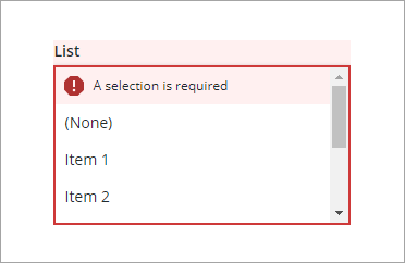
Validating List Widget Data
You can use validation properties to validate the selection of list items at run time. For example, you can require an item in the list and display an error message when no items are selected.
For more information about the validation properties, see Applying Validation to Widgets.
The following table lists validation properties that are available on the Validation panel in ThingWorx 9.3.4 or later.
Property | Description | Base Type | Default Value | Bindable (Y/N) | Localizable (Y/N) | ||
|---|---|---|---|---|---|---|---|
CriteriaMessage | The message to display for the validation criteria and when the validation fails. | STRING | n\a | Y | Y | ||
CriteriaMessageDetails | The details to display for the validation criteria and failure message. | STRING | n\a | Y | Y | ||
RequiredMessage | The message to display when value required is set to true and item is not selected | STRING | A selection is required | Y | Y | ||
ShowValidationCriteria | Shows a hint message about the required input when editing the list | BOOLEAN | False | Y | N | ||
ShowValidationFailure | Show a failure message when the entered value fails the validation | BOOLEAN | False | Y | N | ||
ShowValidationSuccess | Show a success message when the entered value is validated as successful | BOOLEAN | False | Y | N | ||
ShowValidationState | A bindable service that enables you to display the validation state before a user interacts with the widget at run time. By default, the validation state is only displayed after user interaction.
| Service | n/a | In | N | ||
SuccessMessage | The message to display when the validation is successful | STRING | n\a | Y | Y | ||
SuccessMessageDetails | A secondary message that displays more information about the validation success message | STRING | n\a | Y | Y | ||
Validate | A bindable event that is triggered when the widget value is changed. Bind this event to service or function to apply a validation pattern or expression. | event | n\a | Y | N | ||
ValidationCriteriaIcon | Select an SVG icon to display within the hint message for the validation criteria | IMAGELINK | info | N | N | ||
ValidationFailureIcon | Sets the SVG icon to display within the status message when the validation fails. | IMAGELINK | error | N | N | ||
ValidationOutput | Retrieves the output of the widget validation. Returned values are Undefined,Unvalidated ,Valid , orInvalid. | STRING | n\a | Y | N | ||
ValidationState | A bindable property that sets the validation state. You can set this property to Undefined, Unvalidated, Valid, or Invalid. | STRING | Undefined | Y | N | ||
ValidationSuccessIcon | Select an SVG icon to display within the statues message when the validation succeeds | IMAGELINK | success | N | N | ||
ValueRequired | Require an item in the list to be selected | BOOLEAN | False | Y | N |