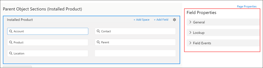
Field Properties
Fields on objects represent the details of each object and are equivalent to columns in a database table. Each field on the object has one or more of the following properties.
The following screen displays the Field Properties:
The following table lists the sections within the Field Properties:
|
Field Properties
|
Description
|
||||
|---|---|---|---|---|---|
|
General
|
This section displays the general Field Properties.
• Field Name: This displays the name of the field.
• API Name: This displays the API name of the field.
• Read Only: This is a toggle button and is disabled by default. You can enable or disable the button. If Read Only is enabled, the field event section is not displayed. If Read Only is disabled, the field event section is displayed.
• Required: This is a toggle button that you can enable or disable. If the Required button is enabled, the field information is mandatory.
• Allow New: This property allows the user to create a new record from the lookup field. When the Allow New toggle button is enabled, the user can see the New option in the lookup field at runtime. The user can create a missing record without canceling the existing session using the New option. The Allow New toggle button is available for a lookup field in the header or the child lines. The Allow New toggle button is disabled by default.
Example: In an SFM, the user searches for a part in the Parts lookup field. But the part is not available in the lookup search results. With the New option available in the lookup field, the user can create the missing part, and select and add parts from the lookup list.
• Show as Rich Text (web only): This property is available only on fields with data type as Text Area (Rich). When enabled, users can view and format the content added to this field. By default, the content is displayed as plain text.
|
||||
|
Field Events
|
This section allows you to configure the events to the selected field.
• On Exit: From the drop-down, select any of the following options:
◦ None: This option is selected by default.
◦ Invoke Webservice: This option allows you to enter the Webservice method. It is mandatory to enter the name of the method.
◦ Execute Java Script Code: This option allows you to select the method from the drop-down list. It is mandatory to enter the name of the method.
• On Scan: Select the required JavaScript code snippet from the drop-down. This enables automatic extraction and population of specific information from scanned QR codes into the relevant fields.
The OnScan Field Event can be configured in both the Header and Child sections and supports only for the Text and Text Area data types.
|
||||
|
Web Only Options
|
This option allows you to configure the properties you can view on a web.
You can configure the following properties:
• Label Override: Enter a context-specific label for a field that replaces the default system label. Supports up to 255 characters.
• Help Text Display: Enter help text that provides contextual guidance to end users, which reduces errors and supports user onboarding. You can configure one of the following:
◦ Info Tooltip: Displays contextual guidance using a hoverable information icon next to the field label.
◦ Placeholder Text: Displays input guidance within the field box. The text clears when the user starts typing.
|
||||
|
Mobile Options
|
This option allows you to configure the properties you can view on a mobile device. On enabling the Field Button, the Action Type drop-down is displayed. On clicking the Action Type drop-down, it displays the options: None, Custom Action, Execute JavaScript Code.
• None: This option is by default.
• Custom Action: This option displays a list of methods in the drop-down.
• Execute Java Script Code: This option allows you to select the method from the drop-down list. It is mandatory to enter the name of the method.
• Field Button: This is a toggle button, and you can reset the entire mobile options by disabling the button.
|
Lookup Field Properties
Lookup field properties provide information about the Lookup fields.
A lookup configuration includes a definition of context, basic filter, and advanced filters, all specific to the lookup configuration and not reusable. Though Advanced filters in the lookup configuration are named filters, they are not reusable and cannot be shared across lookup configurations.
The following table lists the Lookup field properties.
|
Lookup Field Properties
|
Description
|
||
|---|---|---|---|
|
Configure
|
This property allows you to configure a Lookup Editor.
If the Lookup is associated, an info icon is displayed along with the Configure label. On hovering over the icon, the associated Lookup configuration name is visible.
|
||
|
Default Sort Field
|
This property allows you to define the field on which the lookup results must be sorted at runtime. Using the arrow icon, you can sort the lookup results in ascending (upward arrow) or descending (downward arrow). The value is set to None by default, and the default sort order is Ascending.
|
||
|
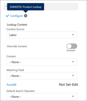
Lookup Context
|
This property is enabled only for Related sections and not for the Header section. Click on the Context Source, and a drop-down is displayed with a list of values of the Header object and the selected Related object. Within the Context Source property, if you select any value, the context of the drop-down value is changed.
If the Context Lookup filter is configured based on the RecordType Id, then matching records on the Lookup appear based on the RecordType Name match instead of the RecordType Id.
|
||
|
Override Context
|
This is a toggle button, and by default, it is disabled. You have the option to enable it.
|
||
|
Context
|
This option in the Parent Object and Related Object Sections allows you to select a lookup field. All the other fields are displayed except the chosen field in the Context drop-down. You can select any value as required from the drop-down.
|
||
|
Matching Field
|
This field has a drop-down with a list of all the fields related to the selected object. If you select the value from the Context drop-down, that lookup name is pre-populated. You have the option of changing the field from the matching field drop-down. If you reset the context value, the matching field's value is reset automatically.
|
||
|
Default Search Operator
|
This property is a drop-down with a list of operators for lookup search. The value you select in this property defines the type of keyword search performed on this lookup field. For example, if you select Exact Match as the value in the field, search results are displayed only when there is an exact match with the entered string. When no value is set for this property, a keyword search on the lookup field considers the search operator configured in the global setting GBL017.
|
The following screen displays the configurations of the Lookup section in Field Properties:
Configuring the Lookup Editor
To configure the Lookup Editor:
1. Click Configure. A pop-up window is displayed with the Lookup Filters.
2. Select the name of the lookup filter of your choice and click Apply button. The selected lookup filter name is added to the list, and you can see a check mark beside the Configure label on the lookup page. If the Lookup is associated, an info icon is displayed along with the Configure label. On hovering over the icon, the associated Lookup configuration name is visible.
3. Click Cancel to close the pop-up window.
The following screen displays the Lookup Editor.
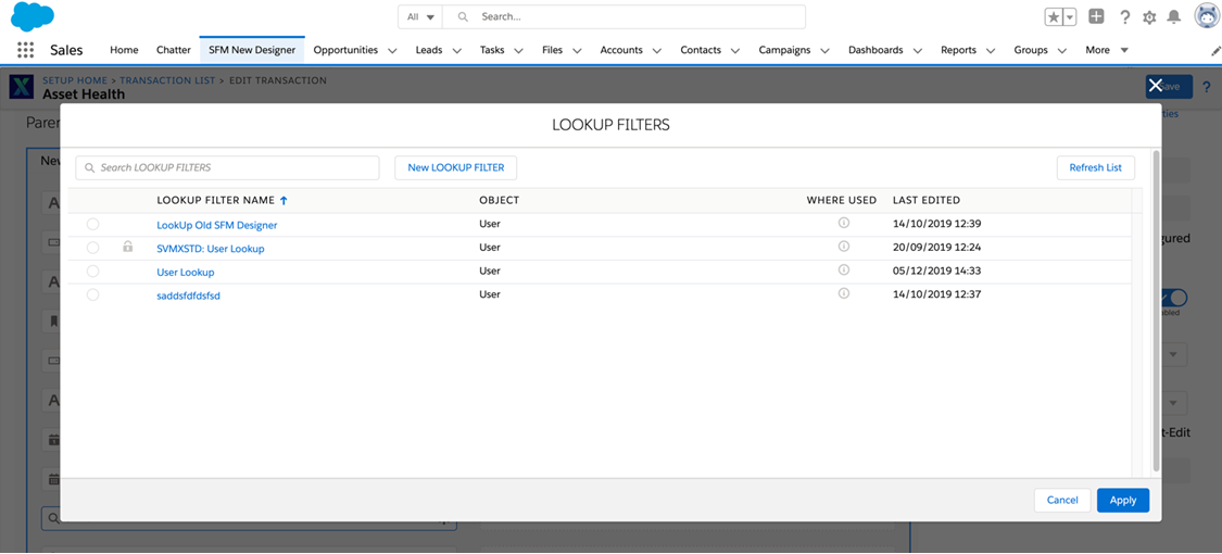
UI Components of Lookup Editor
The following are the UI components within the Lookup Editor:
|
Fields
|
Description
|
|---|---|
|
Lookup Filter Name
|
Displays the name of the Lookup.
|
|
Object
|
Displays the name of the object that is associated with the Lookup Filter.
|
|
Where Used
|
Displays a list of transactions where this Lookup Filter is used.
|
|
Last Edited
|
Displays the date when the Lookup Filter was last edited based on your time zone. You can view the name of the person who last edited the Lookup Filter by placing the cursor over the value.
|
|
Search Lookup Filters
|
This allows you to search for a Lookup filter in the list.
|
|
Refresh List
|
Displays the latest list of Lookup filters.
|
|
Cancel
|
Closes the pop-up window.
|
|
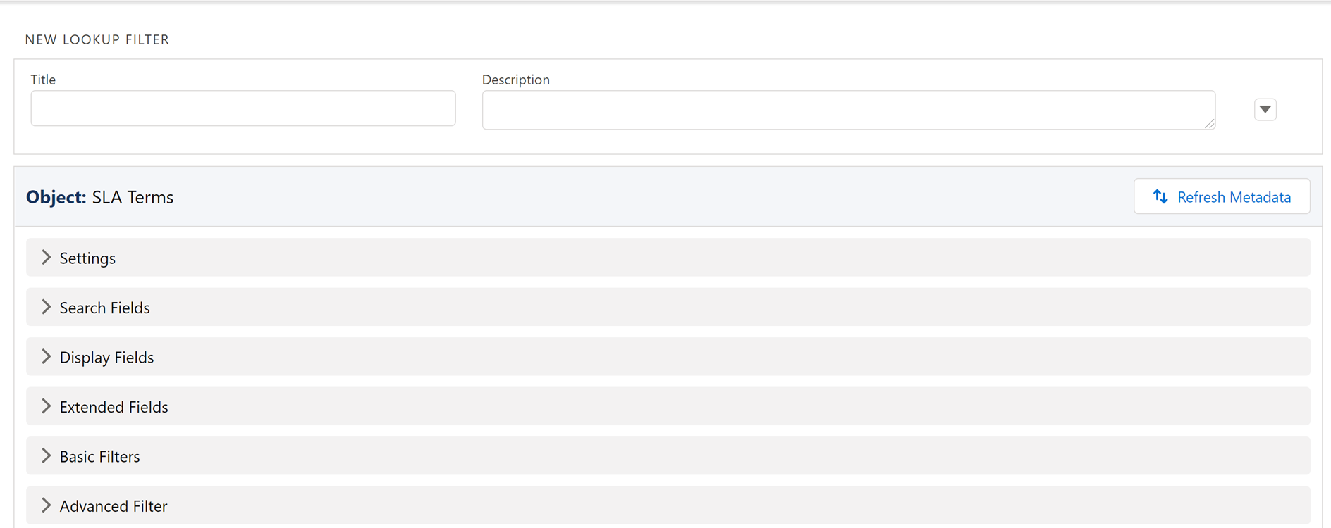
New Lookup Filter
|
This allows you to create a New Lookup filter.
|
UI Components of New Lookup Filter
The following are the UI components displayed in the New Lookup filter:
|
Fields
|
Description
|
Screenshots
|
||
|---|---|---|---|---|
|
Title
|
This property displays the title of the selected Lookup Filter that you can edit.
|
 |
||
|
Description
|
This property displays the description of the selected Lookup Filter that you can edit.
|
|||
|
Object
|
This column displays the object name referred to by the Lookup field.
|
|||
|
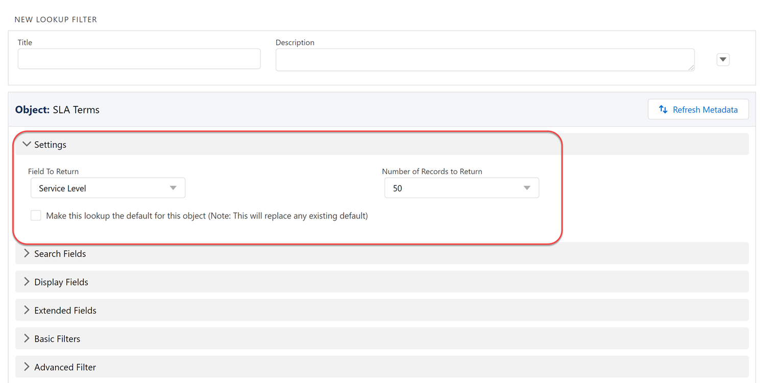
Settings
|
The Settings has two fields
|
 |
||
|
Field to Return
|
This option is displayed in the lookup search dialog box on performing a search.
|
|||
|
Number of Records to Return
|
This option is displayed in the lookup search dialog box on performing a search. The default value is 50.
|
|||
|
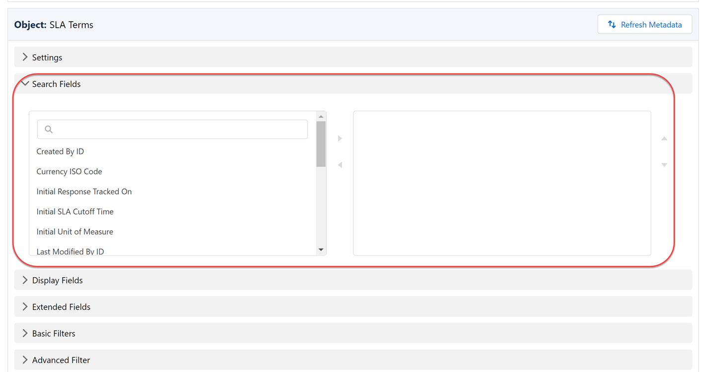
Search Fields
|
This allows you to add each field against which the keyword is searched during the lookup search in SFM Delivery. Boolean and Checkbox data types are not supported in the Search Fields.
|
 |
||
|
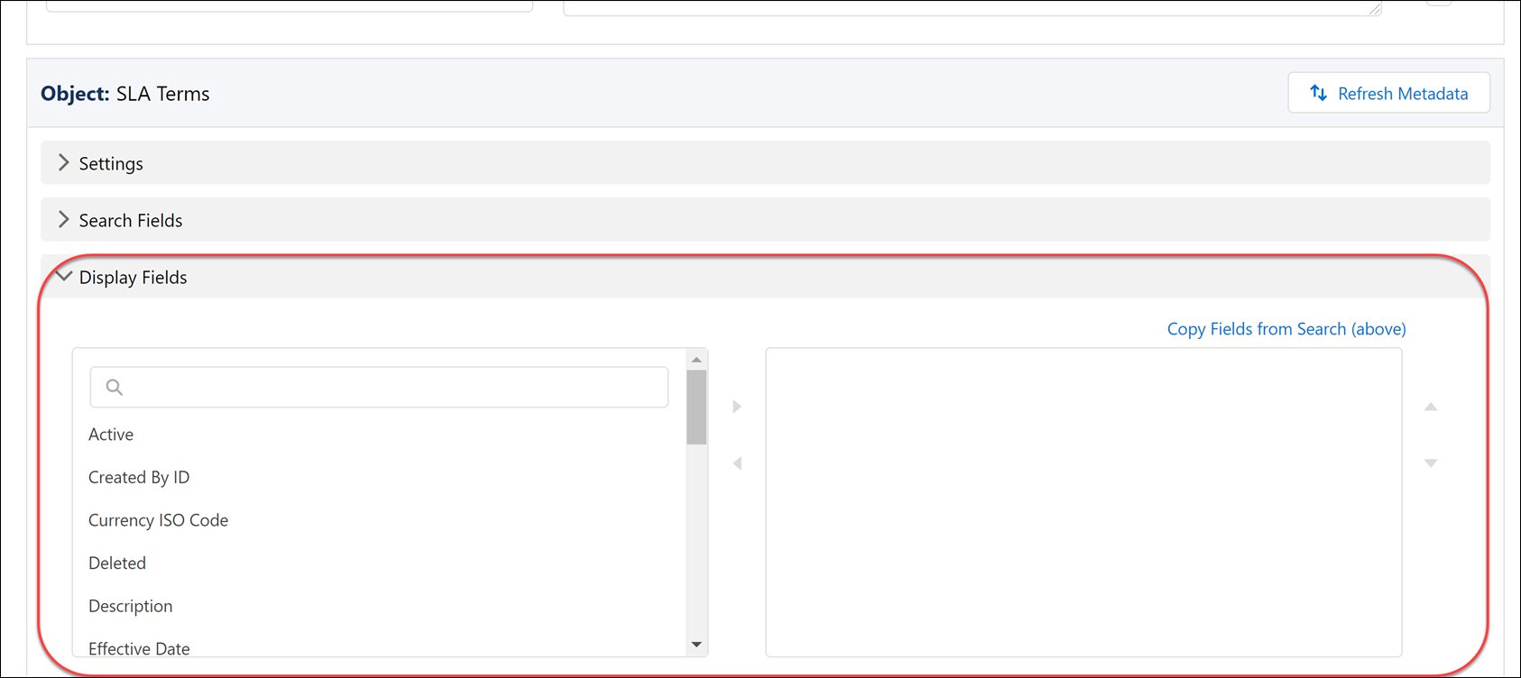
Display Fields
|
This allows you to add each field displayed in the lookup search dialog box in SFM Delivery.
|
 |
||
|
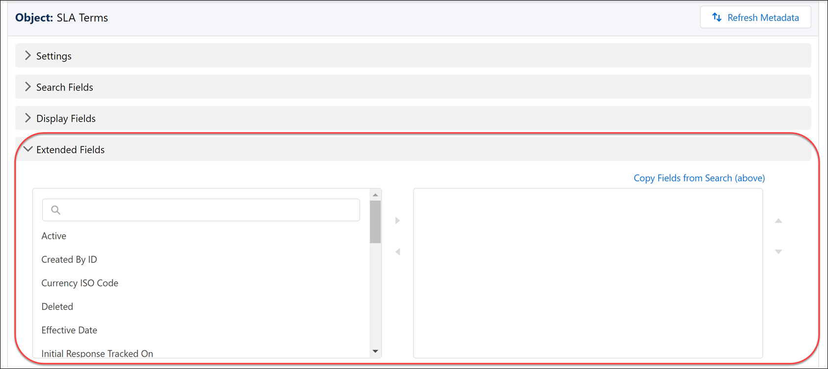
Extended Fields
|
This allows you to add each field displayed on clicking the lookup search in SFM Delivery. Boolean and Checkbox data types are supported in the Extended Fields.
|
 |
||
|
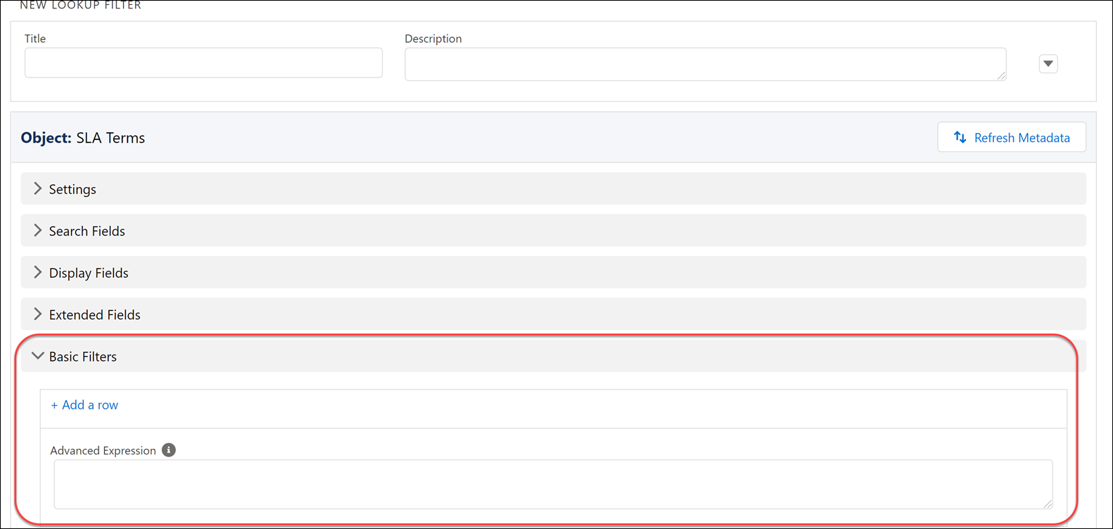
Basic Filter
|
This is an optional filter, and if configured, it is applied when a lookup search is done in SFM Delivery.
|
 |
||
|
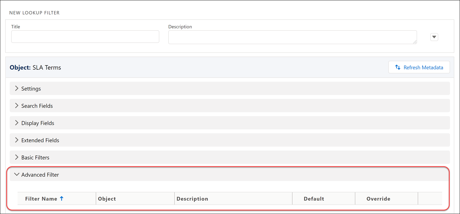
Advanced Filter
|
This filter, if configured, is either optional or applied when a lookup search is done in SFM Delivery, based on the configuration. Though they are named filters, they are not shared between lookup configurations. Cloning an existing lookup configuration, standard or custom creates clones of any associated advanced filters.
|
 |
||
|
Add Filter
|
This allows you to create a filter.
|
|||
|
Delete
|
This allows you to delete the Advanced Filter from the list.
|
|||
|
Cancel
|
This allows you to cancel the Advanced Filter.
|
|||
|
Save
|
This allows you to save the Advanced Filter.
|
Creating an Advanced Filter
Use the Advanced Filter tab in the Configure Lookup Field dialog box to manage Advanced Filters.
The following screen displays the Advanced Filter Editor:

To create an Advanced Filter:
1. Select the required related list Object from the picklist.
2. Enter a unique Filter Name and Description.
3. Select the Default On checkbox if you want the filter applied by default when the lookup search is done.
4. Select the Allow Override checkbox that allows you to override this filter. Define expressions as required.
5. Click Apply to save the filter.
 |
• Date and Datetime fields support the functions Today, Tomorrow, Yesterday, and Now.
• Location lookup fields support the function User Trunk.
|
Formfill
Formfill is used to configure the auto-map when the record is selected via lookup at runtime. If the mapping is not set, it displays the label Not Set-Edit.
The following screen displays the Formfill Editor:
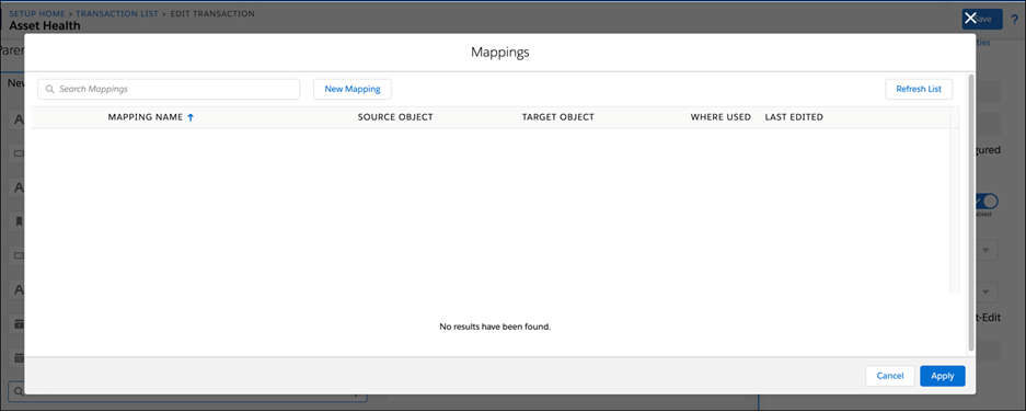
The following are the UI components of the Formfill Editor:
|
Fields
|
Description
|
|---|---|
|
Mapping Name
|
Displays the name of the mapping.
|
|
Source Object
|
Displays the name of the Source object. The source object is blank for Value Mapping.
|
|
Target Object
|
Displays the name of the Target object.
|
|
Where Used
|
Displays the areas where the mapping is used.
|
|
Last Edited
|
Displays the date when the map was last edited based on your time zone. You can view the name of the person who last edited the map by hovering the mouse over the value.
|
|
New Mapping
|
This allows you to access the Mapping Editor. After successfully creating the mapping, you can go back to the pop-up window and click the Refresh List to get the updated list of mappings.
|
|
Refresh List
|
This allows you to view the latest list of mappings.
|
|
Search
|
This allows you to search and filter the mappings in the list.
|
|
Apply
|
This allows you to configure a mapping to the selected field. You can view a tick mark before the Formfill button. The tick mark indicates that the mapping is successfully configured. After the mapping gets configured, the Not Set-Edit label is not visible.
|
|
Cancel
|
This allows you to close the pop-up window.
|
|
Remove Association
|
This allows you to remove or edit an association on a mapping. When the association is removed successfully, the tick mark icon is not displayed, and the Not Set-Edit option is displayed. There is an option to edit the mapping you selected.
|