Loss Reason Pareto Charts
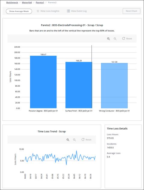
Each loss reason Pareto page provides a bar chart of all loss reasons at that level of the loss reason tree for which there is loss event data. The chart is presented in descending order with the top loss reasons starting on the left. Bars that are on and to the left of the vertical line represent the top 80% of losses for the selected equipment and date range. Below the main chart, two additional panes provide details about the data displayed and selected in the main Pareto chart.
There can be multiple levels of Pareto charts that you can navigate through, depending on the number of levels in the reason tree for the selected bar in the chart.
• The blue bars in the top-level Pareto chart (Pareto1) show the loss categories for events which have the Event Category that was selected in the waterfall chart. For events where the Work Unit Causing Event is the pacemaker, the loss category is the same as the event category. For events where the Work Unit Causing Event is not the pacemaker, the loss category can be different from the event category.
• The blue bars in subsequent Pareto charts show the loss category and the loss reasons.
The title for the top-level Pareto chart (Pareto1) is a breadcrumb showing the name of the selected work center and event category. As you drill down through subsequent levels of Pareto charts, the loss category and sequence of loss reasons that you select are added to the title breadcrumb.

Each bar in the chart represents a reason and the work unit that reason applies to. If there are loss events for the same reason but different work units, there will be a bar for each reason and work unit combination. The number of hours for each bar in the Pareto chart is displayed at the top of the bar.
Use the Show Average Week toggle to view the data in the main Pareto chart normalized to a 168 hour week.
When the applied equipment filter is for a site, area, or work center, and the filtered date range is 1 month (31 days) or less, click View Event Log to open a read-only event log showing the loss events for the currently displayed data.
Hover over a bar in the chart to see details for that bar in a tooltip. For Pareto1 charts, this includes the work unit that caused the event, the event category, loss category, and the time loss duration. For Pareto2 and subsequent charts, this includes the work unit that caused the event, the event category, loss category, reason or sequence of reasons, and the time loss duration.
After selecting a bar in the chart, you can use the right and left arrow keys on your keyboard to navigate to other bars and view their tooltips. Once you have navigated to a bar, you can press ENTER to select the bar. This is particularly useful in situations where you have both very large and very small bars in the chart, as the small bars can be difficult to hover over and select. |
To zoom in, click  You can also zoom in by clicking and dragging over the portion of the chart that you want to see in more detail. To zoom out, click
  . Click Reset to return to the full chart display. Zooming or resetting the chart does not impact the filtered information.
Bottom Panes
Below the main Pareto chart, two panes display additional information for the data displayed in the main Pareto chart. These bottom panes are not impacted by the Show Average Week toggle.
The pane on the left displays the Time Loss Trend chart. The title for the chart includes the loss reason that is displayed in this level of the Pareto charts, for example, Time Loss Trend – Planned Downtime. When no bars are selected in the main Pareto chart, the total loss hours for all loss reasons display for each day in the date range. When a bar is selected, the time loss values displayed are for that loss reason only. This trend chart has the same zoom functionality as the main waterfall chart.
The pane on the right displays Time Loss Details for the current Pareto chart:
• Loss Hours—When no bar is selected, this is the total loss hours for all bars in the chart. When a bar is selected, this is the total loss hours for the selected bar.
• Incidents—When no bar is selected, this is the number of loss events for all bars in the chart. When a bar is selected, this is the number of loss events for the selected bar.
• Average Loss—The average loss, calculated as Loss Hours divided by Incidents.