Working With the Data Sync Monitor Dashboard
When you launch Max Admin, the Data Sync Monitor Dashboard appears by default. The Dashboard view shows status at a glance in side-by-side dashlets that display data in chart and list view formats.
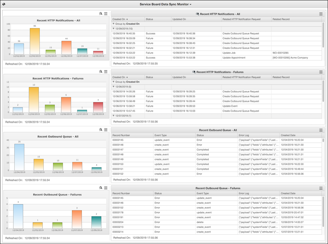
The View Dashlet shows HTTP Notification records in a list view format. By default, entries are grouped by the Created On field, and only records from the past 7 days are shown. You can click the column headers to sort, click the arrows in the gray rows to expand and collapse the groups, and click See Entire List ( ) in the top right corner to open the associated list view in Max Admin. The Data Sync Monitor includes two View Dashlets: Recent HTTP Notifications - All and Recent HTTP Notifications - Failures.
) in the top right corner to open the associated list view in Max Admin. The Data Sync Monitor includes two View Dashlets: Recent HTTP Notifications - All and Recent HTTP Notifications - Failures.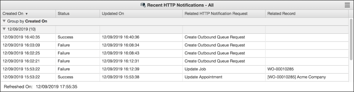
The Chart Dashlet shows HTTP Notification records in a chart format. The chart shows one bar for each day in the filtering range during which records were generated, along with the daily total. You can click each bar to open a list view of that day's records. In the top right corner, you can click Zoom In ( ) to enlarge the chart or See Entire List () to open the associated list view in Max Admin. The Data Sync Monitor includes two Chart Dashlets: Recent HTTP Notifications - All and Recent HTTP Notifications - Failures.
) to enlarge the chart or See Entire List () to open the associated list view in Max Admin. The Data Sync Monitor includes two Chart Dashlets: Recent HTTP Notifications - All and Recent HTTP Notifications - Failures.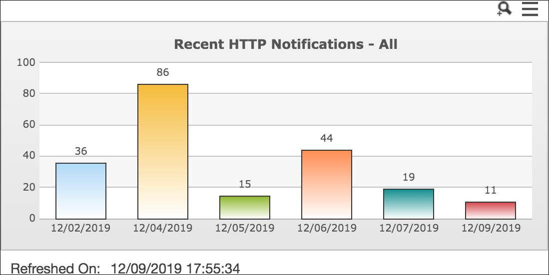
The Salesforce List View Dashlet shows Salesforce Outbound Queue records in a list view format. By default, only records from the past 7 days are shown. You can click the column headers to sort, and click See Entire List () in the top right corner to open the associated list view in Salesforce. The Data Sync Monitor includes two Salesforce List View Dashlets: Recent Outbound Queue - All and Recent Outbound Queue - Failures.
) in the top right corner to open the associated list view in Salesforce. The Data Sync Monitor includes two Salesforce List View Dashlets: Recent Outbound Queue - All and Recent Outbound Queue - Failures.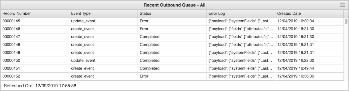
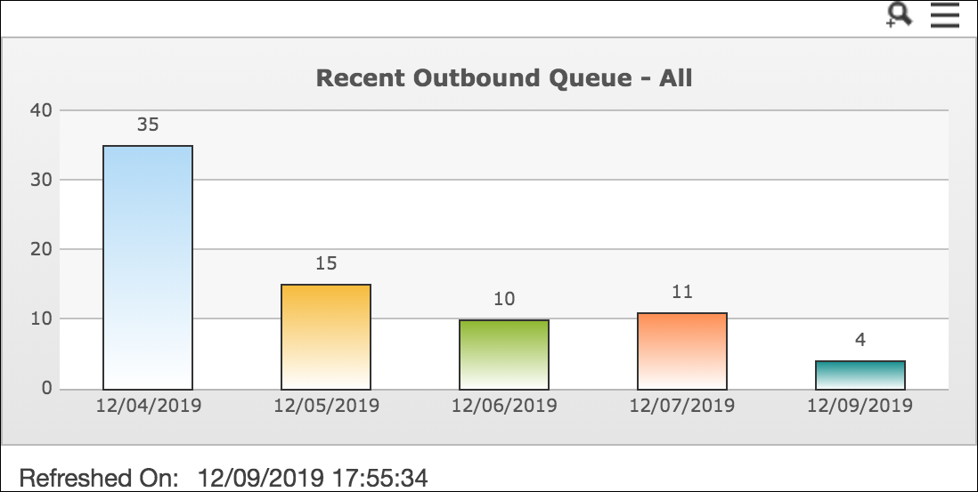
The Salesforce Chart Dashlet shows Salesforce Outbound Queue records in a chart format. The chart shows one bar for each day in the filtering range during which records were generated, along with the daily total. You can click each bar to open a list view of that day's records. In the top right corner, you can click Zoom In () to enlarge the chart or See Entire List () to open the associated list view in Salesforce. The Data Sync Monitor includes two Salesforce Chart Dashlets: Recent Outbound Queue - All and Recent Outbound Queue - Failures.
) to enlarge the chart or See Entire List () to open the associated list view in Salesforce. The Data Sync Monitor includes two Salesforce Chart Dashlets: Recent Outbound Queue - All and Recent Outbound Queue - Failures.