Responsive UI
The SFM Delivery UI components are dynamically responsive to device screen size and resolution. The UI elements auto-adjust in placement to provide the best user experience based on the device screen size and the screen resolution.
The following are the key points of the responsive UI:
• The components on header, detail grid, and extended edit modal window are dynamically responsive to screen size and display resolution.
• The component width auto adjusts to match the column width when you change the column width in the detail grid. This auto-adjustment enables you to adjust the column width based on the content displayed in the column. For example, you can adjust the column width for lookup and picklist fields according to the values displayed in the selection list. User preference per SFM is saved and presented in subsequent launch.
• The detail grid header is fixed. This enables you to always view the column names as you scroll through the list of records.
• All the list views dynamically display up or down based on available viewport in extended edit modal windows. Calendar menu always displays downwards.
• The user preferences with the UI persist for the current user session.
Zoom Level Impact on the UI
All the SFM Delivery UI components auto-adjust when you zoom in or zoom out the screen, to ensure that the best UI experience is achieved at any zoom level.
The following points are considered when you change the zoom level:
• Field name placement is auto-adjusted.
• The space between the fields is auto-adjusted.
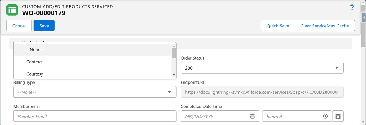
• The dropdown lists for picklist fields are displayed down or up dynamically based on the screen resolution.
• Scrolling is enabled dynamically.
|
|
For the zoom level best practices and recommendations, see System Requirements.
|
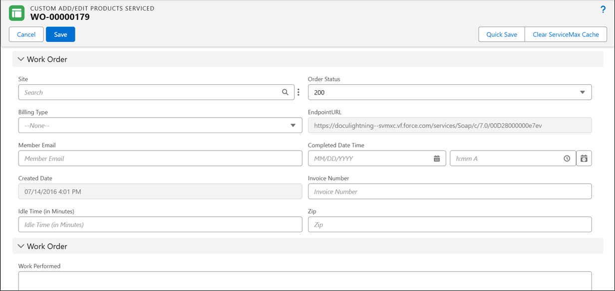
The following is a screenshot of an extended edit window at 100% zoom level.

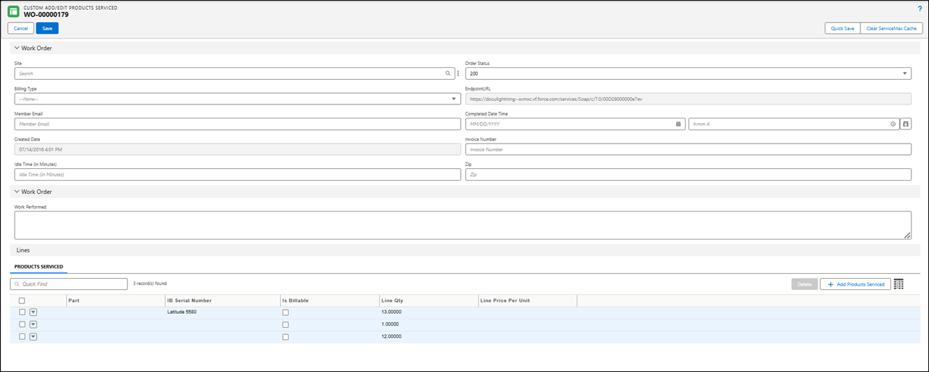
The following is a screenshot of an extended edit window at 50% zoom level.

The following is a screenshot of an extended edit window at 150% zoom level.
