Customizing the Chart Legend
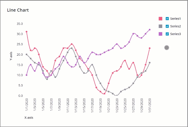
Each data series in the bound infotable is represented using a unique color on the chart. The chart legend defines the data series on the chart. The following topic provides information on different ways that you can customize the legend area.
Hiding the Chart Legend
To hide the chart legend, enable the HideLegend property. You can bind the property to a Toggle Button widget or any other Boolean property to show or hide the legend at run time.
Customizing Data Series Colors
Each data series color is defined in the mashup style theme. To modify the series colors for chart widgets, edit the style theme or use the Style Properties panel.
To edit the style theme:
1. In Composer, open the style theme entity that is applied to the current mashup.
2. On the Styles tab, under Elements, expand the Charts category. Style options for each data series are listed.
3. Expand the data series and pick new colors as required.
4. Click Save.
The new styles are applied to charts in all mashups that use the style theme.
Alternatively, select a chart on the canvas, and then use the available styles on the Style Properties panel. These changes are applied only to the selected chart.
Customizing Data Series Labels
The legend area lists the names of data series that are displayed on the chart. By default, the infotable field names are used to display labels in the legend. To define custom legend labels manually, you must set the number of series on the chart using the NumberOfSeries property.
1. In Mashup Builder, select a chart widget on the canvas or using the Explorer panel.
2. On the Properties panel, set the NumberOfSeries property to the number of series that you want to display on the chart.
3. Use the DataFieldN properties to select the infotable field name with the data for each series on the chart.
4. Use the DataLabelN properties to specify the label of each data series.
5. Click Save, then View Mashup.
The changes to the labels are applied at run time.
Adding Data Filters to the Legend
You can add check boxes next to each label in the legend area, which enables users to filter data at run time. To filter the chart data series, set the FilterLegend chart property to True.
To hide a data series on the chart, clear the check box next to the label in the legend.
Setting the Maximum Width
To set the maximum width of the legend area, use the LegendMaxWidth property on the Properties panel. When a label exceeds the maximum available width, the text is truncated. This lets you build more consistent charts when working with various data sources.
Changing the Color Marker Shapes
You can use the LegendMarkerShapes property to control the shape of the color markers for all entries in the legend. You can choose from two different shapes:
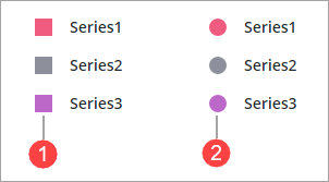
1. Square
2. Circle