Example: Applying State Formatting to Charts
Overview
You can apply state formatting to multiple charts in Mashup Builder like the Line Chart, Bar Chart, and Waterfall Chart widgets. By default, state formatting is applied to all data series in a chart when the NumberOfSeries property is set to Auto. To define different state formatting rules for each data series on a chart, set the widget NumberOfSeries property to a specific number, then use the widget SeriesStyleN property to configure state formatting rules for each series.
Line Chart
You can apply state definitions to a Line Chart widget. In the following example, state formatting is used to highlight data points that fall under a specific number. The following figure shows the chart at run time before state formatting is applied.
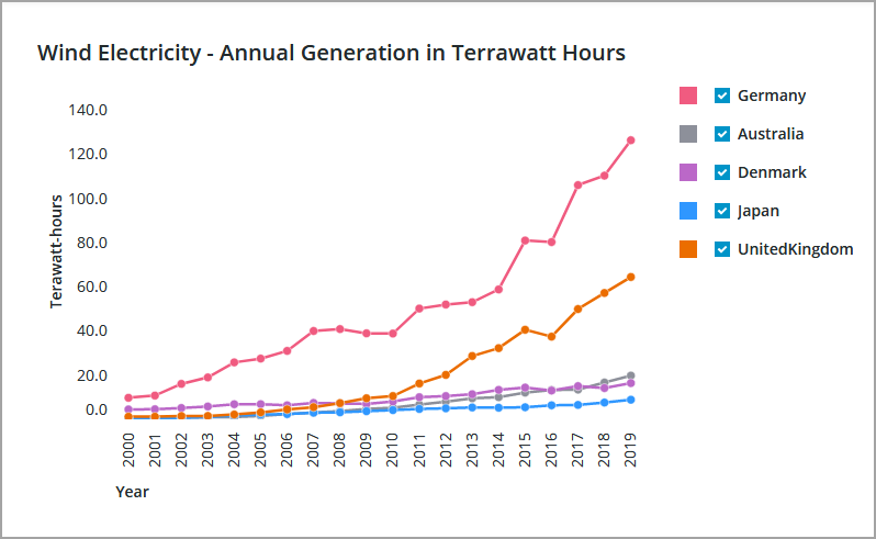
The chart shows all the data from the bound infotable. Each column is displayed as a separate series. Colors are applied to each series using the default values of PTC Convergence Theme. In this example, the chart is modified to highlight the data pattern in a specific data series.
If required, adjust the chart before you apply state formatting. In this example, the additional data series are not required as part of the visualization:
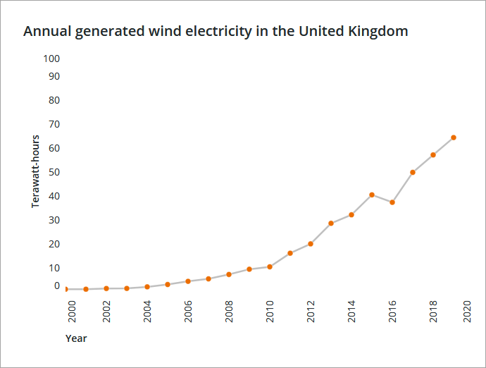
• To limit the number of data series that is displayed, set the NumberOfSeries property to 1. The DataField1 property is added.
• In the DataField1 property, select the infotable column with the data that you want to display on the chart.
To provide better context, modify the chart header by updating the Label property. As a result, the legend area is no longer required. You can hide it by enabling the HideLegends property. The following figure shows the chart at run time with the changes applied:
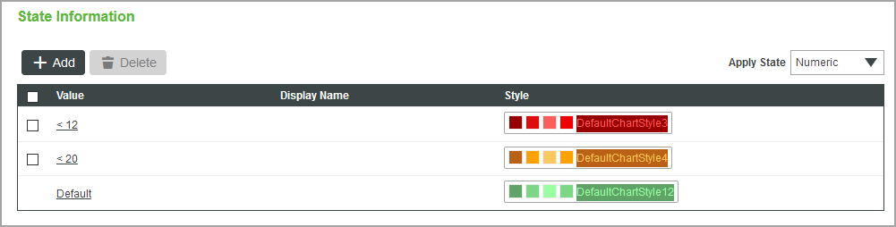
After adjusting the chart, you can create a style definition, or select an existing one in Composer. The following figure shows a state definition that contains states that are defined as follows:
• < 12—Values that are lower than 12 are styled using a red color.
• < 20—Values that are lower than 20 are styled using an amber color.
• Default—Any other value that is higher than or equal to 20 is styled using a green color.
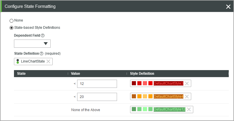
After you create the style definition entity, click the State Formatting button next to the SeriesStyleN property for the series that is displayed on the chart.
 | When the NumberOfSeries property is set to Auto, the state definition is applied to all data series. |
1. In Mashup Builder, select the chart on the canvas.
2. On the Properties panel, click State Formatting next to the SeriesStyle property to open the state formatting dialog box.
3. Select State-based Style Definitions, and then choose a state definition entity.
You can also select a dependent field from the bound infotable with the data to use when evaluating the state condition.
4. Click Done to close the dialog box, and then view the mashup.
At run time, the chart data is displayed and each point is colored according to the defined states within the State Definition entity. The following image shows the line chart with state formatting applied.
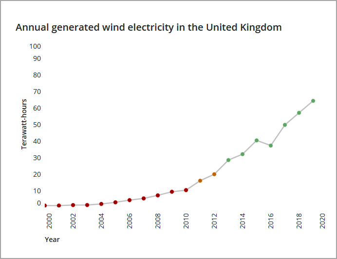
You can customize the lines and other chart parts to better highlight the color of the data point. You can use a gray color for connecting lines to highlight the data points and to add more contrast.
Bar Chart
The following image shows a bar chart that is configured as a column chart. State formatting is applied to the widget, similar to the line chart. The defined states are as follows:
• Numeric values that are higher than 1200 are styled using red columns.
• Any other value is styled using a gray color.
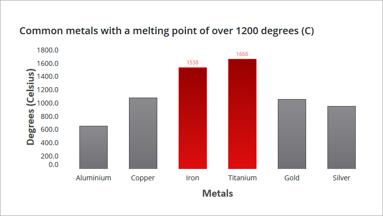
At run time, columns with the defined values are styled according to values in the data series. Note that the state formatting overrides the default style theme colors for all columns.