Applying Validation to Widgets
You can use validation to check data that users can type or select within a mashup. Validation enables you to verify that the provided data is in the correct format and matches the expected requirements of your application. Some inputs may be required, while others must match a specific format, such as phone numbers or email addresses. Typically, simple validation is performed on the client side before submitting data to the server. However, you can use events and services to perform advanced validation on the server side. You can use validation to improve the user experience of your mashups in the following ways:
• Collect data using the right format. Data services and functions may not work correctly when data is missing or incorrectly formatted.
• Protect user data by making sure only valid and safe data is stored on the server.
• Protect the mashup from malicious data that can cause damage to the application.
When the validation is successful, the application allows the user to submit the input to the server. When the validation fails, a failure message is displayed and users can correct the input and try again. You can use widget and style properties to configure the text, icons, and styles of criteria, success, and failure messages. The following widgets support input validation in ThingWorx 9.3.4 or later:
• Dropdown
• Checkbox
• Slider
• Grid
For more information about applying validation to the Grid widget, see Validating Input within the Grid.
When you select one of the listed input widgets at design time, its validation properties are listed on the Validation panel. The following figure shows the properties of the Text Field widget. You can configure the validation properties, such as MaxLength and MinLength messages.

Best Practices
• Make sure that widgets have enough space to display a validation message in the layout. Setting a fixed height on a widget that is too small can affect the visibility of the message. We recommend setting the height to automatic sizing.
Configuring Validation Properties
You can use the available validation properties to perform the following configurations:
• Set the state of the validation programmatically using the ValidationState property to the one of the following values:
◦ Undefined—When the validation is disabled (Default)
◦ Unvalidated—When the validation has not been triggered
◦ Valid—When the validation is successful
◦ Invalid—When the validation fails
• Trigger validation services of functions when the widget data changes using the Validate event.
• Retrieve the state of the validation using the ValidationOutput property.
• Control the visibility, text, and icons of the criteria, failure, success, and required value messages.
• Control whether a specifying a value for the widget is required using the ValueRequired property.
There are additional properties that are specific for each widget. For example, you can set the maximum and a minimum supported number of characters for the Text Area widget.
 |
The full list of properties of each widget are listed within the widget topics.
|
There are two ways to validate data:
• Instantly—When using instant validation, the data is checked as the user enters it. You can use this method to provide users with feedback as they are typing. For example, you can validate whether special characters are typed within a Text Field widget using the Changed or EnterKeyPressed events. This type of validation does not require connecting to a server and is typically performed on the client side.
• Explicitly —Validates data in response to a user action, such as clicking a submit button or navigating to a different page using a link. When such an event occurs, you can execute a validation service that returns a Valid, or an Invalid value for the ValidationState property. You can use this type of validation to perform server-side validation, which takes more time than client side validation.
Applying Client-Side Validation
You can use this type of validation to apply validation rules that are applied within the browser. Using client-side validation improves the experience within your application by allowing users to fix formatting issues before submitting the data to a server. Client-side validation is also faster than server-side validation. The following are examples of when you can apply client-side validation:
• Check whether a required filed that must contain data.
• Check a ZIP code or email address format
• Validate a special characters or sequence
You can use functions like the Validator and Expression functions to validate data on the client side before sending it to a server.
Applying Server-Side Validation
Using client-side validation does not guarantee that the input data is valid and safe. To perform advanced validation, use server-side validation services. You should validate submitted data on both the server-side and the client-side in the following cases:
• When the validation accesses server-based data or when a large amount of data is required to do the validation. For example, when a user is accessing a database to check whether a machine part is available to order in a request form. Using client-side validation in this case requires downloading large amounts of data, which can impact performance.
• When working with sensitive data. Applying client-side validation does not guarantee security. Users can still submit incorrect or malicious data to a server. Make sure that all input data is sanitized before sending it to the server.
The following are examples of use cases for server-side validation:
• Check whether the ID of a new machine part is unique and does not already exists.
• Check if a remote Thing name exists.
• Check whether an email address exists.
• Check whether a user has the required permissions to perform a task.
Applying Validation to a Widget
To apply validation to a widget, perform the following steps:
1. In Mashup Builder, select an input widget on the canvas or using the Explorer panel.
2. On the Validation panel, define the validation criteria and messages:
◦ To require a value, set the ValueRequired property to true. You can customize the message to display using the RequiredMessage property.
◦ Configure the criteria, failure, and success messages to inform the user about the validation requirements and outcomes.
3. Optionally, bind the widget ValidationState property to a function or a data service.
4. Bind the Validate event to function or a data service, depending on the type of validation that you want to perform.
◦ To perform client side validation, use a function.
◦ To perform server side validation, use a data service.
5. Click Save, then view the mashup.
The validation is applied to the widget at run time.
Customizing Validation Messages
You can display the following types of messages within widgets that support validation:
• Criteria—Displayed before the validation is applied.
• Failure—Displayed when the validation fails
• Success—Displayed when the validation is successful
• Required—Displayed when a required value is missing
|
|
Some widgets such as the Text Field include specific messages for built-in validation properties. For more information about the available properties for each widget, refer to the widget topic.
|
You can display criteria messages to inform users about the required data format and the applied validation rules for a widget. To display a criteria message, set the ShowValidationCriteria property to true.

1. ValidationCriteriaIcon—Sets the icon used for the criteria message.
2. CriteriaMessage—Sets the criteria message to display next to the criteria icon.
3. CriteriaMessageDetails—Additional details to display about the validation criteria.
To display the criteria message when the validation fails, set the ShowFailureMessage property to true.

The message and details of the criteria state are also displayed for the failure state. To set a specific icon for the failure state, use the ValidationFailureIcon property.
You can display success messages to confirm that data or the selection for a significant action or task is valid. To display a success message, set the ShowValidationSuccess property to true. At run time, the success message is displayed when the ValidationState property value is set to Valid.

1. ValidationSuccessIcon—Sets the icon that is displayed within the success message.
2. SuccessMessage—Sets the message to display for the validation state.
3. SuccessMessageDetails—Additional details to display about the validation success.
You can use the RequiredMessage property to display a message when a required value is missing or not selected. The following example shows the failure message that is displayed when a Checkbox widget is not selected.
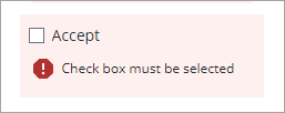
In this example, the TrueRequired and ShowValidationFailure properties are enabled. You can indicate that selection is required using the ShowValidationCriteria and CriteriaMessage properties.
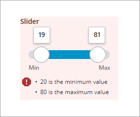
When multiple validations fail, the failure messages are displayed in a list. In the following example, the slider validation fails because the first value in the range is lower than the minimum and the second value is higher than the allowed maximum.
Styling Validation Messages
By default, success, failure, and criteria messages are styled using red, green, and blue highlight colors. You can customize the validation styles within the mashup style theme:
1. Open a style theme entity in Composer.
2. On the Styles tab, under Global, expand >
3. Edit the values for the Success and Danger colors.
4. Save changes to the style theme and preview the changes in a mashup.
You can also use widget style properties to style the font, color, and background colors for each one of these states on the Style Properties panel.
1. In Mashup Builder, select a supported input widget.
2. On the Style Properties panel, expand a validation state, such as Valid. The available parts are listed.
| | The style properties of the Date Time Picker widget are listed under the Base state. |

3. Expand one or more parts, then edit the available style properties.
4. Click Save, then View Mashup. The styles are now visible when validation is applied.